Venture capital fund Northzone has been repositioned around its strength of character, thanks to a complete rebrand by Ragged Edge. The move sees the renowned VC cement and expand its place on the European stage, while positioning it for growth internationally.
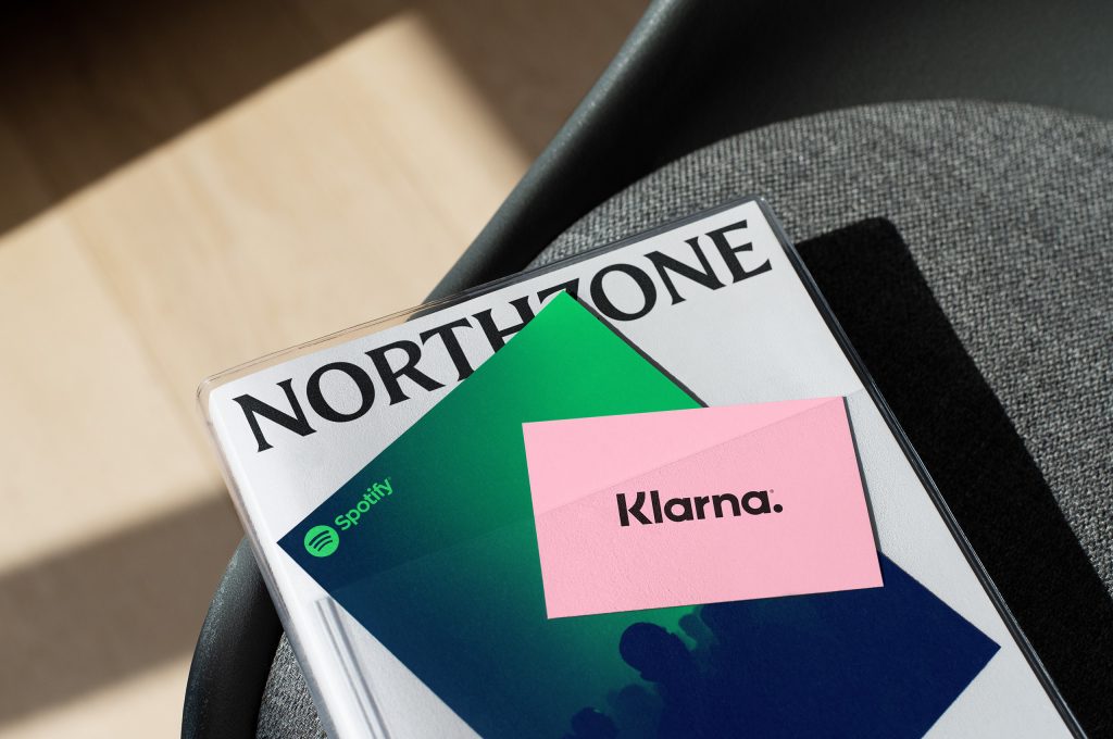
The fund, which has invested in Spotify, Trustpilot and Kahoot among others, approached London-based branding agency Ragged Edge because it wanted to elevate its profile to match its formidable track record.
Paul Murphy, general partner, Northzone, says: “Since 1996, we’ve made over 150 investments, raised over €1.5 billion, and survived two financial crises unscathed. You can’t do that by thinking like everybody else. We felt the time was right to tell that story to a wider audience, particularly internationally.”
A new direction
Max Ottignon, co-founder, Ragged Edge, says: “A lot of the messaging in the VC world is pretty interchangeable – there’s an industry vernacular that’s all too easy to slip into. But Northzone has a genuine point of difference. Instead of relying on an overarching operating thesis like most firms, the partners at Northzone have the freedom to back their own conviction in order to identify true outliers. And they look for that same sense of conviction in the entrepreneurs they back. That felt like a powerful foundation on which to build a brand that would set them apart.”
That strength of character underpins the fund’s new positioning, informing everything from the visual and verbal identity, right through to the firm’s approach to content on its new website.
Hot off the press
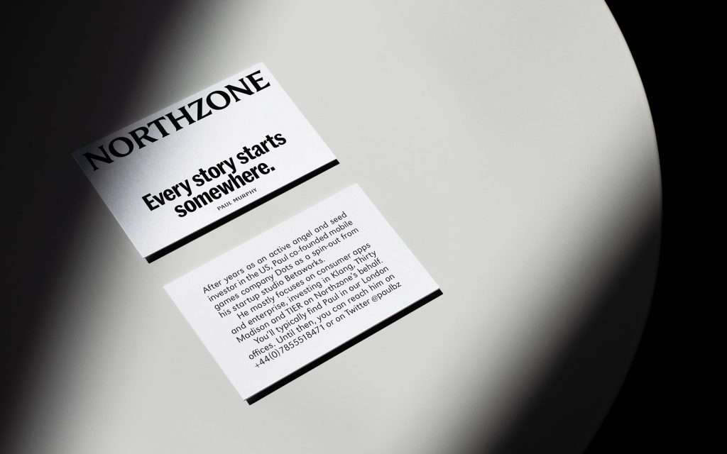
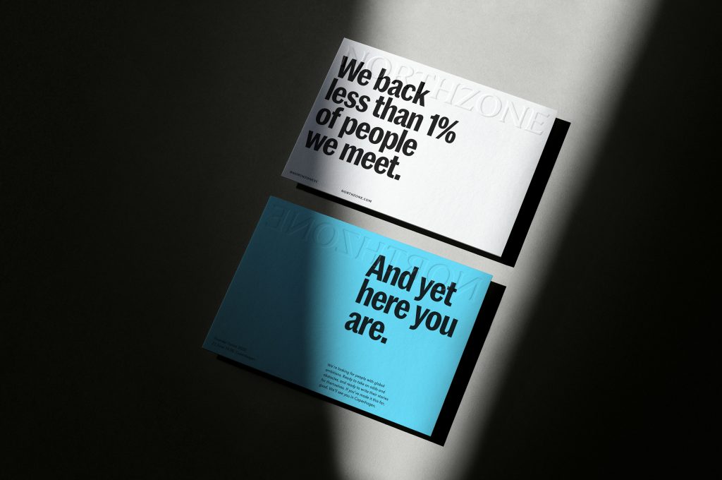
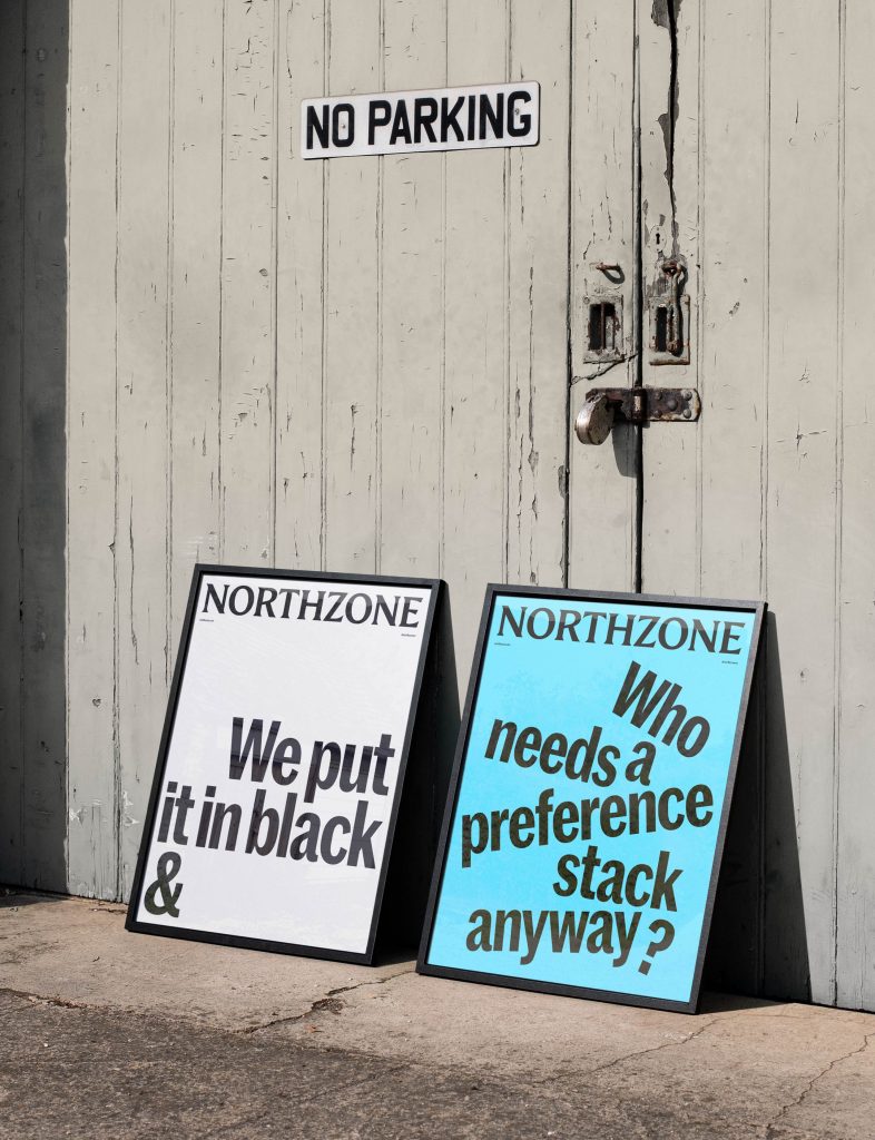
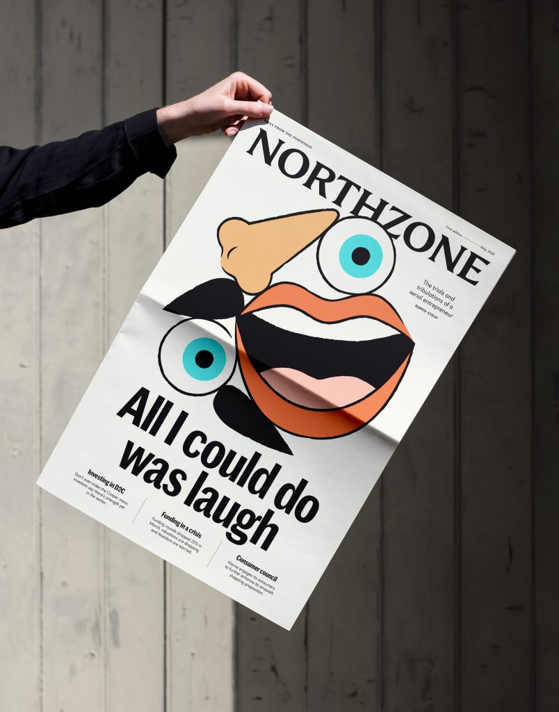
The existing identity was deliberately neutral. But the new positioning demanded something stronger and more directional. Visually, Northzone’s unwavering honesty inspired Ragged Edge to borrow from editorial design. The logotype was inspired by magazine mastheads, while the typographical approach positions the VC as a content brand with storytelling at its heart. A black and white colour palette was the natural choice, reflecting Northzone’s unyielding commitment to tell it like it is.
The distinctiveness of the core visual elements allows for a diverse approach to art direction, with photography and illustration designed to flex around individual stories, from the partners to the entrepreneurs they stand behind.
And the fund’s open, no bullshit approach is reflected with a tone of voice unafraid to challenge the conventions of the category – forthright, yet optimistic.
A brand built for change
Ottignon says: “The strength of the identity’s foundations, from the masthead to the bold tone of voice, allows Northzone to continue to adapt without losing any coherence. It felt important to make room for the personalities of the individuals – from the founders to the entrepreneurs they back.”
Northzone’s Murphy says: “Defining a brand around our diverse range of perspectives was never going to be easy. But Ragged Edge challenged us to challenge ourselves. Our new brand captures the firm’s unwavering conviction in a way that feels true to our past, present and future.”
Source: Ragged Edge
Ragged Edge creates rebrand for VC fund Northzone added by newsroom on
View all posts by newsroom →
You must be logged in to post a comment Login