Pearlfisher is reigniting Coppertone’s sun-kissed spirit to help people positively ‘seize the sun’ as it gives Beiersdorf’s iconic sunscreen brand a fresh, bright and modern new look.
As one of the original suncare giants, many people have their own memories of “Coppertone summers”. However, the suncare sector had, in recent years, become an SPF race, focused on numbers and protection from what is “bad”, with an emerging new breed of more bold and emotive brands overtaking the brand leaders. Coppertone challenged Pearlfisher to reinstate its iconic status with a new visual identity system that would, once again, cement its place as the category leader.
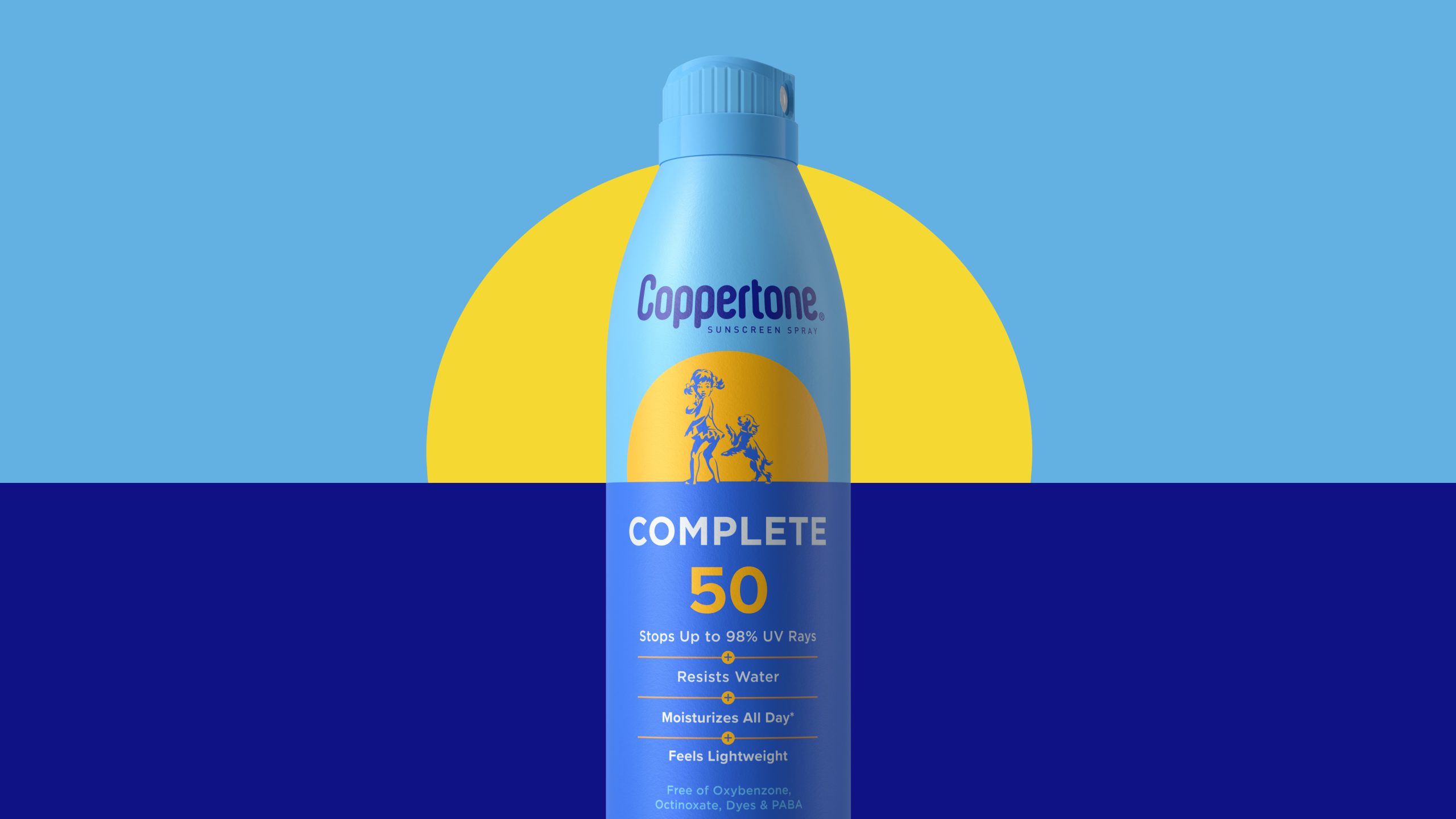
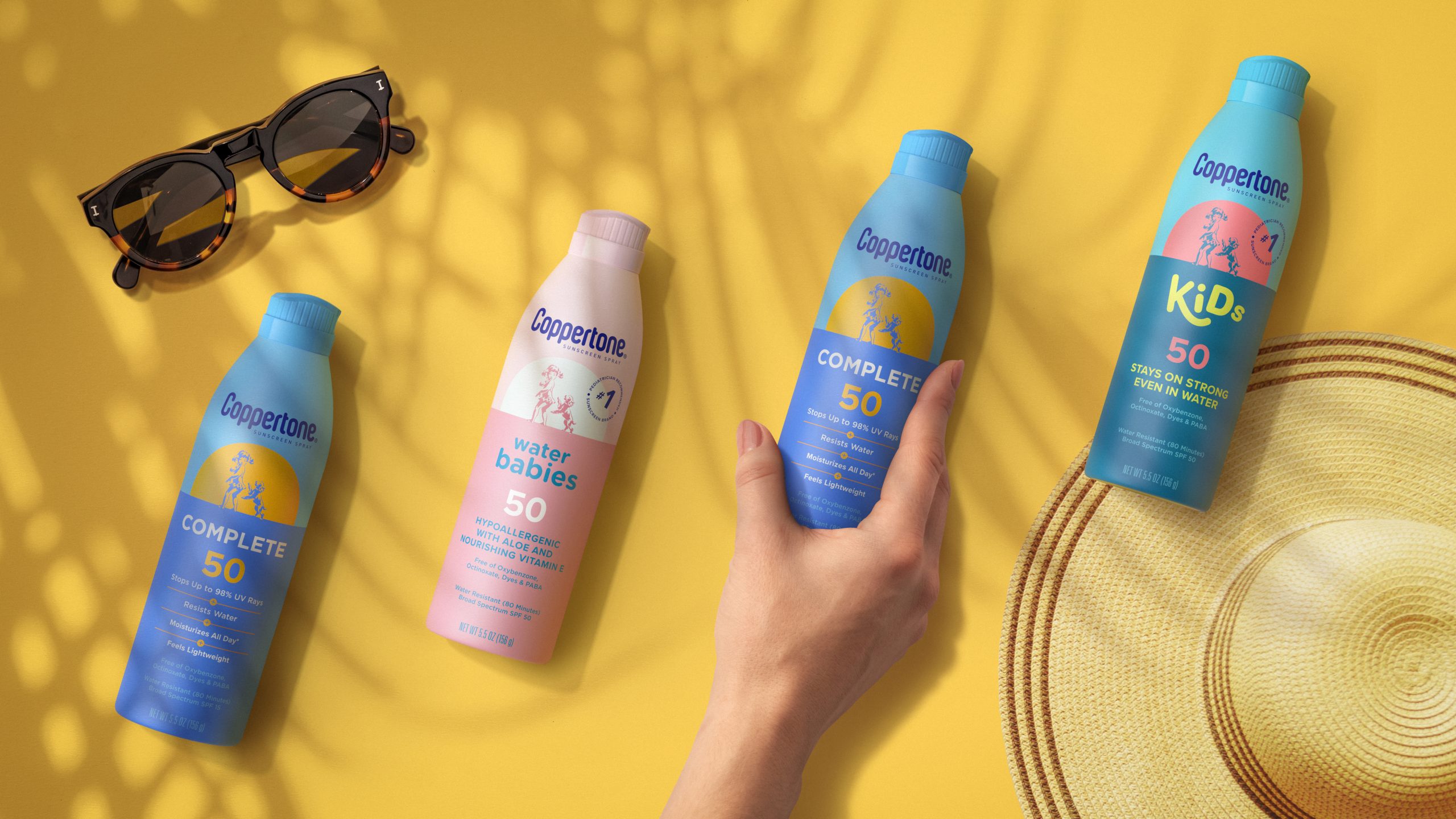
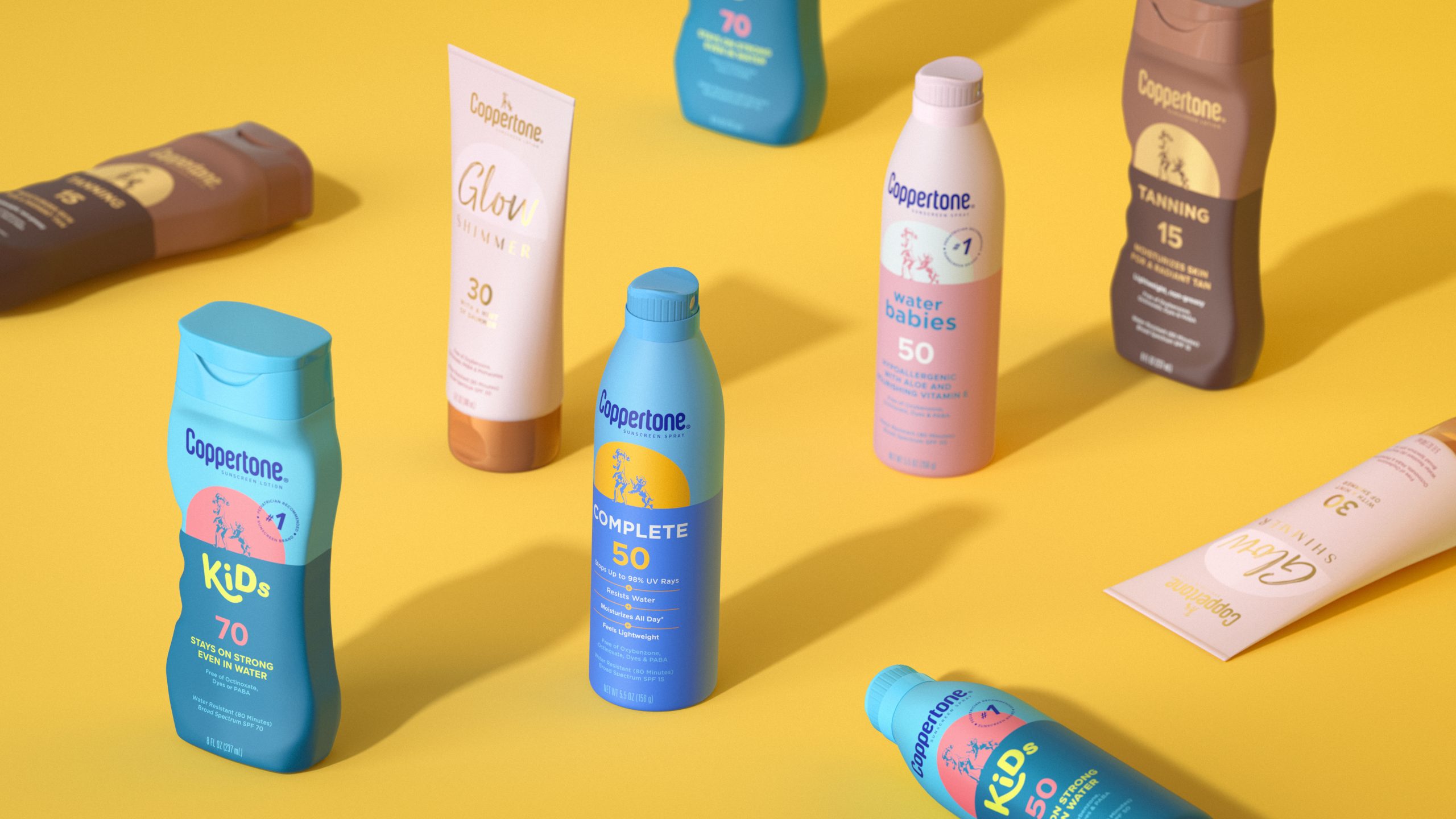
By delving into what the sun means to people, and the Coppertone brand, Pearlfisher created a positive and emotive new positioning for Coppertone centred on the freedom to embrace all that is good under the sun. This translates into a new streamlined brand architecture and visual identity system to make the Coppertone portfolio more clean, contemporary and ownable.
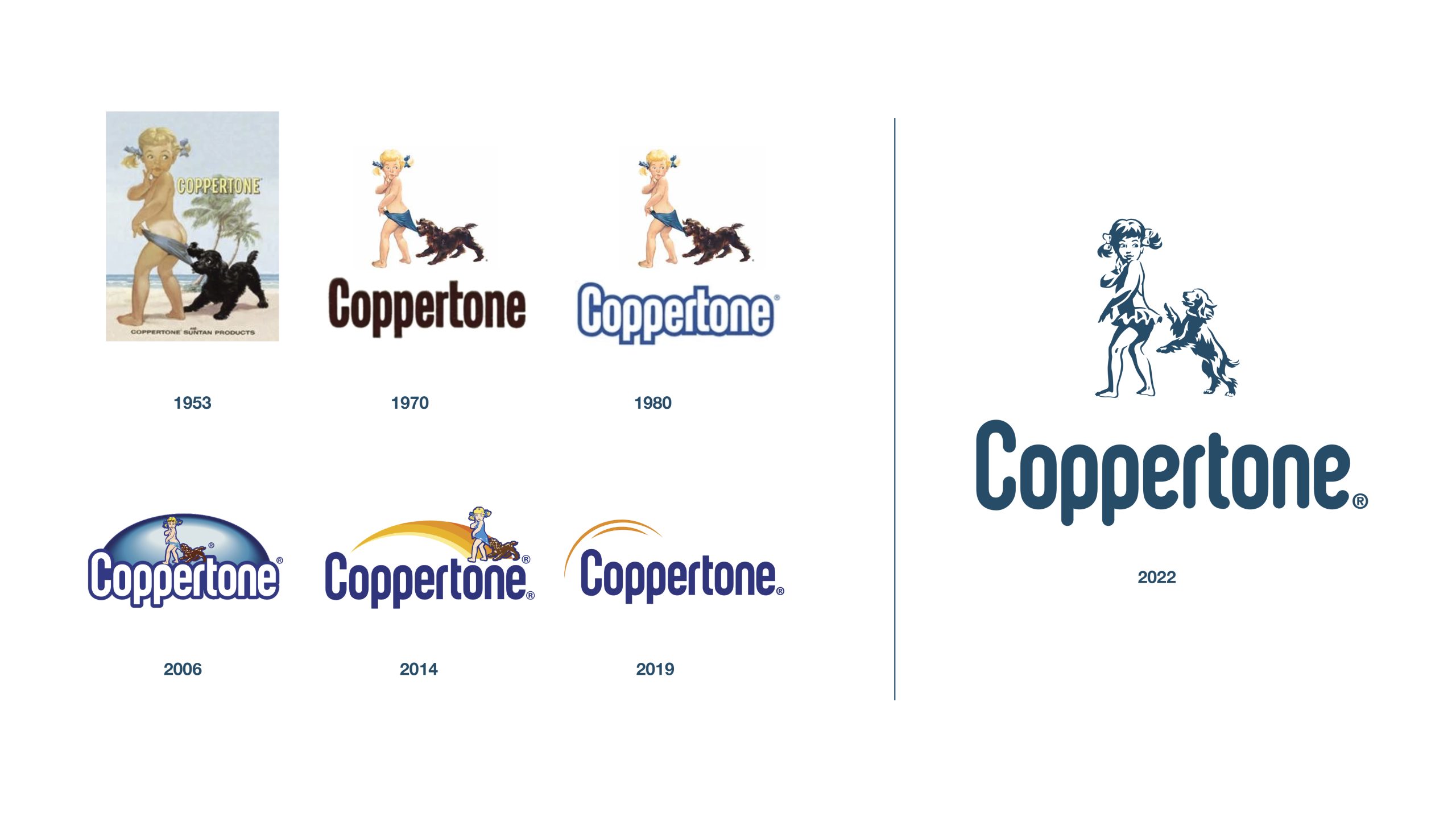


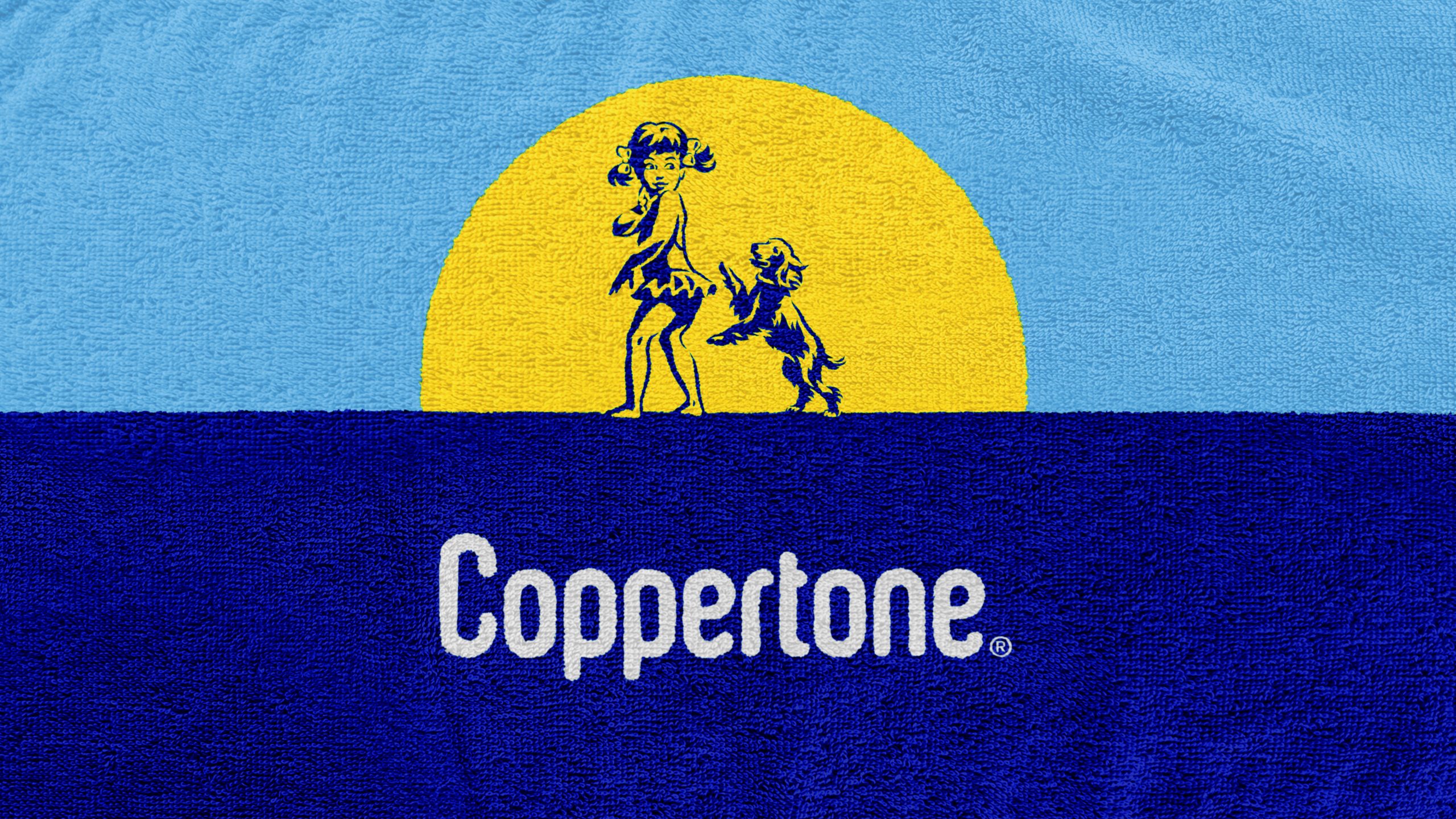
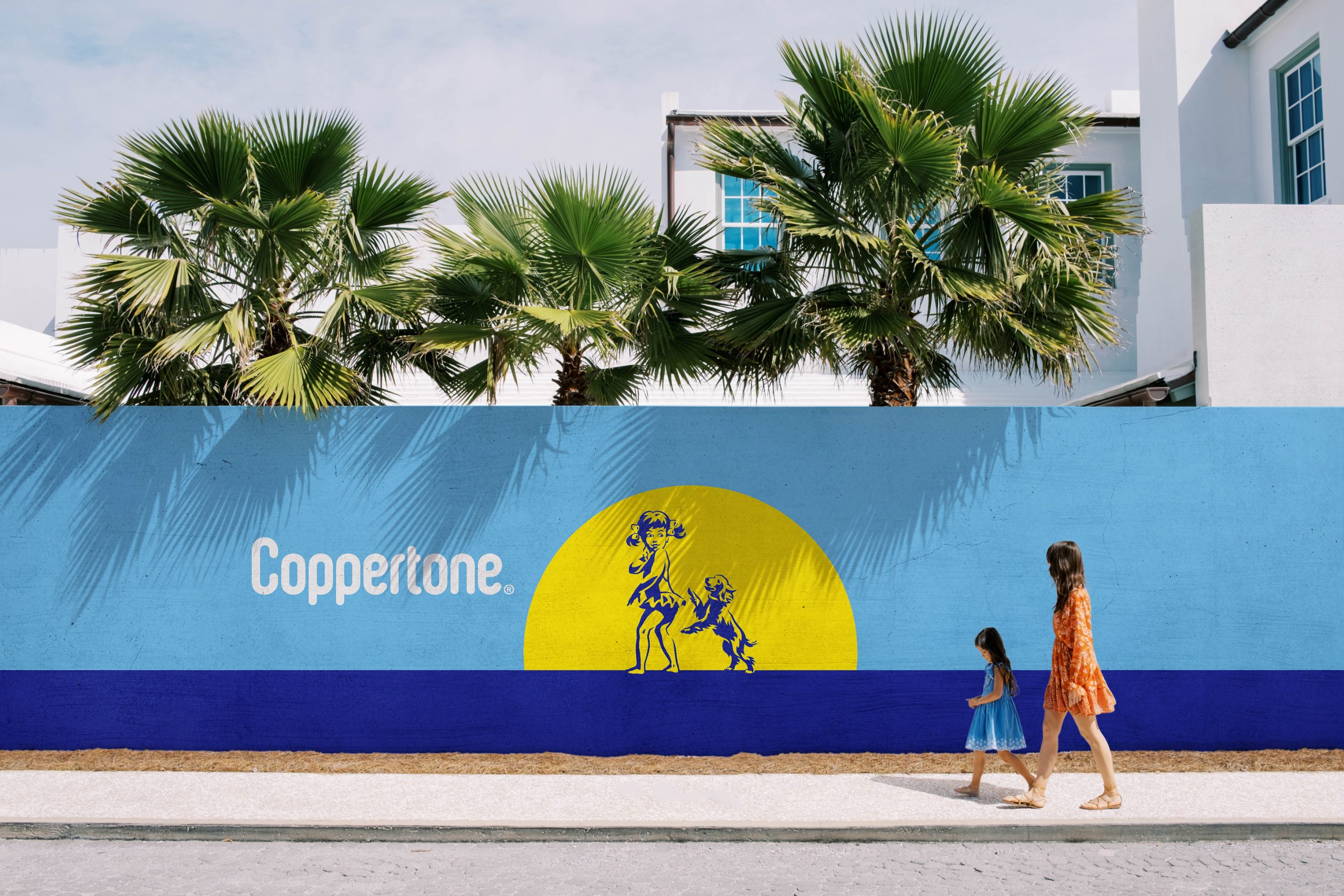
Talking through how the new identity and design comes to life, Hamish Campbell, Executive Creative Director at Pearlfisher, said, “We looked back at Coppertone in its heyday, taking inspiration from this icon’s most loved and distinctive equities, such as Little Miss Coppertone, who has always stood for trust, care and efficacy. Now, a more contemporary, inclusive and playful illustration of her takes pride of place across brand communication. This includes packaging where she flexes across all sub-brands, as she becomes central to the brand storytelling and mission to ‘seize the sun’.”
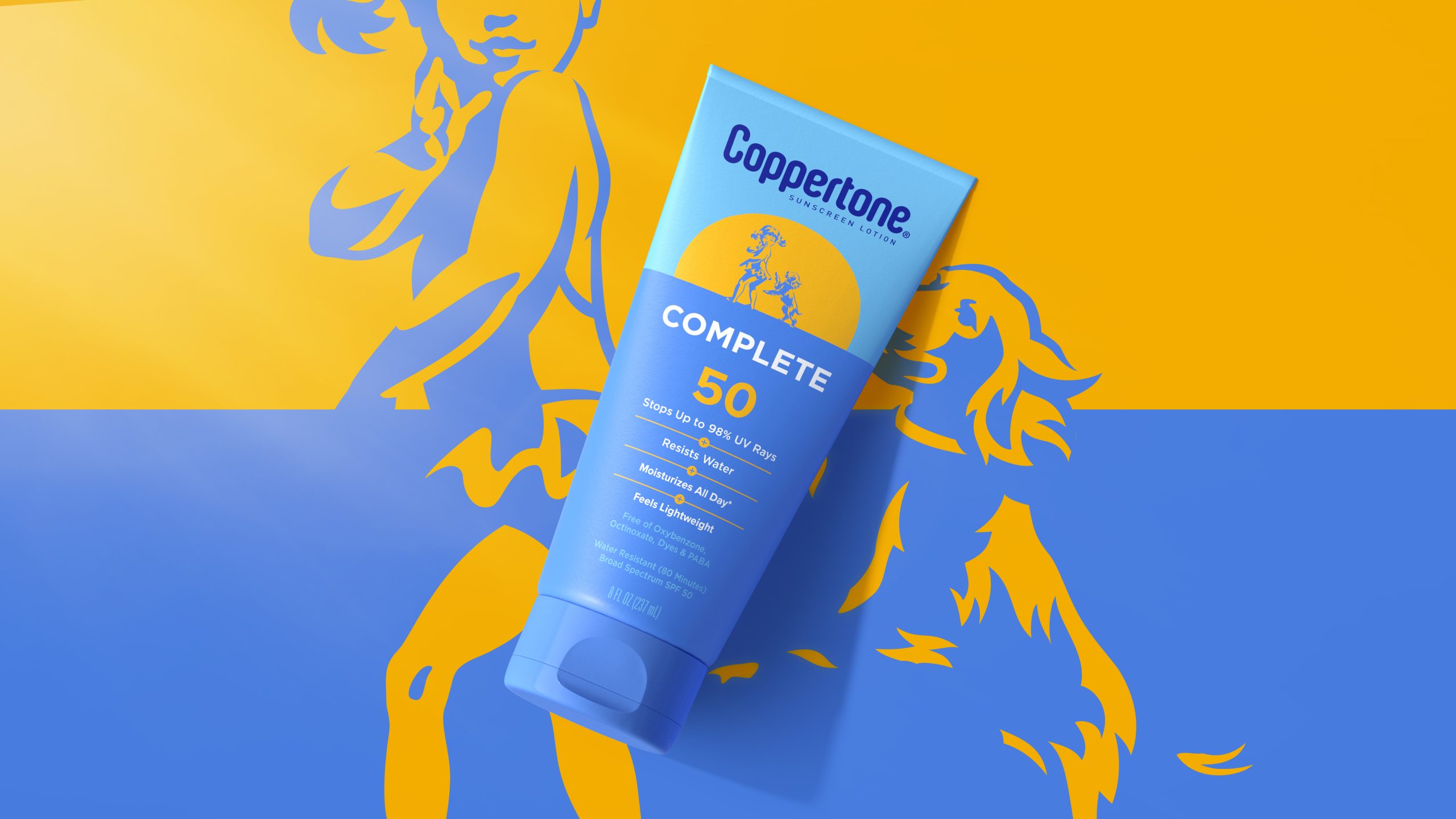


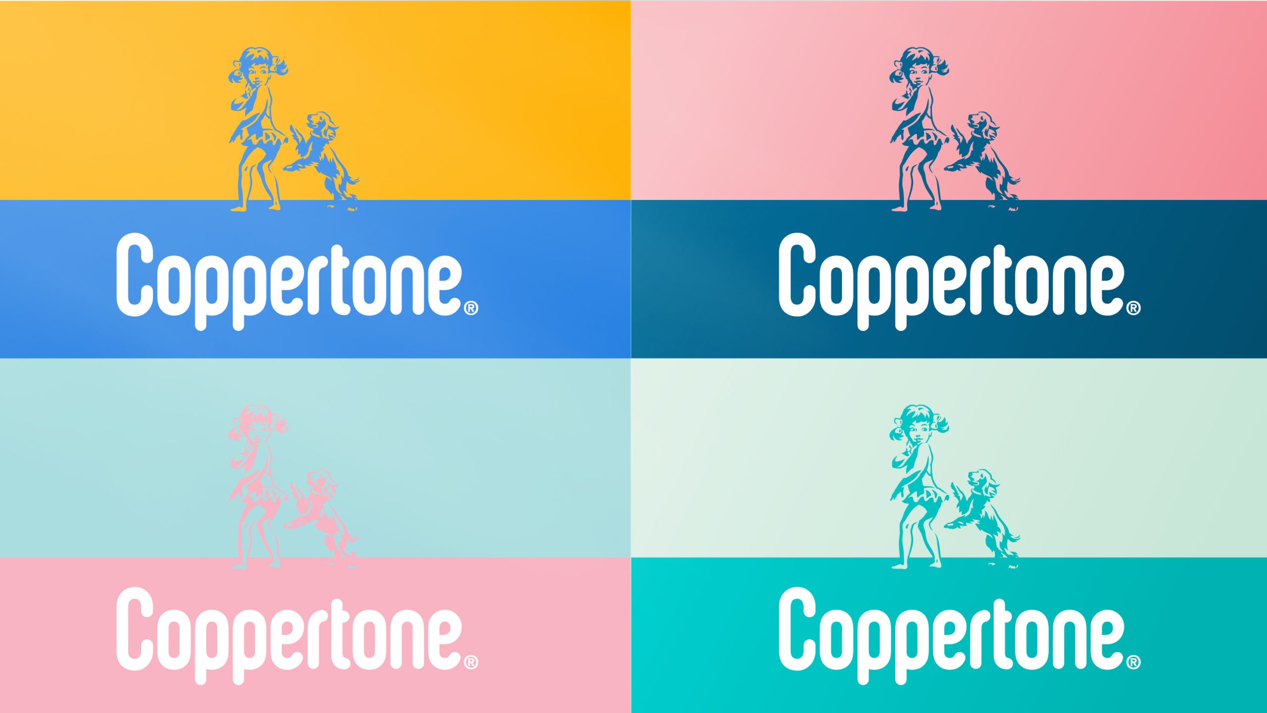
He continued, “Our design solution unites each product quite literally under the sun, utilizing the horizon line to represent the Coppertone brand, whilst using a unique set of design principles to bring to life each individual product. This is combined with a refined type for the brand mark and bold, varied colors to bring to life each individual product across the portfolio.”
Jean Fiufido, Coppertone Global Brand Director, said, “This is a brilliant design system that makes each of our products stand out on shelf but also unifies the portfolio. We now have a strong, modern icon that takes inspiration from our past. It’s warm and welcoming and encourages people to get out into the sunshine and have fun knowing that we’ve – literally – got them covered.”


The new-look Coppertone portfolio is now live. Visit www.coppertone.com/ to find out more.
Source: Pearlfisher
Seize your sun: Pearlfisher creates a bright new brand design and future for Coppertone added by newsroom on
View all posts by newsroom →
You must be logged in to post a comment Login