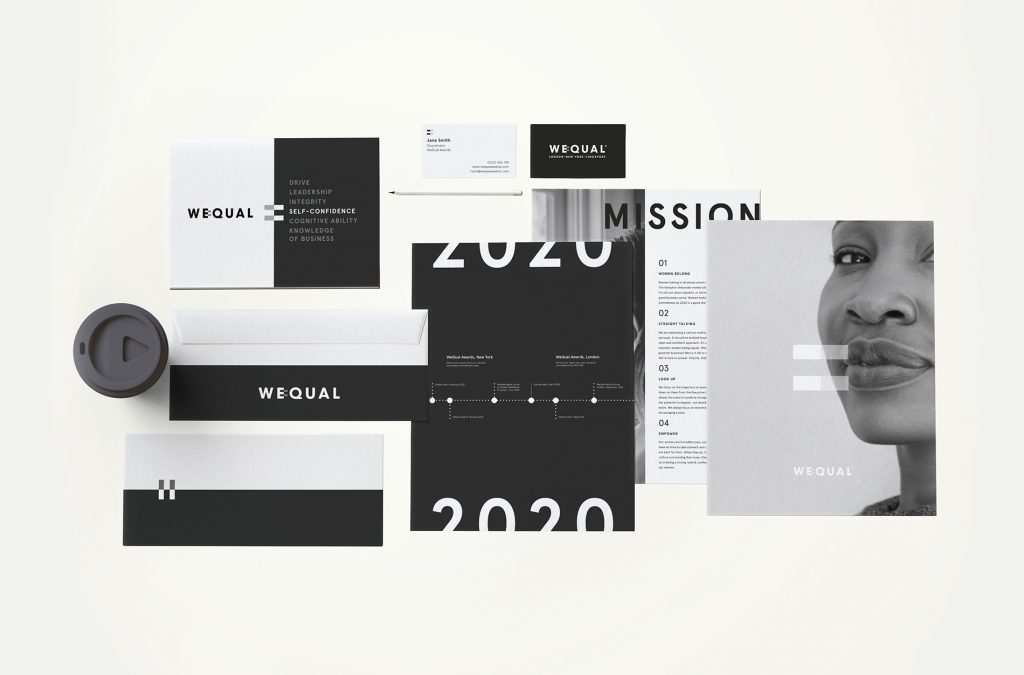
WeQual launches with a mission to open the doors of FTSE 350 executive committees to women, with straight-talking brand identity and event collateral by London design studio ShopTalk.
Recent research by The Hampton-Alexander Review has highlighted that there is still a considerable gender imbalance in the higher echelons. WeQual has been set up to empower women to stride confidently into more senior positions, challenge the male-dominated culture of these executive committees and, ultimately, improve business for everyone.
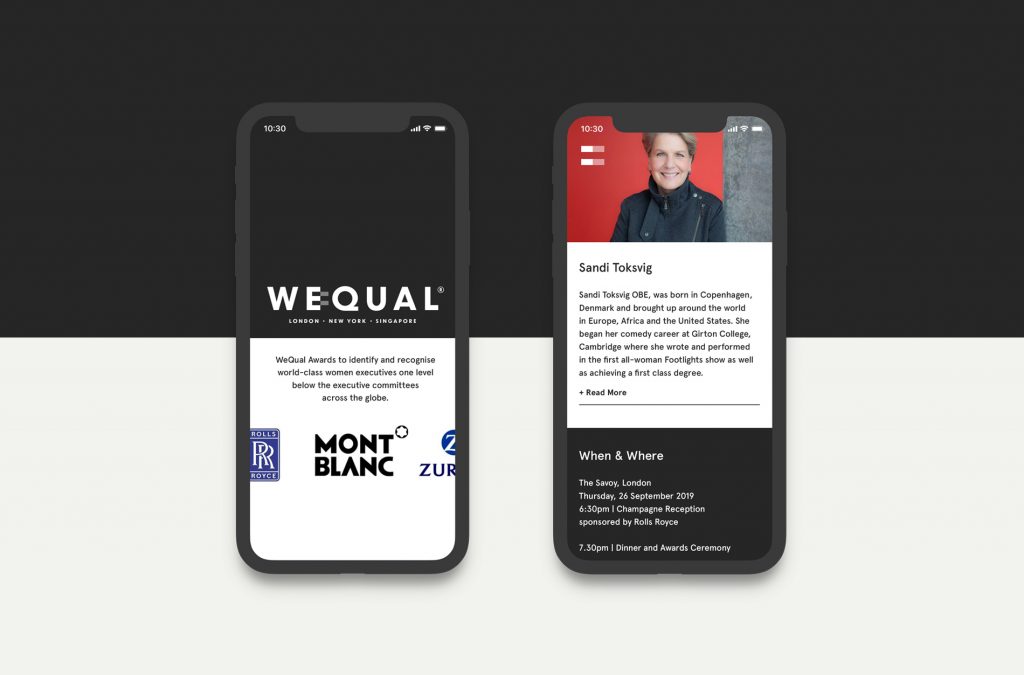
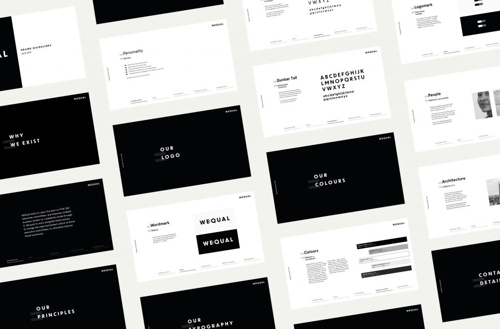
Former Executive Director of the Financial Times and WeQual founder, Katie Litchfield, saw an opportunity to promote women in business, and approached ShopTalk with a formative idea for an awards programme. The team were asked to develop the brand guidelines, name, logo, website and event materials; and of paramount importance was attracting sponsors from across the City to support the venture from the outset.
Following an immersion session, brand pillars were decided upon in order to curate a cohesive ethos: WeQual is a positive, straight-talking forum with its eyes fixed on the future and a mission to empower women to exist in all the places where big business decisions are made.
ShopTalk’s approach shows how, with strong brand principles and a directional identity, the message of inclusivity can be married with impressive business credentials, giving the venture a sense of authority and purpose that appeals across the board.
Achieving balance
James Wood, Co-founder and Creative Director, ShopTalk, says: “WeQual is all about celebrating and recognising successful women on the cusp of executive-board status, and assisting them in
moving up the ranks. As such, the tone needed to be frank, forthright and bold, without being preachy or overly focused on imbalance. The message is clear: what WeQual seeks to achieve will benefit women, men and business, and there’s plenty of evidence to support this.
“But we had to tread a careful path. We wanted to bring traditional institutions and their largely male workforces on board because their support is vital. So the look and feel had to be approachable and non-confrontational if WeQual were to appeal to the businesses that fall short on gender balance, too. It’s all about positive outcomes for everyone.”
All the branding, website and
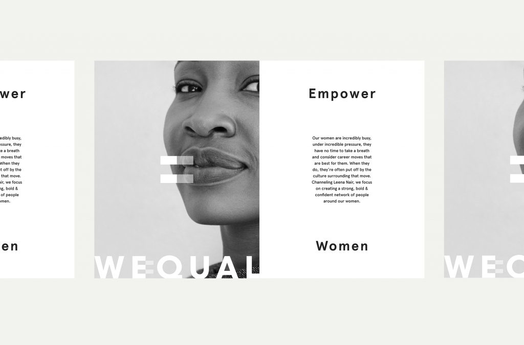
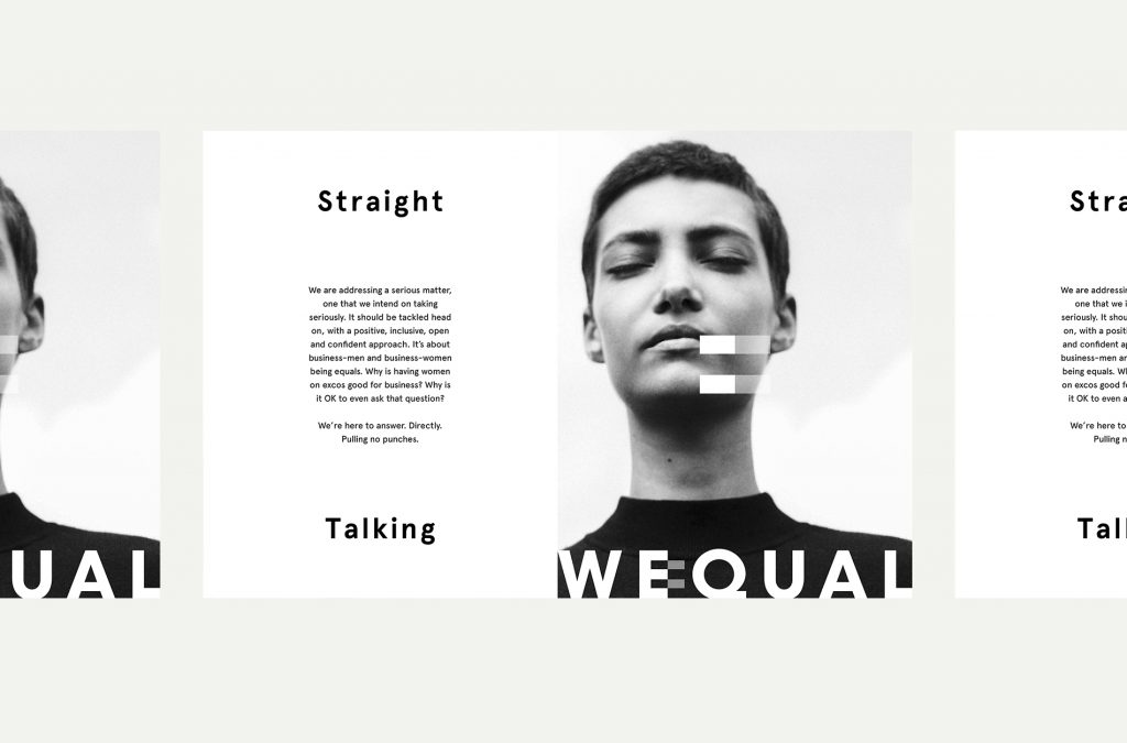
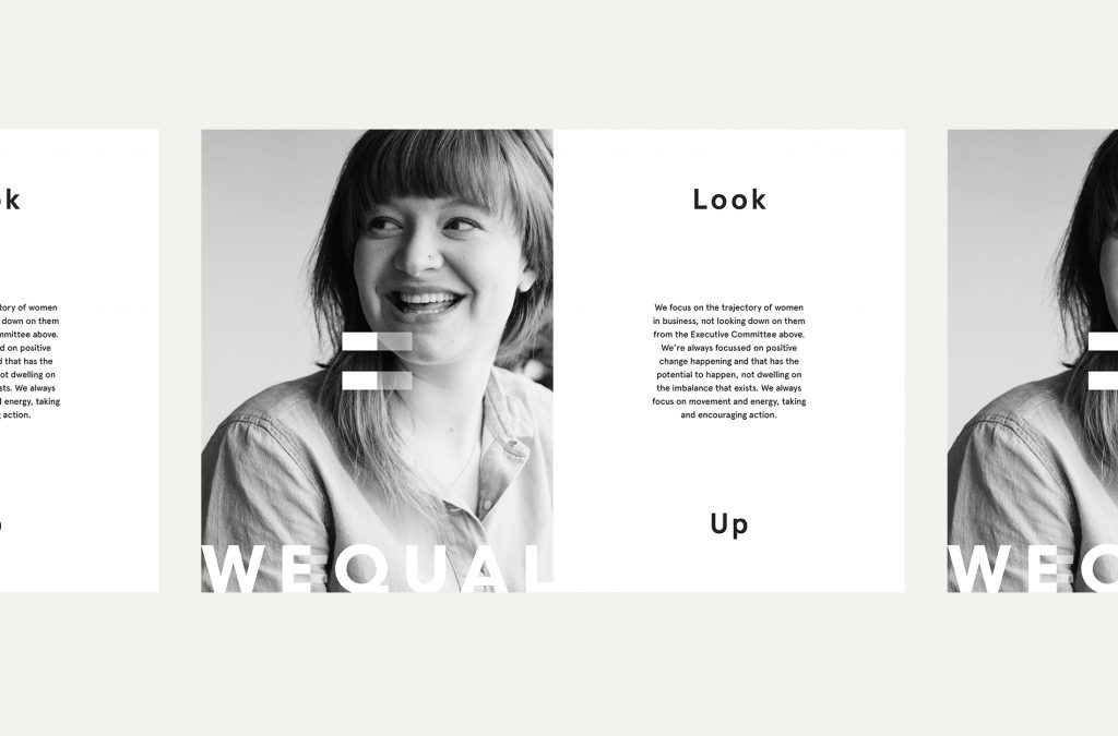
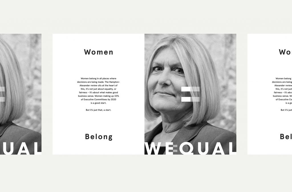
event collateral has been delivered in a striking monotone palette to drive
home that this is a black and white issue – business and society will benefit
from having more women at executive level. The two-tone approach also
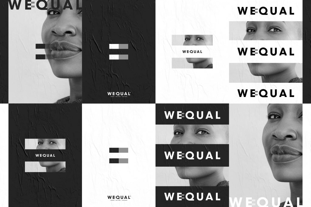
represents the straight-talking, 50-50 philosophy.
Breaking the mould
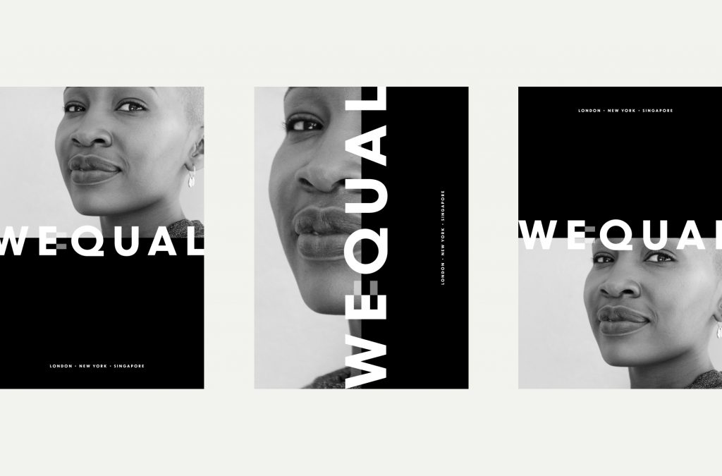
WeQual is an abbreviated portmanteau of Women Equal Business. The logo incorporates an equal sign that can also be used in isolation across event materials, both print and digital, to drive home brand messaging at all touchpoints. And customised sans fonts – not usually associated with the traditional, serif-loving City – give it a modern, direct feel.
Katie Litchfield says: “I approached ShopTalk with an idea for an awards programme that would make a real difference. From scratch, they have created the tenets on which the whole organisation hangs and totally nailed the messaging and spirit. We now have a strong brand that gives us total credibility as women who mean business. “The team at ShopTalk showed agility and responsiveness. They understood my ambition from the outset and worked with us from the ground up to make it happen. We’re on the verge of signing New York City and Singapore as event hosts – the strong reception we’ve received to the brand in London gives us every confidence that we can take WeQual to the world.”
Source: ShopTalk


You must be logged in to post a comment Login