Gone are the days of slapping on a bit of vitamin E cream and hoping for the best. The skincare industry has gone tech, and more and more people are demanding DIY dermatologist-grade treatments at home. With smooth-skinned Insta-beauties gracing every screen these days, there’s a vast amount of interest in advanced treatments for those who love the benefits but not the hefty price tag or the needles. Beauty-conscious customers across the spectrum are investing time and money in self-care like never before, relying on regular at-home skin routines to keep themselves feeling better about themselves.
People are always looking to upgrade their routine, and that’s where Vice Reversa comes in. They have created medical-grade home-treatment patches with a superior, patented, pain-free crystallised serum needle design. Delivering active ingredients right under the skin, eliminating the need for expensive and painful clinic-based care.
Vice Reversa appointed Taxi Studio to develop a new brand expression and disrupt this busy marketplace. Their current look simply wasn’t working hard enough to firmly position them as the premiere microneedle brand out there. It needed to better educate customers on the products and their selling points while leaving plenty of room for the range to grow.
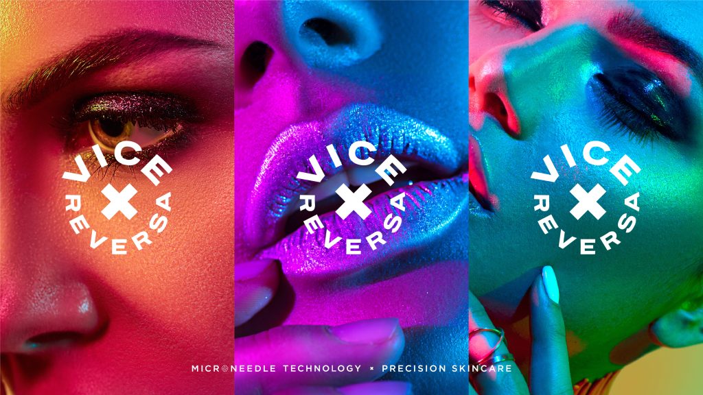
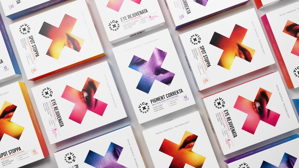
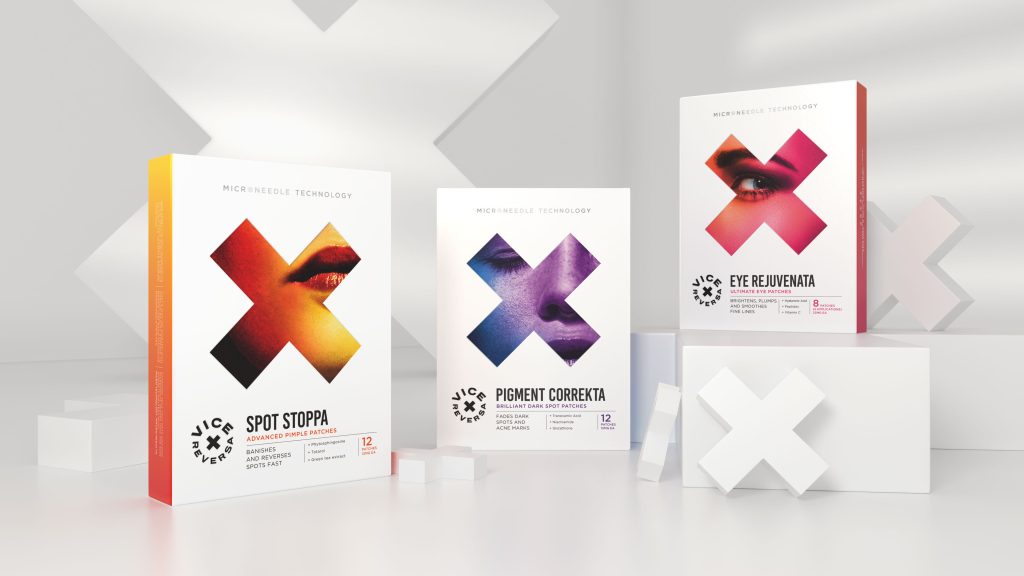
Taxi Studio evolved and enhanced the existing Vice Reversa brand mark, building in a brand mnemonic that symbolises the way the brand targets problem areas of the skin. X marks the spot. Literally.

“Our aim was to keep the design system hygienically clean with strong hits of vibrant colour that looks just as at home in the fashion industry as in the cosmetic,” says Karl Wills, Taxi Studio’s Creative Director. “Vice Reversa are true industry disruptors, and we wanted to translate their bold spirit into an equally bold brand expression, cementing Vice Reversa’s position as the highest quality microneedle skincare brand on the market”.


Source: Taxi Studio

You must be logged in to post a comment Login