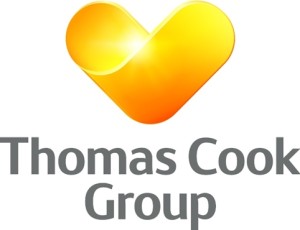
 Holiday company Thomas Cook is launching new ‘sunny heart’ branding, with new logos replacing the incumbent globe graphic.
Thomas Cook says that the new visual identity and branding looks to reflect the ‘warmth and approachability’, ‘trust and personalisation’ and ‘message of High Tech, High Touch’ of the brand.
The new look replaces the previous identity, which was designed by Futurebrand in 2001.
According to Thomas Cook Group, the sunny heart was originally designed last year by Swedish consultancy Happy for the company’s Northern European businesses, in a rebrand project that unified three Nordic brands under the Thomas Cook Group umbrella.
It was then ‘refined in-house’. Thomas Cook says, ‘We have not paid expensive consultants or spent lots of money on this brand unification, although we have used additional resources where necessary.’
 It adds, ‘We did the majority of this ourselves as we strive to develop the company into what we want it to be and what we want to be known for. This has been a hugely collaborative effort across the Group reflecting the positioning required in each part of the business as we drive our strategy forward.’
A new strapline, ‘Let’s go!’ is also being introduced, replacing the ‘Don’t Just Book it. Thomas Cook it’ message.
The new logo will be used across all platforms including online, international stores, the airline fleet and throughout its headquarters and overseas offices.
Harriet Green, group chief executive of Thomas Cook Group plc, says, ‘This isn’t just a rollout of a new logo, it’s about a promise. What we’re announcing today is a renewed promise to our customers, our people and suppliers. A promise that we’re putting them at the heart of our transformation it’s the essence of who we are.’
Brands under the Thomas Cook Group include Neckermann in Europe, Ving in Sweden, Condor in Germany and Airtours in the UK. The Group says that ‘in most cases, [the brands will] carry the heart as some part of their logo’.

You must be logged in to post a comment Login