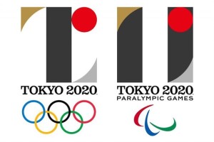
 The organisers of the Tokyo 2020 Olympic Games have dropped the official logo for the event after a number of allegations of plagiarism against the designer, Kenjiro Sano, according to reports.
The BBC and the Associated Press news agency have quoted Toshio Muto, the director-general of the Tokyo organising committee, as saying at a news conference: “We have reached a conclusion that it would only be appropriate for us to drop the logo and develop a new emblem. At this point, we have decided that the logo cannot gain public support.”
Sano’s logos for the Olympic and Paralympic Games were unveiled on 24 July and were described by the committee as symbolising “the power of coming together as one”.
The committee said at the time: “The black colour of the central column represents diversity, the combination of all colours. The shape of the circle represents an inclusive world in which everyone accepts each other. The red of the circle represents the power of every beating heart.”
The Olympic emblem was inspired by the T in Tokyo, tomorrow and team, while the Paralympic emblem was inspired by =, the universal sign of equality.
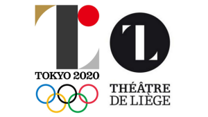
 However, trouble started brewing when a Belgian designer took legal action claiming the logo was similar to one he had designed for a theatre in Belgium.
The committee defended Sano and stood by the logo as recently as August 28.
However, Sano was accused of sourcing a photo from someone else’s website without permission in order to show a mock-up of his Olympic logo on banners hanging from the ceiling of a Tokyo airport lobby.
According to AP, Sano has also previously acknowledged that eight of the 30 designs for a brewery’s promotional tote bags included copies of others’ works, which he blamed on his assistants.

You must be logged in to post a comment Login