 me&dave, in collaboration with real estate developer Delancey, has brought London institution Royal Mint Court back to life with a refreshing and unique branding strategy.
Since Barclays’ departure in 2000, the historic British site had been left dormant, so integrated branding agency me&dave was recruited to turn its fortunes around.
me&dave was tasked with creating a brand that would respect the heritage – there are listed buildings and it’s opposite the Tower of London – and ‘shout out’ about its forward-looking potential.
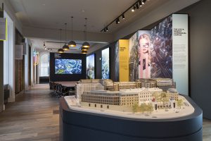 London is famous for its old-world architecture and history, but it’s also an international powerhouse that never lets the past hold it back. me&dave reflected that energy with a ‘pop’ colour palette and strong, disruptive imagery to shift perceptions and revitalise the iconic development.
With an impressive 600,000sq ft footprint, the brief was to breathe new life into the site and appeal to as wide an audience as possible.
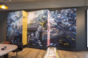 Situated just outside the capital’s main business hub, the location was not without its challenges. me&dave, however, turned that into an opportunity, appealing to innovators, not followers, people prepared to look beyond the Square Mile and break boundaries.
Creative director Mark Davis says: “The obvious strategy would have been to play up the past, but we believed the brand had to be almost at odds with history to reflect Royal Mint Court’s unique old-meets-new juxtaposition. And because it’s on the City fringes, we knew we were appealing to those who were prepared to break City codes.”
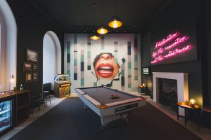
 An on-site marketing suite transported potential occupiers through heavy, traditional wooden doors into an unexpected, brightly lit space, with glossy red lips dominating a wall, a juke box, pool table, drinks fridge and neon signs.
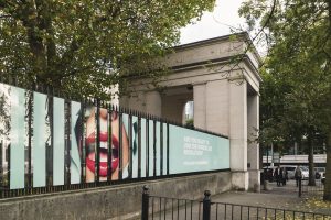
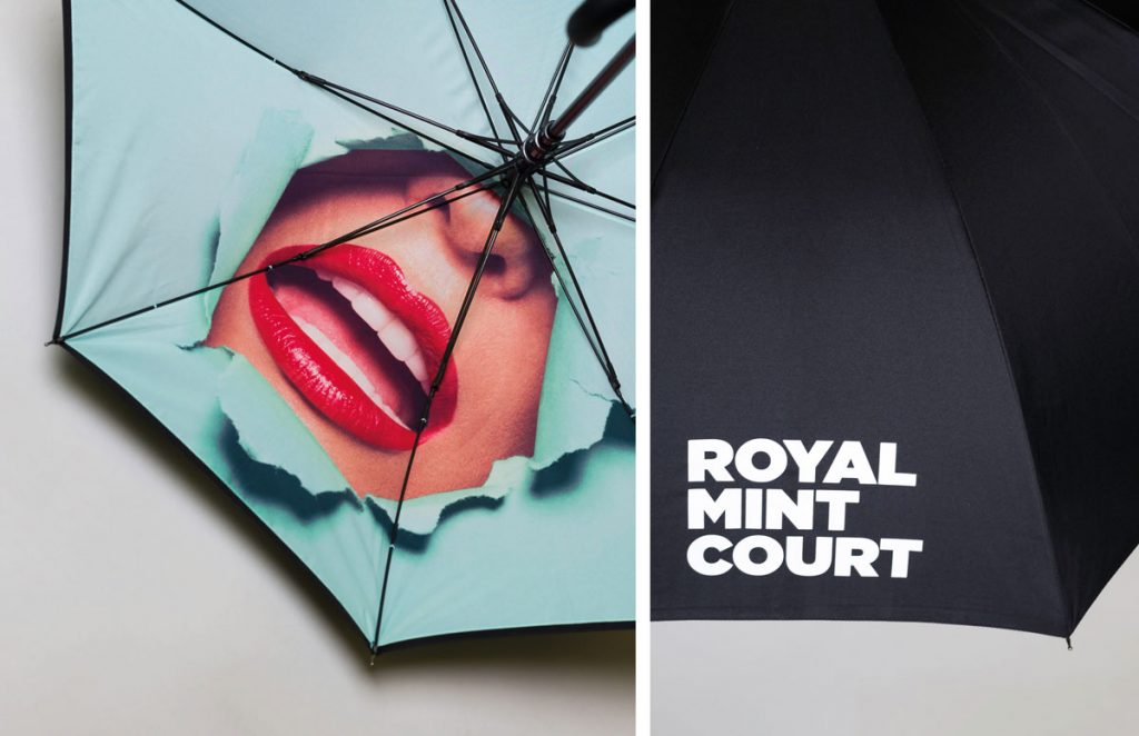
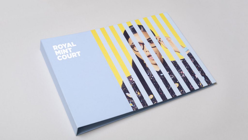
The lipsticked mouth made its way onto eye-catching hoardings, which have apertures so that people can peer into the historic site. Other marketing collateral consists of a website, a teaser brochure and a beautifully presented A3 box with plans, details about the development and CGI imagery.
 Last but not least, me&dave produced a series of merchandise, including a jet-black umbrella. A classic City-gent accessory, except that when opened, that bright signature smile is looking right back at you. Perhaps the perfect metaphor for the whole campaign.
Katharine Walsh, marketing and communications director at Delancey, said: “me&dave understood that this was all about bringing the old and the new together in a sensitive but exciting way. The creative team’s innovative strategy really demonstrated that historic Royal Mint Court has a fresh and significant role to play in modern London life.”
Source: me&dave

You must be logged in to post a comment Login