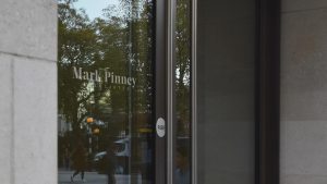
 Mark Pinney Associates is a bespoke design and architecture practice based in London that specialises in high-end luxury. They have designed aspects of many Apple stores, most of the premium retail stores on Bond street, several top Mayfair restaurants, luxury hotels in New York and a long list of expensive private residences around the world.
Over the last 20 years they’ve worked with some of the world’s highest profile brands but still have a very low profile in the world of architecture. To fix this Mark approached design house, BTL Brands, and gave them the challenge of helping him reinvent his brand and grow his business.
 The first thing BTL needed to address was the name of the business. Mark had made the decision a long time ago to remove his name and call the company MPA (Mark Pinney Associates), in the belief that all of the associates within the business would be given equal status.
However, the number of associates has reduced and most of his clients refer to the practice as Mark Pinney Associates (or Architects). The new brand name simplified matters by putting Mark’s name back above the door.
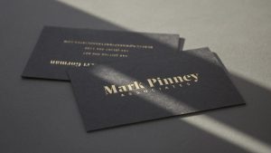
That was the easy bit, getting Mark to sign up to a decorative font for the new visual identity (a stylised font that wasn’t a cut of Arial, Univers, Helvetica or any of the other usual suspects from the architects sans serif font lists) was not so easy. Avaunt Stencil Semi-Bold is a bespoke typeface hand cut by a small font foundry in east London, used by several style magazines (the type of magazines read by Mark’s clients).
 Building Lasting Relationships Between People and Places
The next step was to have a brand workshop with Mark and the team, to really get under the skin of MPA. Branding is a strategic and creative process that is not always recognised as a credible design discipline by all architects so BTL had to tread carefully.
“We had to win their trust on day one so we made sure that we did our homework. Our research told us that most architect practices tend to focus on their final output, talking more about awards for themselves and less about rewards for their clients. What makes Mark and the team different is their focus on the journey, not the destination. They really do care about building meaningful relationships with everyone connected to the project that will last longer than just the duration of the project,” revealed the design house on their website.
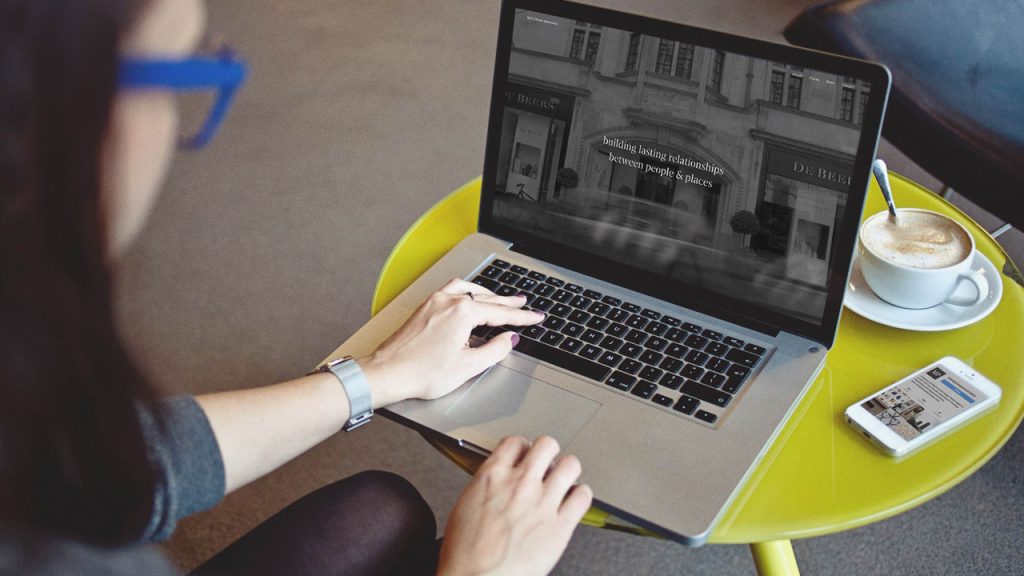
 Building long-lasting relationships between people (the clients, consultants, engineers, builders and the end-users of the buildings) and places (the buildings, locations and materials) was the obvious choice for the new brand message.
The MPA mobile-unfriendly website had been around for nearly 10 years and was not looking very premium or luxury. BTL’s research in the sector proved that the most successful architect practice websites are very visual with minimal text, focusing on the work and letting the design talk for itself.
The design agency created a new website, using a cost-effective Squarespace template, with a front-end that put the spotlight on their work with a back-end that was very easy for them to manage themselves moving forward. BTL didn’t have the time or budget to go back and re-shoot the projects so they retouched the existing library of case study images in a way that brought the new brand message to life.

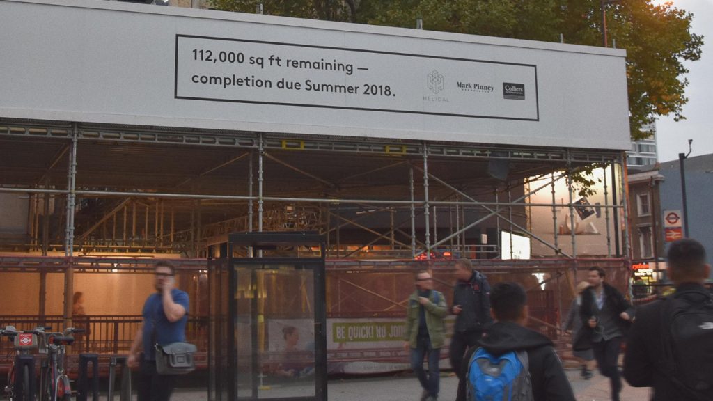
This was the first time that Mark and the team had a brand message to work with. BTL Brands created a marketing plan for them with easy to follow steps showing them how to bring the new message to life with tube ads, magazine ads and banner ads on relevant online design and architecture platforms like Dezeen. At the same time BTL helped them with a social media content and activation strategy, something very new to them which took a bit of getting used to.
The new brand identity is easy to use and the agency helped the team apply it to everything from premium foiled business cards all the way through to the new studio in Greenwich, London.
Source: BTL Brands

You must be logged in to post a comment Login