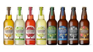
 When Buddy Creative paid a visit to Cornish Orchards for the first time in 2011, they met the real deal: a truly artisan, farm-based cider-producer still operating at a smallish scale, supplying shops and destinations in the West Country.
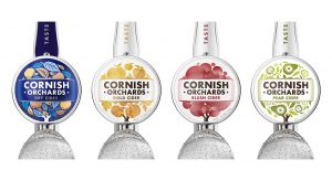
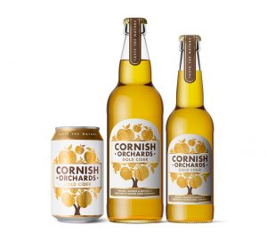
Their branding system for the company brought consistency and uniformity across the range and changed their world. Distribution and demand took off and the company was soon acquired by Fuller’s. Still the real deal and still based at their farm in Duloe, near Liskeard, Cornish Orchards wanted to take things to the next stage and strengthen their position in the premium cider market and fend off competition from new craft cider brands. They came to the design to increase the stand-out of their brand and of individual sub-brands like Gold, Blush and Dry, both at the bar and on the bottle.
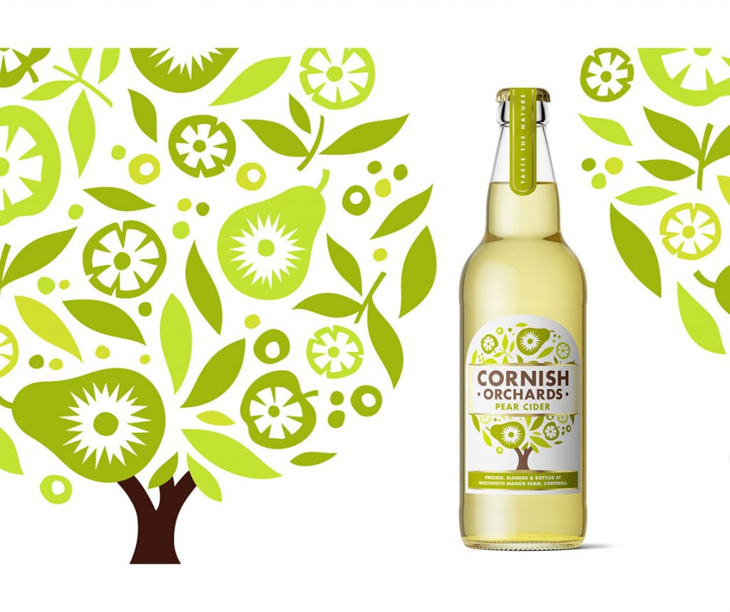
 “We consolidated all of the good things from the original system into a much stronger, more unified identity, giving the artisan, small-scale feel more visual muscle. Central to this is a more integrated lock-up of brand and sub-brand, achieved by developing the tree illustrations that signify each product and moving the Cornish Orchards banner to span the branches of each one. There’s now more tree, more fruit and more Cornish Orchards on each label and lens,” said Buddy on their website.
“To round things off, we also introduced a new, darker palette to label the connoisseur ciders in the range, Dry, Heritage and Vintage. An evolution, not a revolution. But enough to upset a few apple carts, we hope.”

Source: Buddy Creative

You must be logged in to post a comment Login