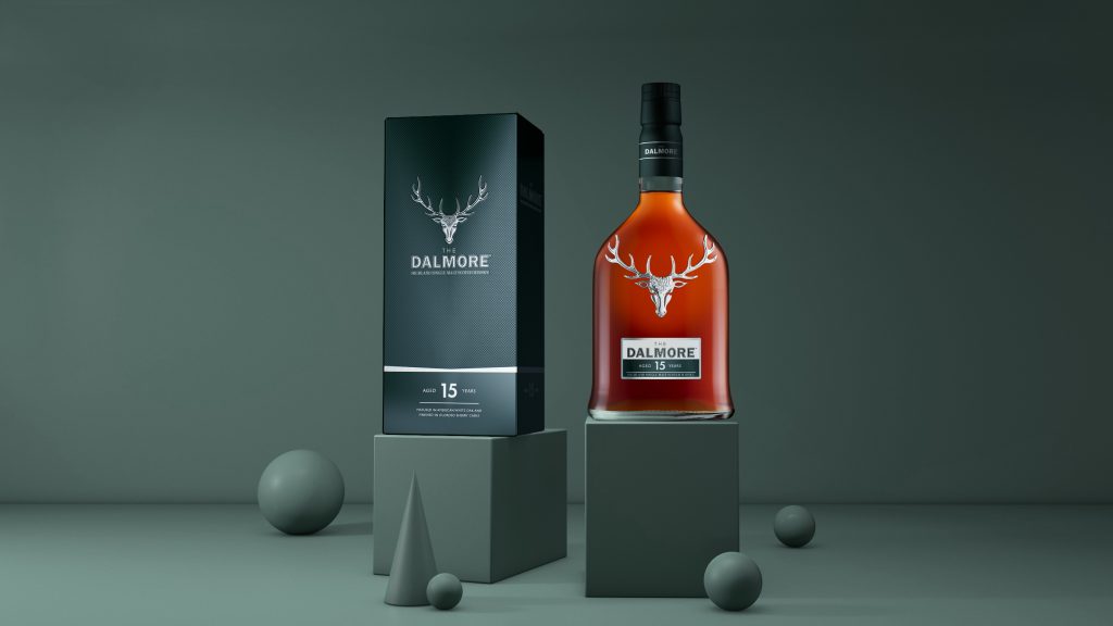
Since its establishment in 1839, The Dalmore has been a voice of authority when it comes to single malt Scotch whisky. In recent years, with its iconic stag proudly leading the single malt scotch stampede, the brand has experienced exponential growth, with its liquids achieving great acclaim. Whilst the current packaging had worked well to date, the Dalmore team wanted to build on the success of its core Principal Collection and inject modern luxury cues in order to set it up for the next phase of its growth.

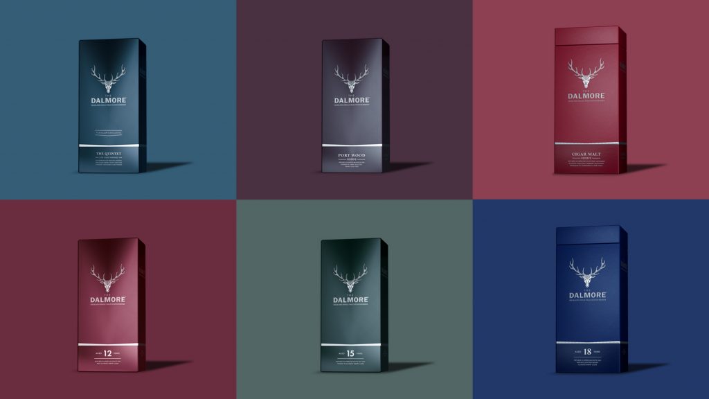
The six individual expressions within the Principal Collection – The Dalmore 12 years old, Port Wood, 15 years old, Cigar Malt, 18 Years old and King Alexander III – are different expressions of the definitive house style. We recognised it was important to capture these subtle distinctions, whilst establishing a consistency and confidence across the range that better reflected the brand’s high-end positioning. Our approach was to take contemporary design cues from outside of the Single Malt category, to interpret the luxurious depth and finesse of the products in an elevated and distinctive way.

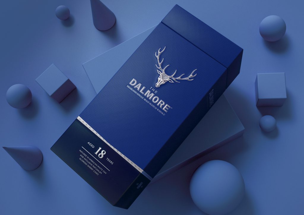
Leading the (re)charge on the outer box was the Royal Stag. A symbol of noble origins, globally recognised, and a key brand asset, it deserved to be heroed. The stag is now proudly positioned high on the pack above the wordmark. With rich sculpturally embossed detailing, it has an emboldened presence and standout which is hard to ignore. The sharp lines of the silver band in the lower half of the box echo the shape the stag; framing it and delineating the space for brand & product information. The matte texture of the box and micro-embossed motif within the satin silver band, bring a contemporary tactility to the packaging.
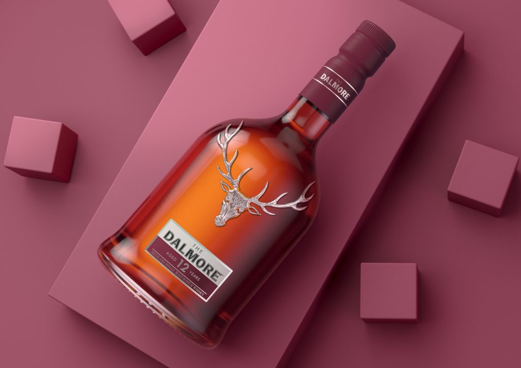
As with the liquids themselves, the difference is in the detailing. Across the range, the original colours have been subtly enhanced through the use of micro-embossed texture and satin finishes, reinvigorating a traditional palette with a modern kick. Whilst on the label, age statements have been subtly emphasised and elevated through the use of bespoke fonts.

The outcome is recognisably The Dalmore but with added depth and detail, resulting in elevating the pack designs from the boot room to the drawing room!
“Butterfly Cannon’s sensitive redesign of our Principal Collection has given our Royal Stag the prominent showcase it deserves – whilst capitalising on Dalmore’s signature impactful minimalism. We’re confident it will help position our exceptional single malt at the top of the category.” – Sébastien Gratiot – Global Senior Brand Manager, The Dalmore
Source: Butterfly Cannon & FAB News

You must be logged in to post a comment Login