Electric Automotive Technology company Protean Electric has unveiled a new brand identity designed by London-based studio Carter Wong.
 Protean approached Carter Wong in 2017 to provide structure and clarity to their identity through a comprehensive rebrand project. The previous visual identity was a little tired and had struggled to differentiate between company and product branding both internally and externally.
Delivering Clarity and Structure
 Carter Wong addressed this issue by introducing a new structure for the brand. The overarching identity for Protean has been refreshed with an instantly-recognisable brand mark showing the letter ‘P’ incorporating a lightning bolt in negative space, to help enhance the electric nature of the business.
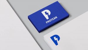
Designed to be flexible across multiple touchpoints, this logo can be used on its own or supported by the brand name Protean and strapline ‘Electric Automotive Technology’ where appropriate.
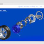
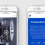
 Protean’s first product – an in-wheel electric motor with integrated digital drive – operates under a separate brand identity, named ProteanDrive, with the core brand logo incorporated into the wordmark. Individual models within ProteanDrive also adopt the ‘P’ logo as part of their identity.
Driving Sustainable Technology
With a target market that straddles both the tech and auto industries, Protean’s new brand identity needed to be flexible enough to appeal to these diverse audiences. Carter Wong encouraged Protean to place its sector-leading technology at the forefront of its brand identity, moving towards a forward-thinking automotive technology company, with inbuilt flexibility to grow and diversify in the future.
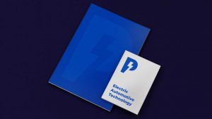 Stepping away from the previously-adopted green tones designed to demonstrate the brand’s eco-credentials, Carter Wong introduced a vibrant blue hue to reflect the electricity at the heart of the brand offer. This vivid tone is the primary colour used across all Protean touchpoints, from the website to social media.
Iconography with Hidden Meaning
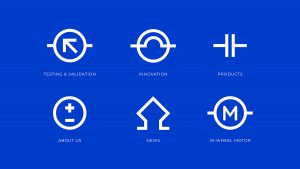
 Iconography taken from a circuit board has been introduced across the brand identity, with secondary meanings behind each visual. For example, a battery symbol shown on the ‘About Us’ page represents the people who power the brand.
Carter Wong selected Google font Montserrat as the brand typeface for its bold, confident aesthetic and flexibility to work across all digital formats. Montserrat is often used across both the tech and auto industries, so feels familiar to consumers in both markets.
A Brand Brought to Life
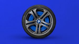
Sarah Turner, Managing Director, Carter Wong said: “After ten years in R&D, Protean’s remarkable product is at the forefront of the Automotive Technology sector, delivering an eco-friendly alternative with great potential. We have strong experience in both the technology and automotive sectors and therefore were able to craft a brand that fits seamlessly into both markets. Protean’s new identity is immediately identifiable with its vibrant blue hue and timeless, memorable logo. The single ‘P’ is strong enough to stand alone and as such, has now been incorporated into the centre of every vehicle which carries Protean technology.”
 Matt Stevens of Protean Electric, said: “Carter Wong’s vision for Protean has given us structure and clarity that was missing from our previous identity, and developed a base upon which we can build and diversify as the brand continues to grow. From brand language to an engaging series of videos, the new identity is clean and strong, allowing us to convey the value of our technology to the majority. Our memorable logo will endure the evolving landscape of this fast-paced sector and reflects our position as world leaders of in-wheel motor technology.”
Source: Carter Wong


You must be logged in to post a comment Login