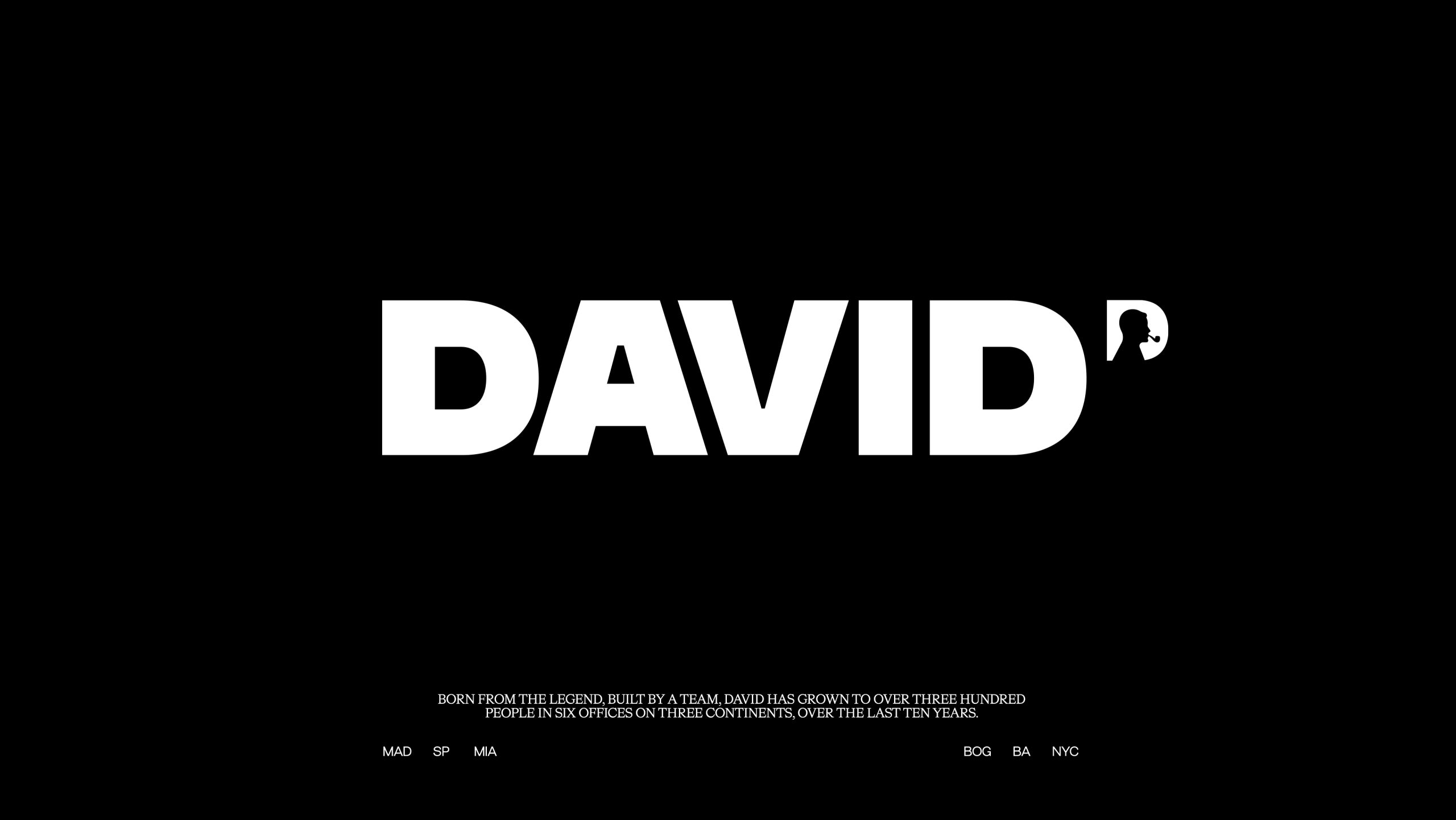
Four hundred people, almost thirty different nationalities. That’s the melting pot that makes DAVID a diverse and special place to be. To celebrate its 10th anniversary, the global agency network introduces a new visual identity with a bolder logo that continues to pay tribute to David Ogilvy, but also celebrates the people who make the agency one of the world’s most creative companies.
“This new moment celebrates all we have built over the last decade: our clients, the great ideas that have poured out of us and our culture. The agency remains inspired by David Ogilvy and his legacy. Now, we also want to honor the talents behind this great company,” says Fernando Musa, Founder, Partner and Chairman.
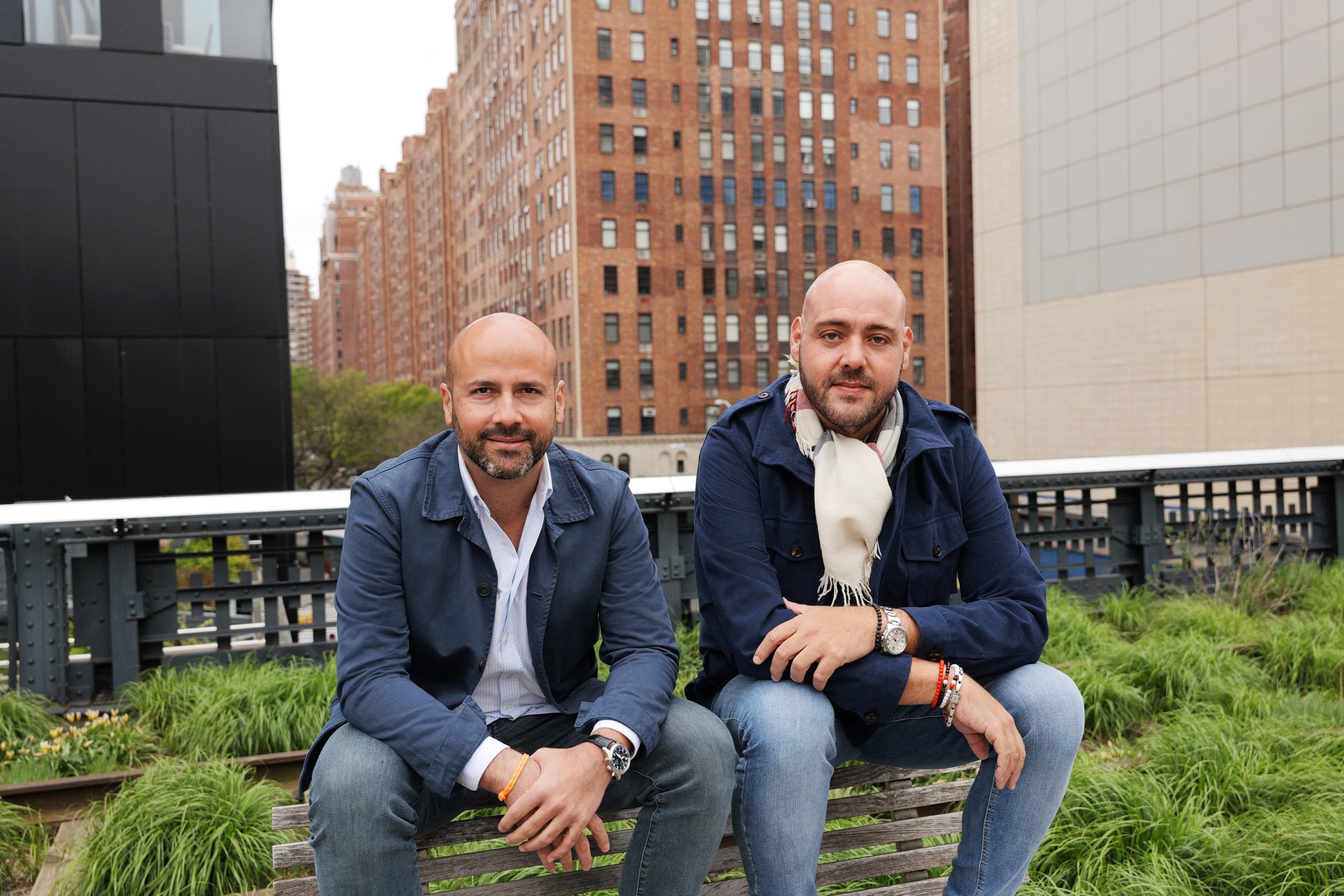
For DAVID’s partner and Global CCO, Pancho Cassis, honoring great ideas and great people “is not only a reflection of who we are, but a trait of our intimate culture. DAVID is about good people, that are also very talented. In that order. It’s really #OneTeam. And this redesign commemorates the past, whilst celebrating the future of an incredible group that is so diverse and so rich.”
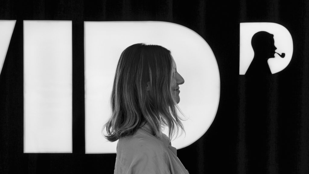
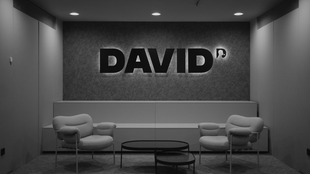
Designed by the DAVID Madrid team, led by CCO Saulo Rocha, the refreshed identity serves as a custom tool so that each team member can use their own profile as the logo. After 10 months of work and hundreds of pictures, the agency will start using this new ID system as of today.
“Doing the redesign ourselves is part of the beauty of this project. It would’ve been so much easier to hire a great designer, really. But letting our creatives come up with the big idea and bring it to life is an essential part of this new chapter” says Saulo Rocha, CCO at DAVID Madrid.
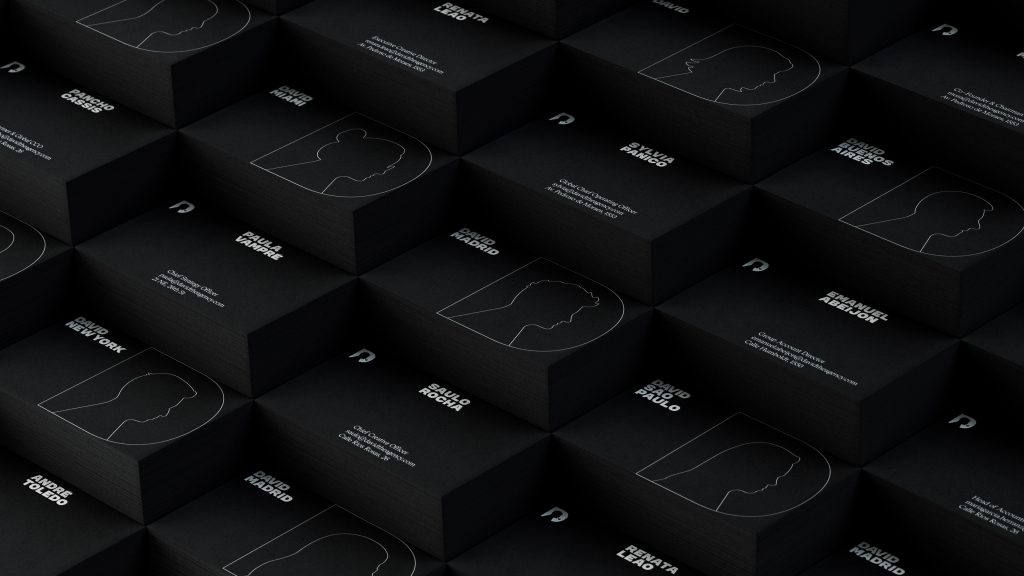
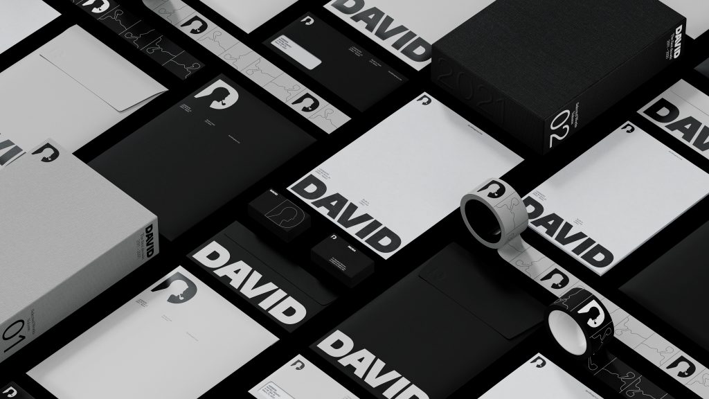
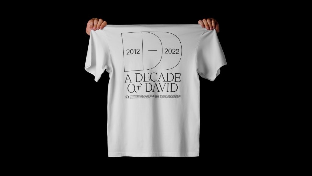
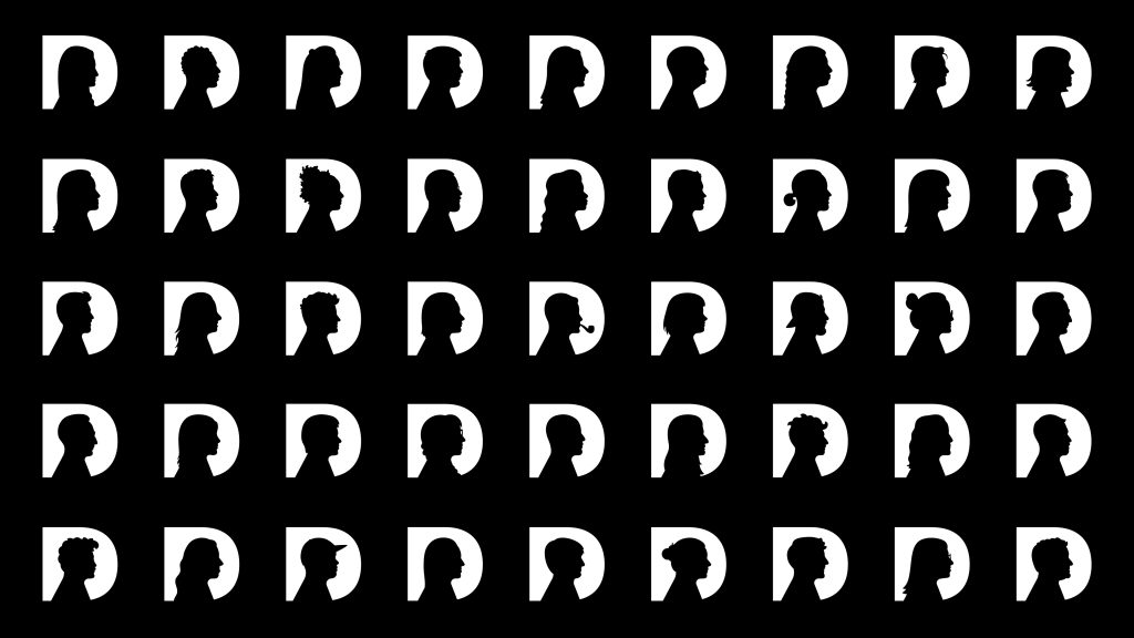
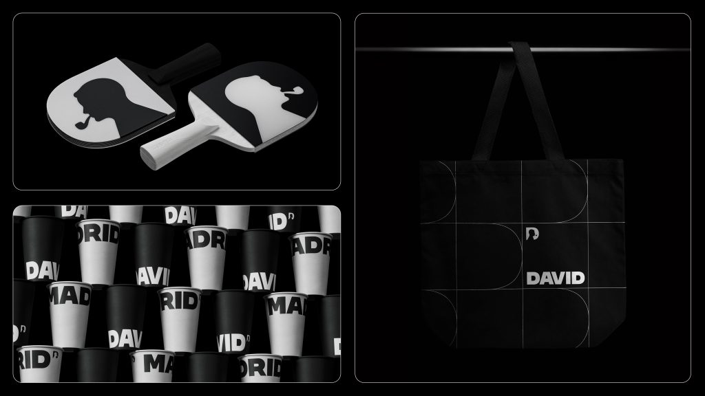
The new visual identity brings the letter D in the primary font type (DAVID Headline), with the figure of David Ogilvy at the center. The secondary typography has been replaced with HW Cigars. This new visual identity will be on everything from email signatures to reconstructed office layouts, as DAVID welcomes a hybrid work model.
To illustrate the new DAVID design, the agency produced a video of the best moments from the last 10 years. It features iconic campaigns including Manboobs (Macma/DAVID Buenos Aires), Google Home of the Whopper and Moldy Whopper (BK/DAVID Miami), This Coke is a Fanta (Coke/DAVID São Paulo), The Wind Never Felt Better (Budweiser/DAVID Miami), Try Not to Hear This (Coke/DAVID Miami), Stevenage Challenge (BK/DAVID Madrid), and several others that earned the agency’s 193 Lions (2 Titanium, 9 Grand Prix, 46 Gold, 51 Silver, 85 Bronze) — a historic honor from the industry’s most coveted award show.
The launch video also recalls the agency’s relationship with the Super Bowl, for which it created 9 commercials over 6 years. These achievements have made 10 years of headlines, new business partnerships and a global expansion beginning with offices in São Paulo and Buenos Aires (2012), to Miami (2014), Madrid (2019), Bogotá (2021), and, most recently, New York City (2022).
“We are so happy to announce this new chapter of DAVID, representing not only our brilliant history, but also every single person in the agency today. After all, we are Irene, Fred, Will… we are all DAVID. And with our united strength, we look forward to the next 10 years of challenges,” says Saulo.
Source: DAVID Madrid

You must be logged in to post a comment Login