DesignStudio has partnered with parent company Zepz to create a new brand identity for its global remittance brand, Sendwave, that reflects Sendwave’s mission and supports the company in its next phase of growth.
Founded in 2014, Sendwave is a digital platform offering money transfers from countries in North America and Europe to those in Africa, Asia and the Americas. Primarily used by migrants, they aim to make sending money as easy as sending a text message. Sendwave is one of two global payments brands powered by Zepz, along with WorldRemit, making global digital payments fairer, faster, and more flexible.
To better position the brand for its next stage of growth they enlisted DesignStudio to help create a fresh visual identity. It was important that Sendwave could better distinguish themselves in the market.
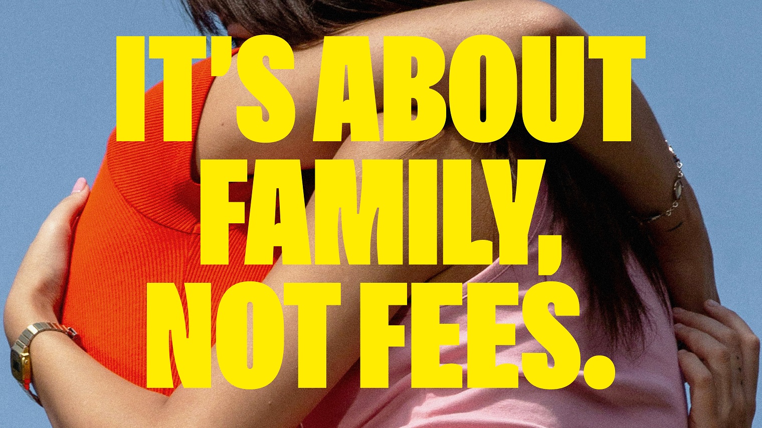
Lorenzo Di Cola, Design Director at DesignStudio said: “Our work is built around the creative idea ‘In Your Corner’, based on Sendwave’s vision that everyone deserves someone in their corner. No matter who you are or where you come from, Sendwave is by your side, honest, dependable and empathetic”.
At the centre of the system, a striking new wordmark evokes the boldness and purpose of the brand, adding a real sense of balance and authority. A new symbol meanwhile, with its symmetrical wave shapes combining to create a globe, elegantly references Sendwave’s ability to link communities across the world.
‘Sendwavy’, a custom typeface, was built in collaboration with Florian Karsten Type Foundry. Overflowing with personality and charm, the character’s distinctive ‘wavy’ curves tie them into the wider visual language of the brand. The typeface features custom glyphs that can change the direction of the wave to create playful typographic layouts.
Conveying the unique spirit of the brand, ‘Sendwaves’ act as the main graphic device. The wave language is uplifting and active, matching the energy the user brings to the sending process.
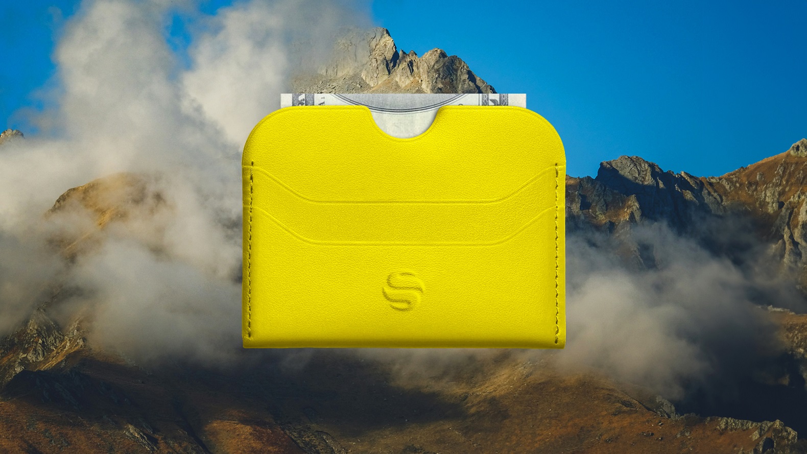
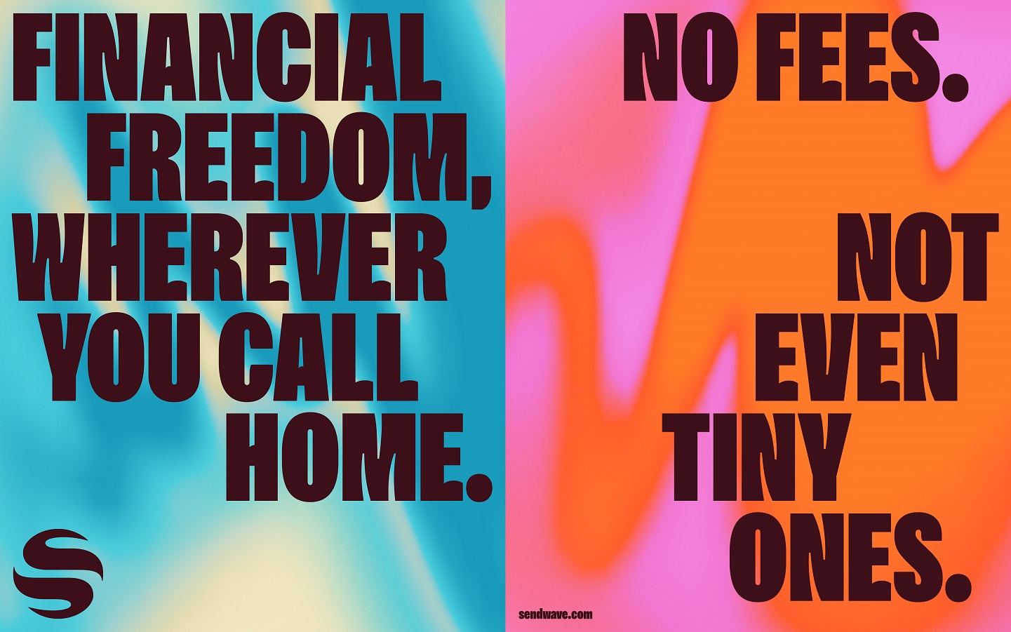
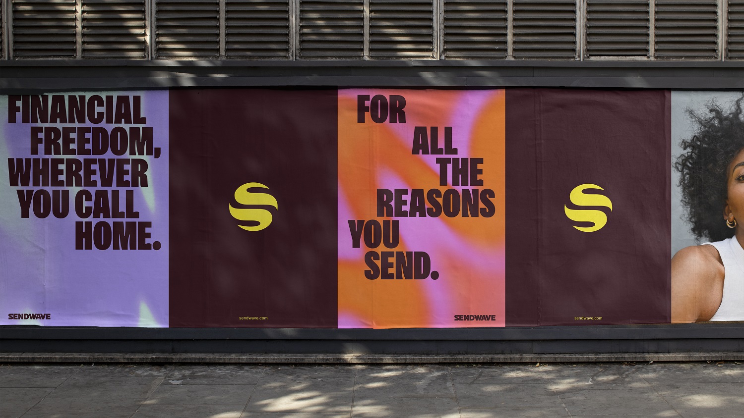
The brand palette is bursting with energy and momentum. The hero colour Sun is supported by a secondary palette of multiple tones that references the truly global nature of Sendwave and its community.
Fitting for a brand that people trust and rely on, we crafted a tone of voice that feels warm and relatable, but also confident and purposeful. This is perhaps best summed up in a new tagline, ‘For here. For there. For home.’
Rose Charlène Renaud, Creative Director at Sendwave said: “We’ve developed a brand that truly represents Sendwave. It deeply resonates with our community, intricately integrated into every aspect of the identity”.
The new Sendwave brand is now live.
Find out more:
Source: DesignStudio
DesignStudio rebrands international money transfer app Sendwave added by newsroom on
View all posts by newsroom →
You must be logged in to post a comment Login