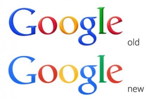
 Search engine giant Google is rolling out a new identity, which ditches the previous 3D-style elements of the logo.
The new, flat identity by Ars Technica, which also features a refined colour palette and updated letter shapes, is launching across most Google products over the next few weeks, according to Google tech lead manager Eddie Kessler.
It is already visible to some users on the Google UK homepage.
The update sees Google ditch the shadowing effect it used in its previous logo, which was brought in in 2010.
The moves comes shortly after Google’s search engine rival Yahoo went the other way, introducing a bevelled shadow effect in its new identity, which launched at the start of the month.
Yahoo’s new identity was designed over a weekend by a team led by company chief executive Marissa Mayer, who says, ‘For the texture, we came up with the nice idea of creating a chiselled triangular depth to the logo – this causes the letter Y to appear in the shading at the ends of each of the letters.’
As well as introducing its new logo, Google is also introducing a new ‘app launcher bar’ which allows users to quickly access Google products including Gmail and Google+.

You must be logged in to post a comment Login