“Amplifying the whispers of Mother Aruba”
A National Park Foundation (now the Aruba Conservation Foundation) is the conservation on Aruba, tasked with protecting over 24% of the island’s natural habitat. Branding agency, How&How, partnered with ACF to create a new brand capable of rallying local support for Aruba’s caves, wetlands, mangroves, dunes and the flora and fauna that inhabit these protected sites.
“The Aruba Conservation Foundation is Aruba’s for island-wide biodiversity and ecological resilience,” explains Cat How, Creative Director at How&How. “In addition to these responsibilities, ACF leads nature-based experiences such as guided hikes and corporate events as well as outdoor educational programs. Yet, in what came as a surprise to our team during our strategy workshop, ACF wasn’t seeking a new brand to increase foot traffic to the island or bolster the tourism economy, but to simply rally local pride, support and action for preserving nature.”
Practically speaking, this meant the How&How team had to reframe the ACF brand from what many believed was a park management organisation to a true conservation authority. This started with a new name, but set the stage for a deeper transformation throughout the brand’s visual and verbal identity.
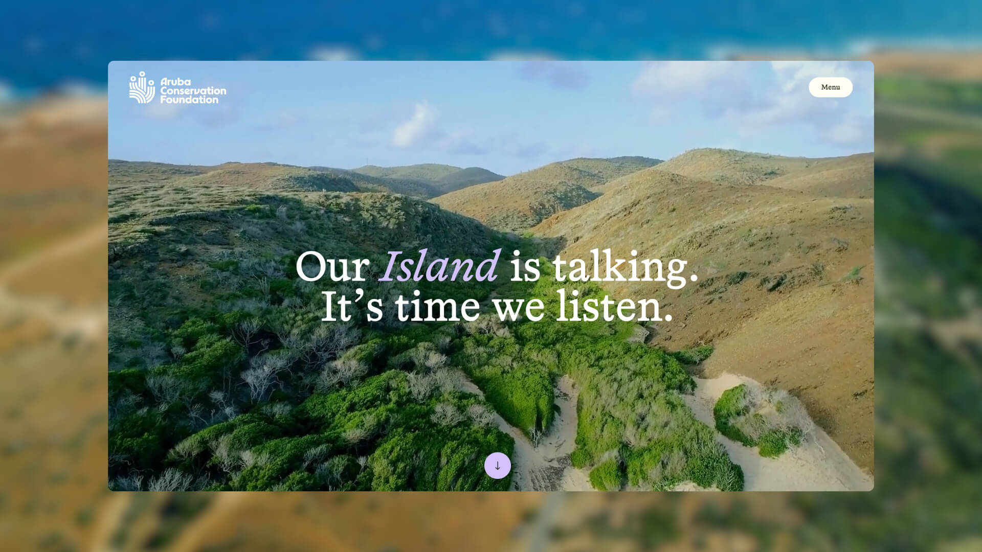
Given the sincerity of their objective, How&How positioned the ACF as Aruba’s Voice of Nature: an organisation speaking up for the interests of local ecosystems and reminding locals of their ties with the land. By framing the brand’s role as a spokesperson for overlooked species and ecosystems, it was the team’s intention to communicate the sincerity of their intentions to Aruban communities and prompt them to remember their oneness with the natural world.
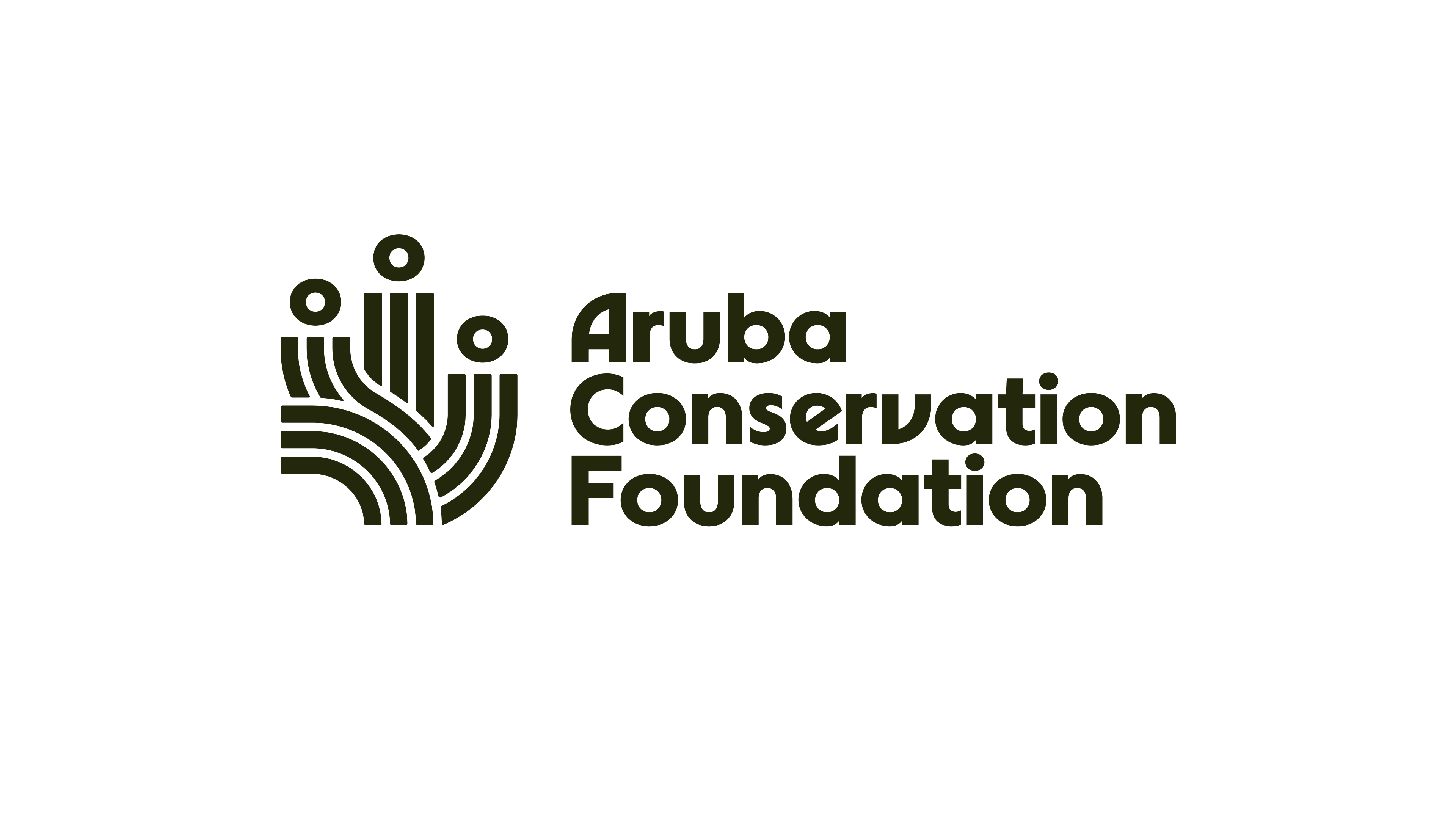
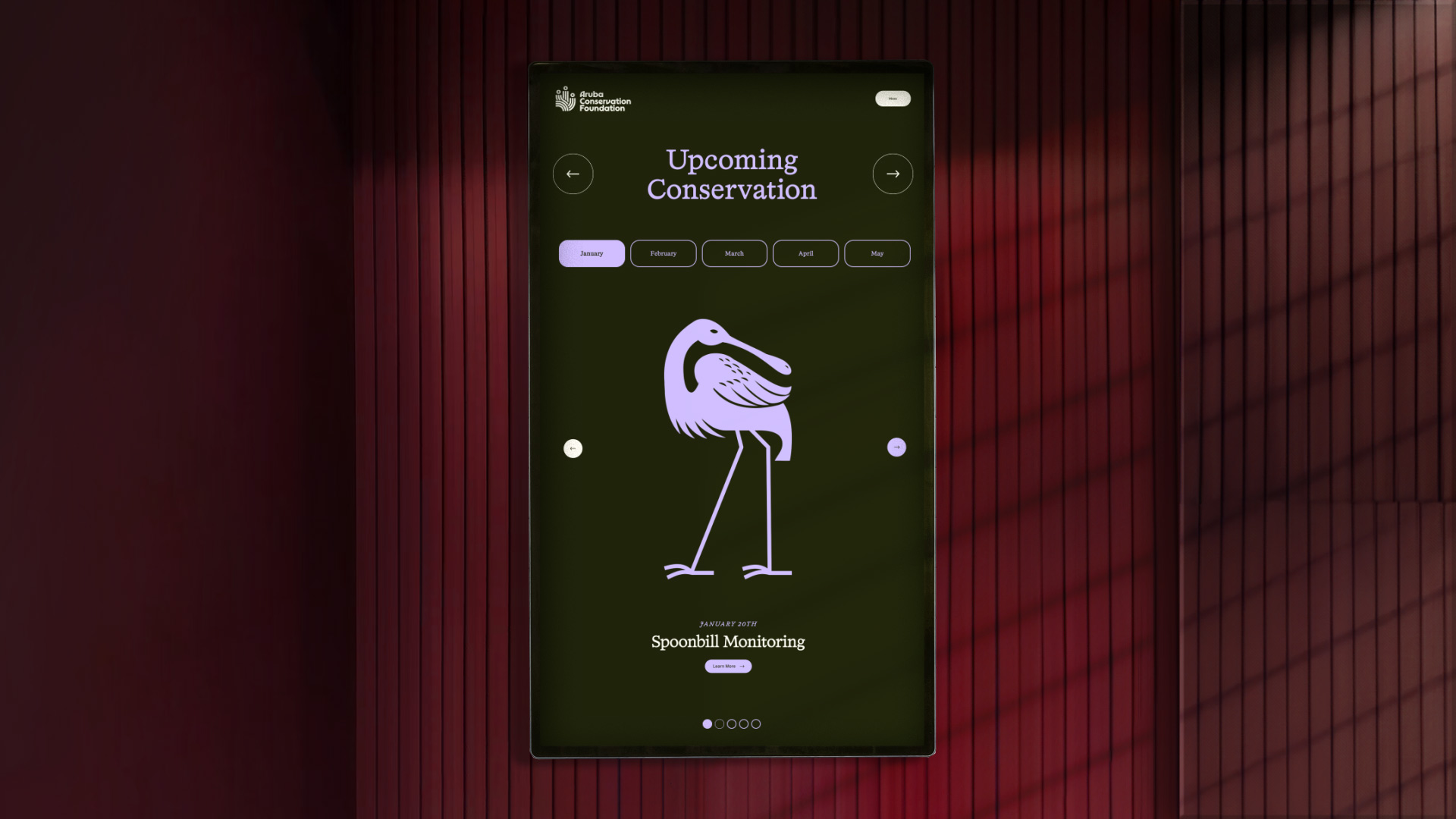
“This metaphor also laid the groundwork for our visual identity,” explains How, “which showcases humanity’s spiritual connection to nature in its logo while drawing on iconography to bring focus to specific species and ecosystems. The brand that results is all about translating the needs of nature into tangible action by using a compassionate authority that the ACF can own for years to come.”
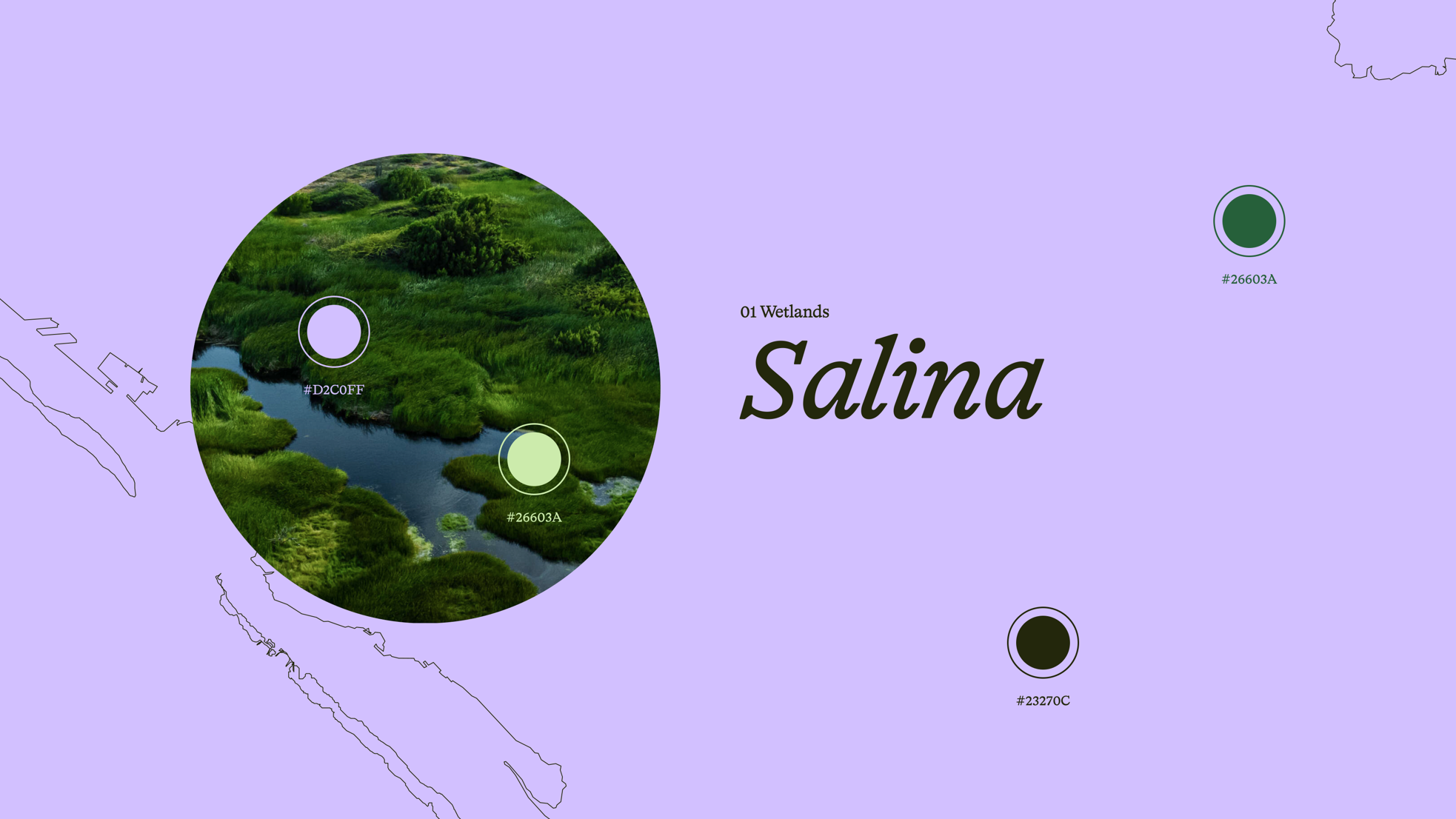
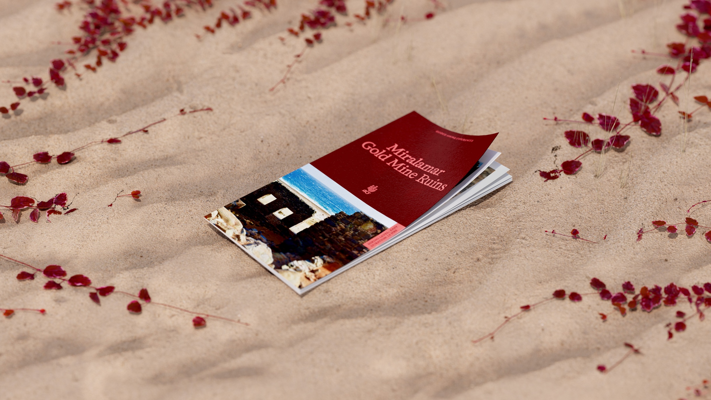
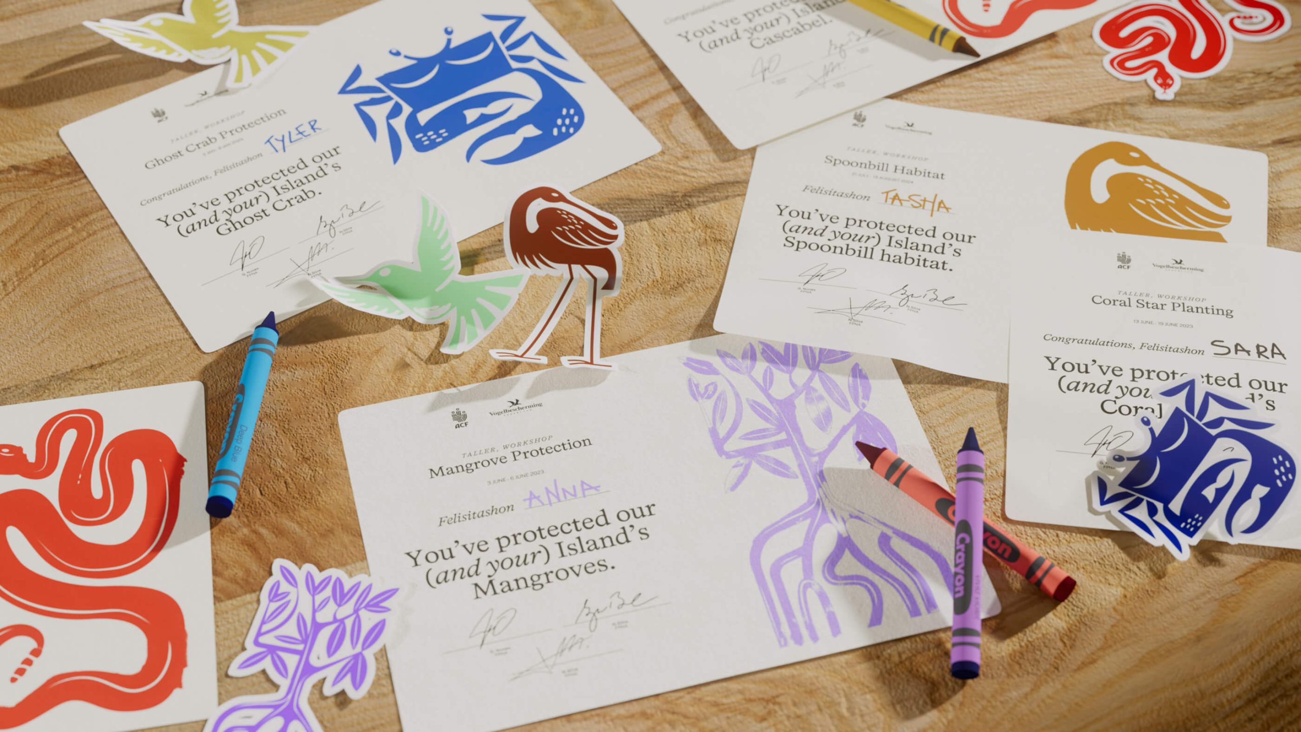
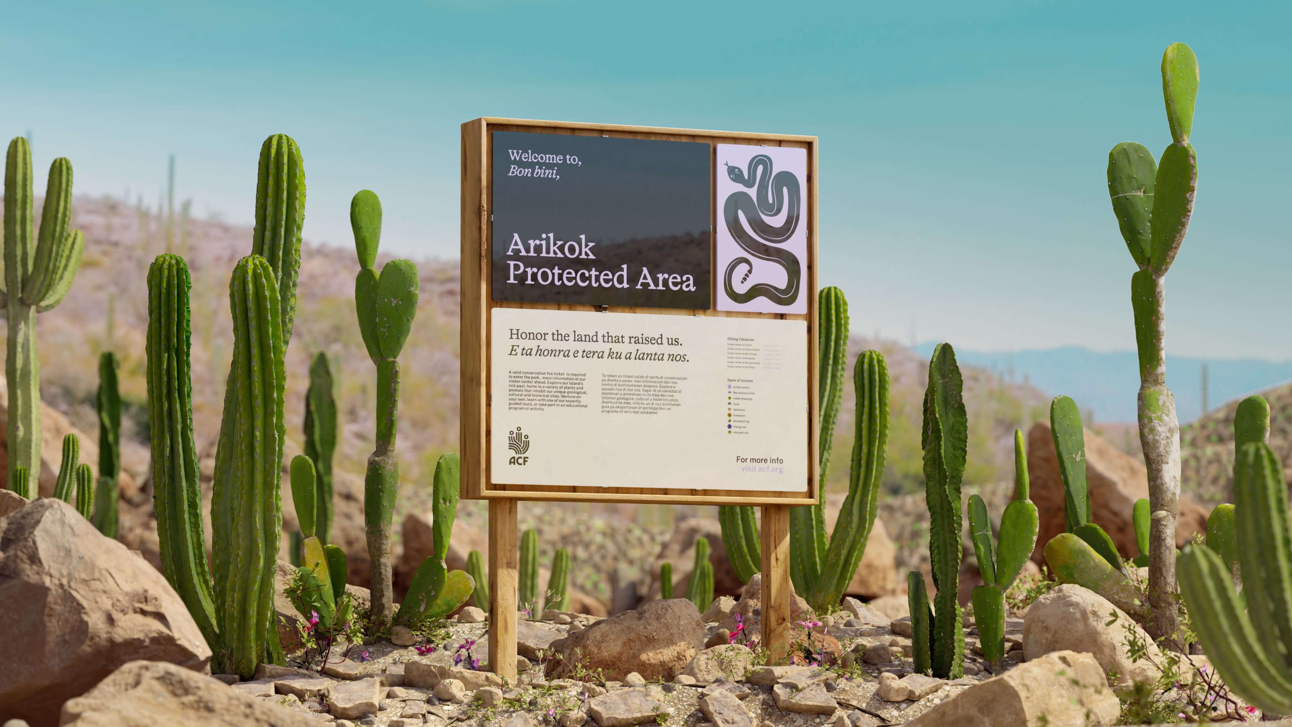
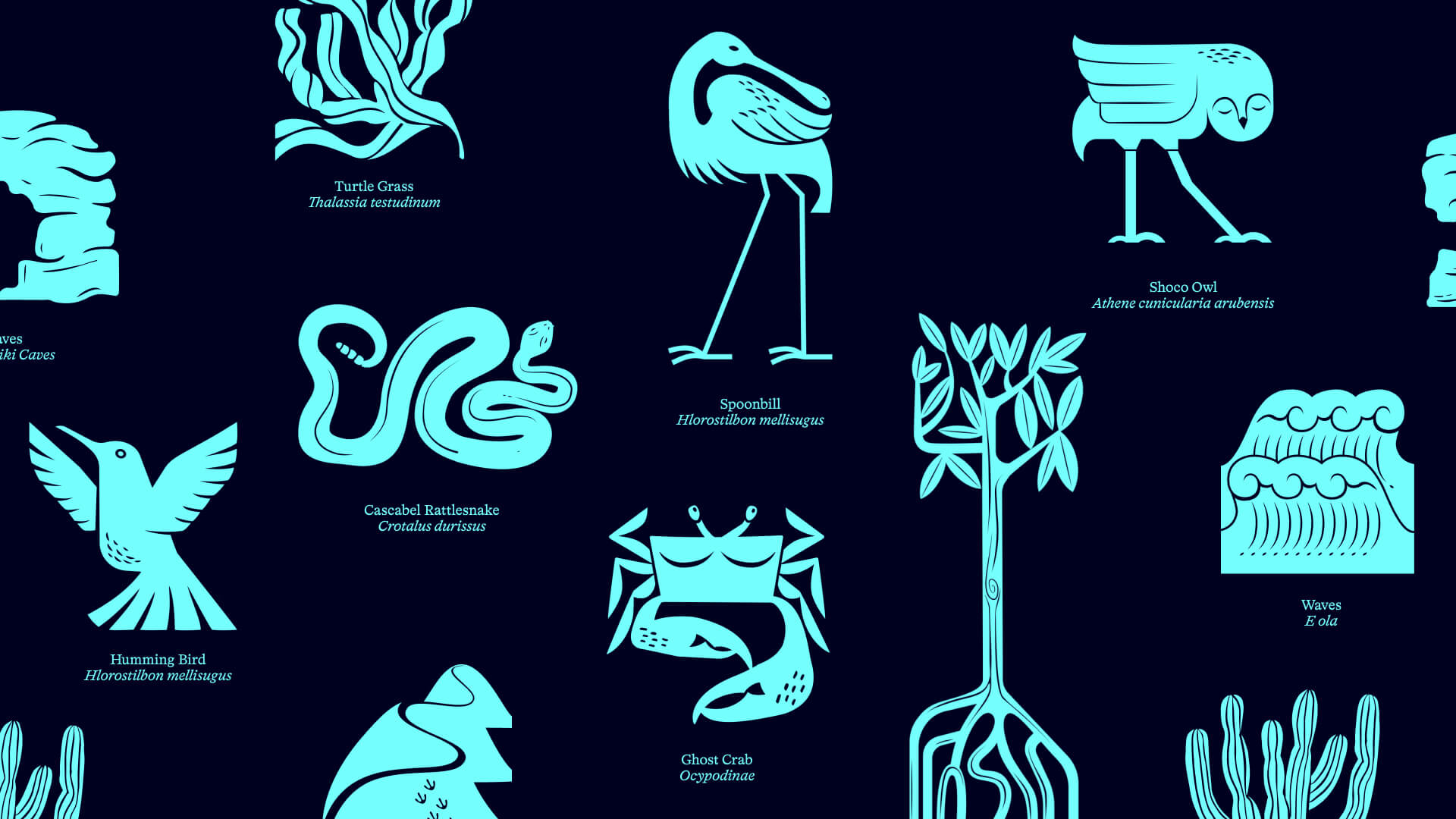
A complex color palette designed to match the different geographical areas – dunes, marshes, the ocean and scrubland – was developed; alongside a modular illustration system where plants and animals are able to ‘grow’ to fit whatever size of layout they need.
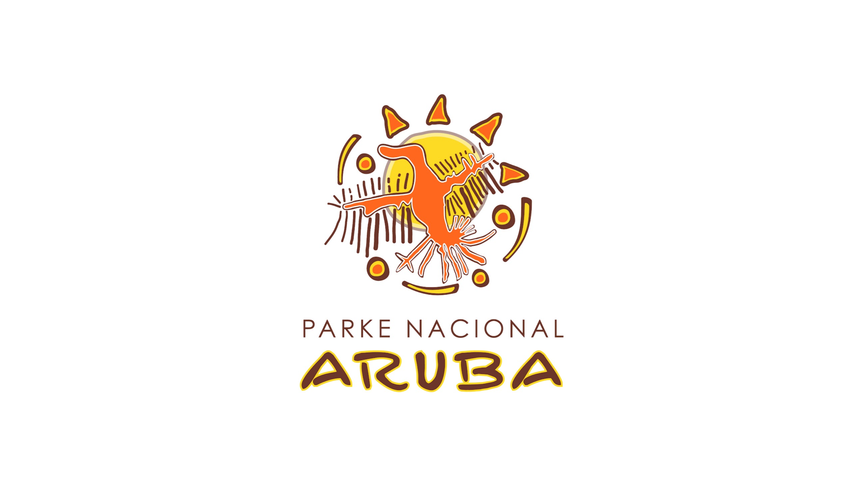
The logo combined the themes of land, sea and collective action in a marque that is authoritative and bold.
Source: How&How
How&How partner with the Aruba Conservation Foundation to redefine nature’s restoration through a new strategic position and brand for the . added by newsroom on
View all posts by newsroom →
You must be logged in to post a comment Login