The cult coffee company has new branding to mark its 10 year anniversary
Branding and design agency NOT Wieden+Kennedy today share a new visual identity and packaging approach for popular London-based roasters, Dark Arts Coffee.
The new identity is based on the concept of Joyful Nihilism, inspired by the style of the company’s signage from their much-loved original roastery and cafe, which featured playfully dark messages such as ‘I WILL KILL AGAIN’ and occult iconography.
After already establishing a strong creative personality and building a cult following through an irreverent approach to coffee naming, social media, and merch drops; the company approached NOT Wieden+Kennedy to further establish themselves as a direct-to-consumer lifestyle brand, seeking mass appeal and more consistency from their previously-disjointed visual identity as they foster ambitions to become available globally.
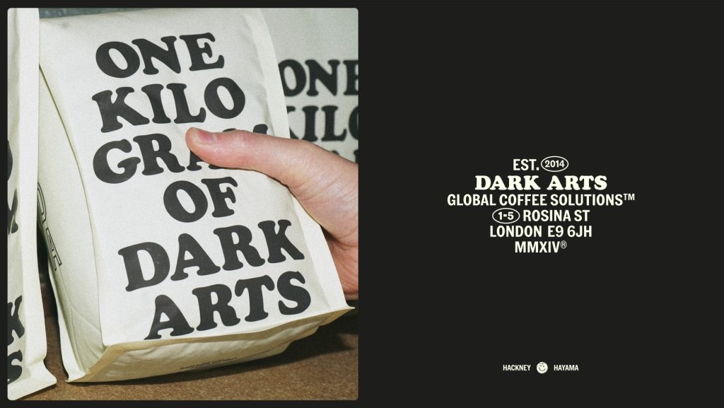

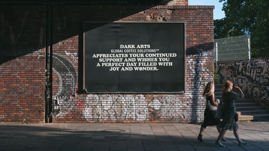
Now, the fresh identity retains their eclectic nature, but with more consistency and grounding; underpinned by the consistent use of Cooper Black font and an irreverent tone of voice through all of their communications, updated iconography, and a refined colour palette.
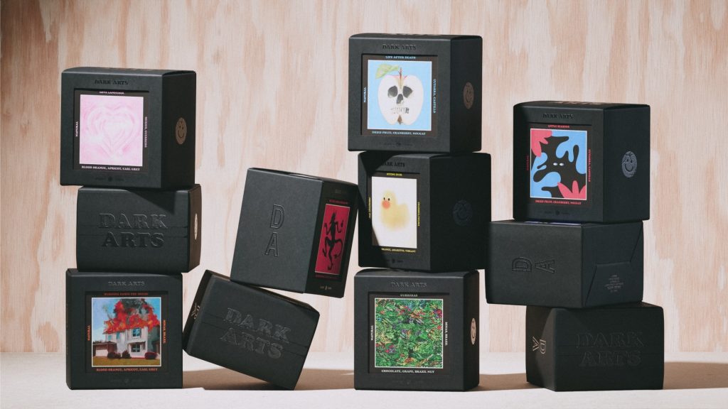
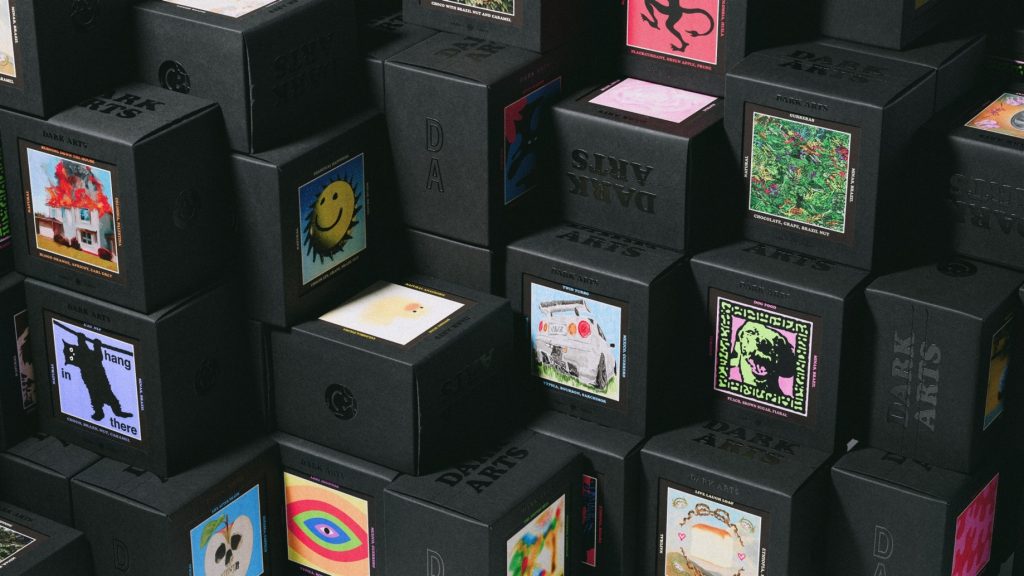
Meanwhile, this is complemented with a new approach to their packaging. Boxes for each of the 100+ variants of coffee they produce feature a window to a collectible card with unique artwork for each coffee, tasting notes, and information on its origin and roasting process; which have been compared to Pokémon cards by fans.
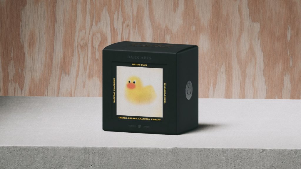
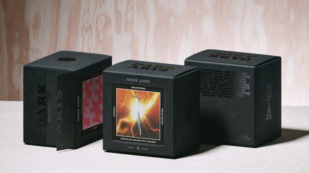
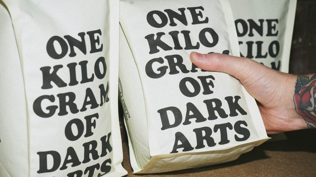
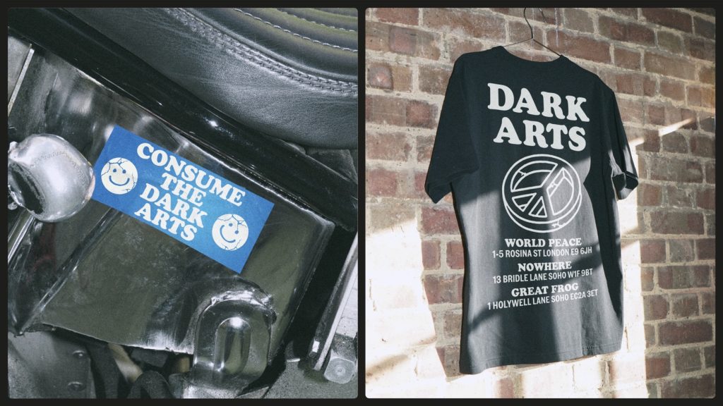
The new packaging has launched for Dark Arts Coffee’s 10 year anniversary, and fresh iterations of the artwork are set to roll out continuously. NOT Wieden+Kennedy produced an initial 50+ for the launch, and have set the company up to produce their own and collaborate with other artists and brands moving forwards.
To further cement the collaboration, Dark Arts coffee is the only coffee now served in Wieden+Kennedy’s London office, and a Wieden+Kennedy flavour of coffee is in the works for the near future.
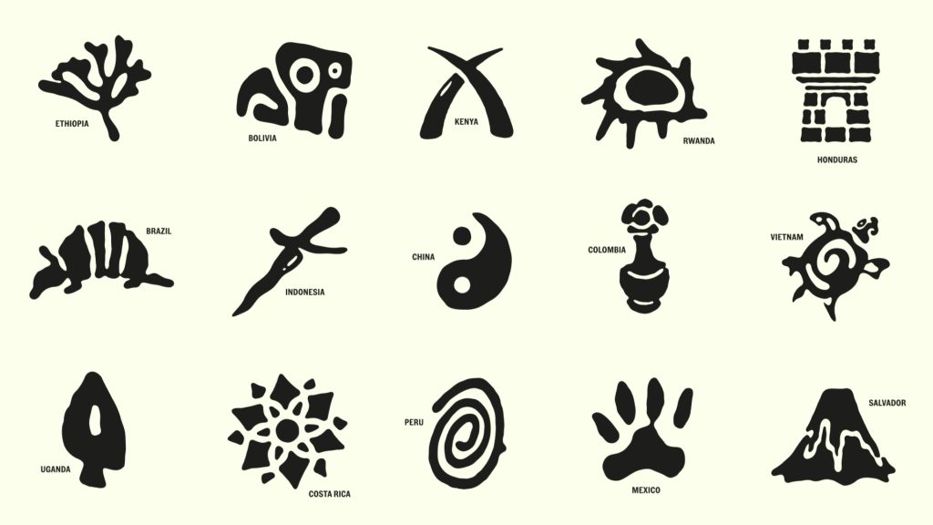

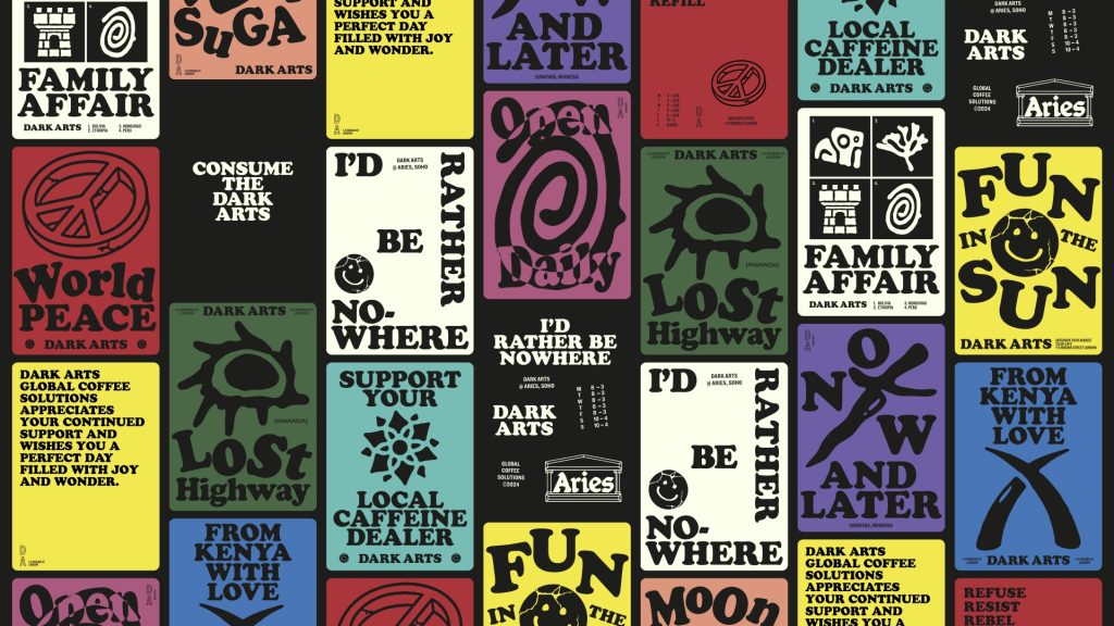
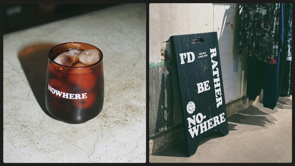
Justin Hallström, Creative Director, NOT Wieden+Kennedy comments: “The challenge with brands like Dark Arts – who already have a strong personality and loyal fan base – is to make something fresh without losing their personality. And at the same time, we needed to balance introducing more consistency whilst being sure to not put a ‘creative straight jacket’ around their eclectic personality. The solution was a simple, refined approach to the visual identity; offset with a sharp tone of voice brings their new brand personality, Joyful Nihilism, to life. Combined with the unique approach to packaging with collectible cards, it makes for a perfect canvas to keep the brand fresh and relevant for years to come. We’re so excited to see where Dark Arts takes it from here.”
Source: NOT Wieden+Kennedy

You must be logged in to post a comment Login