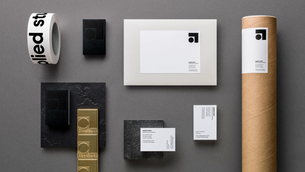
Integrated branding agency Ragged Edge has crafted a fresh brand identity for architecture practice Applied Studio. In an industry where big names can overshadow their work, Applied Studio goes against the grain. It’s grounded in substance, delivering creativity that works for the real world. Ragged Edge energised the brand around a new and exciting idea: ‘creative works’.
Substance and Style
There’s no shortage of design talent in the world of architecture and Applied Studio is no exception, bringing together a focus on service quality and functionality with ingenious design to deliver unique, timeless projects that exceed a given brief. Applied Studio therefore approached Ragged Edge with a desire to be known as much for its creativity as its practical, client-focussed approach.
Creative Works
 Max Ottignon, Co-founder, Ragged Edge, says: “Applied Studio brings together exciting, emotive design, with a hands-on, collaborative approach. It creates beautiful, pioneering spaces for people to enjoy. Places that work, effortlessly. We zeroed in on this visionary, yet practical ethos to coin the proposition ‘creative works’.”
Patrick Abrams, Founder, Applied Studios, speaks on the branding process: “Ragged Edge really got to the truth of who we are. Their deeply collaborative, strategy-first approach helped us unlock our unique brand offering and bring it to the fore. In an industry as competitive as ours, that’s priceless.”
Naming and Visual Identity
 The ‘creative works’ rebrand led to a new name and visual identity. PAC Architecture became Applied Studio. The new moniker is a nod to the way the company applies creativity to the real world – and to the dedicated way the company applies itself to each project.
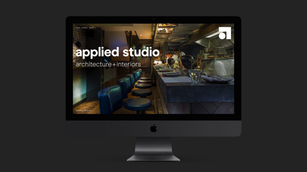
Visually the new logo communicates the bringing together of creativity and practicality. The circle denotes the playfulness and freedom of design; the right angle shows functionality. And the way these elements interact reflect how space can be considered and created.
Bringing it to Life
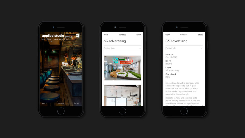
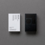
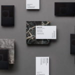
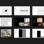
A suite of printed brand assets and a new website bring the brand to life across physical and digital touchpoints. On the website landing page, an animated version of the logo shows how creativity and practicality work together to define spaces. The remainder of the site is stripped back in style, in keeping with the brand focus on functionality.
Source: Ragged Edge

You must be logged in to post a comment Login