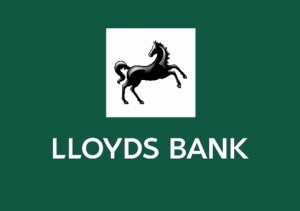
 Rufus Leonard has overhauled the Lloyds Banking Group brand, bringing together all of its businesses under one identity system and introducing a ‘confident and powerful’ customer-focused positioning.
The new brand, which begins to roll out this week, follows Lloyds Bank’s split from TSB – which has re-launched as a stand-alone high street brand – and the Government selling its six per cent stake in Lloyd’s Banking Group.
A new typeface has been created and more presence given to a redrawn horse, which Rufus Leonard says ‘is one of the most recognisable brand icons in the UK.’
Green has been introduced as the main colour and the ‘For the Journey’ campaign is been replaced by ‘The moments that matter’, which assumes a customer-focused and photographic approach.
Rufus Leonard says the new ‘common yet flexible look-and-feel unites the retail banking network far more clearly with the bank’s commercial and wealth businesses’
Digital banking for web and mobile has been made ‘more accessible’ with a system of icons, according to Rufus Leonard.
 Rufus Leonard, which was appointed directly, has worked with Lloyds Banking Group for twenty years.
Lloyds Banking Group has also worked with ad agency RKRC/Y&R, strategic agency Proximity London and media agency MEC to deliver a through-the-line campaign.
A roll-out will reach touch points including bank fascias, staff uniforms, branch collateral and more than 70 different types of credit and debit card.
Rufus Leonard creative director James Ramsden says, ‘The entire range of brands are now all assumed under one identity with the same branding assets and typography.’
Rufus Leonard strategy director Freddie Baveystock adds, ‘What Lloyds has done today is very confident, distinctive and quite different from Barclays, NatWest Santander and every other bank on the high street, most of which are playing it quite safe.’

You must be logged in to post a comment Login