 Creative agency Studio Blackburn, part of the Hello Finch agency network, has designed a new brand identity and logo for the Canal & River Trust, a charitable organisation that cares for and uses waterways across England & Wales to make life better for millions of people.
Studio Blackburn was tasked with revitalising the brand and creating a memorable look that will maximise awareness and support for the Trust and represent the brand’s vision of living waterways transforming places and enriching lives.
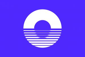
Working alongside strategic partners Hello Finch, the new logo created by Studio Blackburn is named The Reflection Symbol. It references the ripples of water and bridges found across the UK’s inland waterways, and comes in a controlled range of colours to represent nature and water.
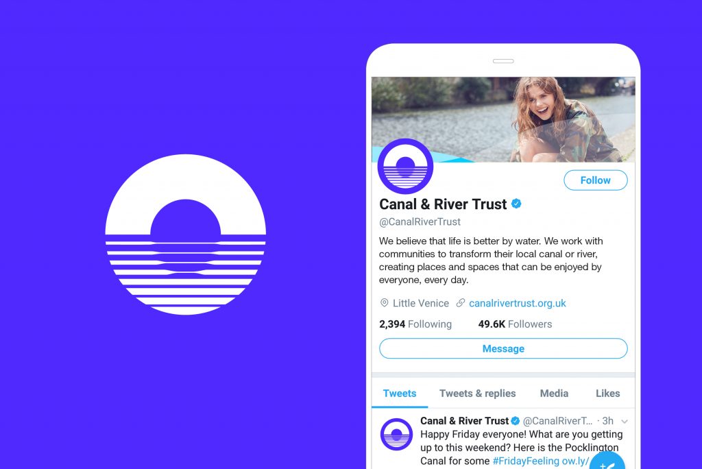
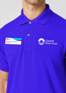
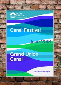
 The wider design scheme is composed of a number of core elements that come together to create a distinctive look and feel that reflects the brand positioning of ‘Making life better by water’. The identity will be used across a variety of brand touchpoints, including physical items – such as special event posters, signage, uniforms and vans – and the Canal & River Trust’s digital and social presence.
“The Canal & River Trust doesn’t just look after the rich history of our waterways, it ensures that these canals and rivers are used and enjoyed by thousands of people every day. Our design solution was driven by the Trust’s focus on bringing waterways alive and encouraging communities to come together to love and care for their local canal or river,” said Paul Blackburn, head of Studio Blackburn.
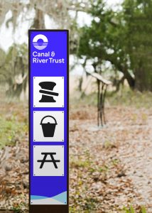
 “This was a perfect brief, delivered by a bold and ambitious client driven by the purpose that life is enhanced when near water. The result is a visually striking, optimistic, colourful and instantly recognisable brand system that will appeal to a broader demographic and boost interest and awareness in the Trust and its valuable work. A brand that works across all the primary channels of the Trust, from large signs on towpaths to social media icons. Other elements of the brand system include a brand typeface called Modern Era – a contemporary, friendly sans serif typeface, with open and rounded forms – and an adaptable and flexible brand pattern.”
Nicky Wakeford, Head of Marketing at Canal & River Trust, said: “The waterways that we care for are used by people in so many different ways – to commute to work, a place to run or somewhere to spend time relaxing on and off the water. We were looking for an identity that captured how being by water makes us feel and which reflects our ambition to become the ‘waterways and wellbeing’ charity. As a team, Studio Blackburn were able to translate the spirit of what we’d envisaged for the Trust into what we think is a strong, unusual and differentiating identity.”
Jemima Bird, Founder of Hello Finch, said: ‘We love working with Studio Blackburn and, as a founding partner of Hello Finch, when Canal & River Trust contacted us to help them define their new identity there was only one independent agency to trust with this important redesign. We are delighted with the identity Studio Blackburn have created.”
Source: Studio Blackburn
Studio Blackburn rebrands the Canal & River Trust added by newsroom on
View all posts by newsroom →
You must be logged in to post a comment Login