 Debenhams, the department store with a rich 200 year heritage is signalling the next phase in its continued transformation with the launch of a new brand identity and above the line campaign playfully inviting customers to ‘do a bit of Debenhams.’
Devised by new creative partner, Mother Design, the new logo mark and visual identity is a bold statement of change and part of a bigger brand repositioning programme aiming to celebrate and reclaim the joy of shopping. Reflecting the vast amount of initiatives taking place in the business, the work shows a marked progression for the well know high street from its previous identity in use since 1999.
The evolved logo beings a modern and approachable twist to Debenhams’ heritage. Mother worked closely with Swiss Typefaces to create a custom and distinctive typeface derived from SangBleu that reflects an updated, dynamic and vibrant personality. The identity is supported by a vibrant colour system and iconic illustration style.
Launching in September, the logo will immediately visible online as well as in new and modernised stores ahead of phasing in across all brand collateral from carrier bags to hangers and eventually the entire store estate.
On the creation of a new logo for the department store, Managing Director of Marketing and Beauty, Richard Cristofoli said, “We are on a journey to build brand affinity and signify the vast amount of change that is taking place in Debenhams. By physically changing and modernising our logo to aim to make an overt signal to customers that there are reasons to come in store and reappraise our offering.”
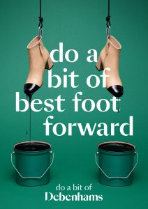
The branding overhaul is also accompanied by a proposition and above the line campaign designed to be distinctive and give Debenhams a point of difference in a competitive marketplace. Playful, attitudinal and proud in its projection, the premise of eight creative executions sees Debenhams take on a mission to celebrate the unapologetic joy of shopping. Hero products feature in unexpected environments such as a pair of contrast toe ankle boots appearing as if lifted from being dipped in paint cans with the humorous statement, “do a bit of best foot forward”, each concept ties to a starting line of “do a bit of Debenhams”.
 The executions, set to appear with a social first media plan will appear in still and gif formats across social and digital channels as well as in 3m brochures inserted into titles including Sunday Times Style, Grazia, You magazine, Metro and Marie Claire.
The new customer proposition ties to the Debenhams Redesigned strategy and is rooted in demonstrating that shopping with Debenhams is a sociable and fun experience. The strategy has already delivered many proof points including its selection of accessible leading designer collaborations including new names Preen and Richard Quinn; market leading categories; and famous beauty brands and service proposition.
On the campaign, Cristofoli continues, “When talking about shopping consumers told us of the real joy that they experience when exploring and trying new things in-store. Many lamented that shopping had lost its role in our culture and in some ways had become transactional, solitary and trivialised – just a relationship with their post room. We wanted to present a rallying cry to consumers to celebrate the joy of shopping and reclaim it as the rich, experiential and joyous experience that brings family and friends together.”
The AW 18 campaign, set to launch on 9th September will run over four weeks and comes ahead of further transformational change with the launch of: a digital Beauty innovation; the first gym within a store in partnership with SWEAT! and further brand partnerships in Debenhams stores.
Ana Balarin from Mother commented on the work: “There are so few high street icons, and Debenhams is certainly one of them. It was a unique opportunity to revisit such a loved and established brand to reflect the modern business it has become.”
Source: Debenhams


You must be logged in to post a comment Login