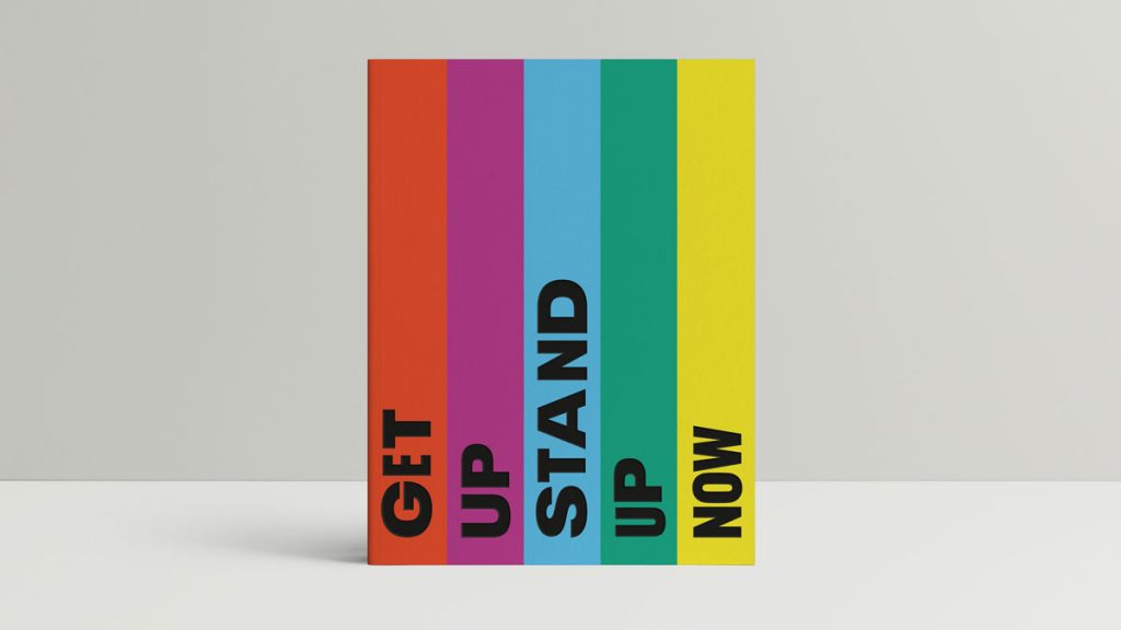
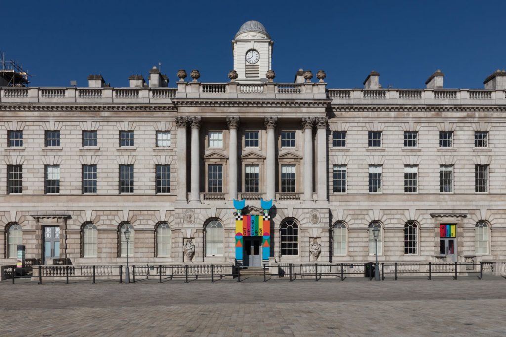
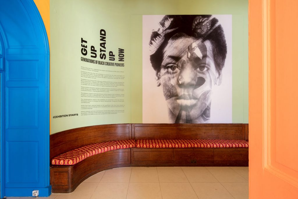
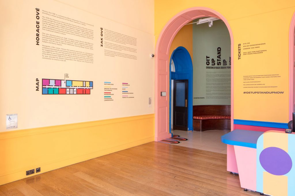
Get Up, Stand Up Now, a major new exhibition at London’s Somerset House, is now open with branding by Here Design. Running until September 2019, the exhibition celebrates 50 years of Black creativity in Britain and beyond, and features over 100 interdisciplinary artists spanning art, film, photography, music, literature, design and fashion.
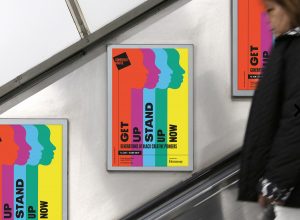
The exhibition, curated by artist, filmmaker and photographer Zak Ové, illuminates the impact of Black creativity and experiences on British and international culture, aiming to give visitors a better understanding of how the past informs the present. The archive of Zak’s father, radical Black filmmaker Horace Ové, forms the foundation of the exhibition as it explores the culturally and politically engaged themes of his work and that of his contemporaries.
The brief given to Here Design was to create a contemporary and forward-thinking identity for the exhibition that would attract a wide cross-section of the visiting public and leave them feeling enriched, moved and inspired. This identity has now been rolled out across all print and digital touchpoints, including the exhibition catalogue, onsite-signage, artwork captions, advertising and online information.
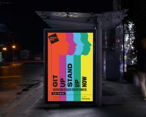
“It’s very challenging to sum up all the extraordinary talent in the exhibition with a singular visual that captures the breadth of the works on show and can be used across all elements of the campaign,” says Caz Hildebrand, Creative Partner at Here Design.
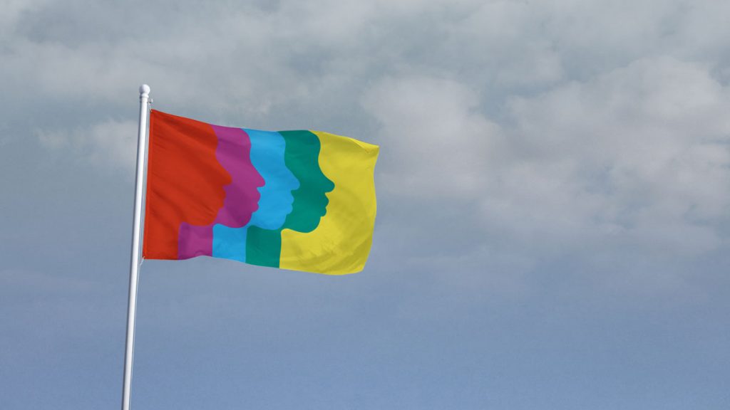
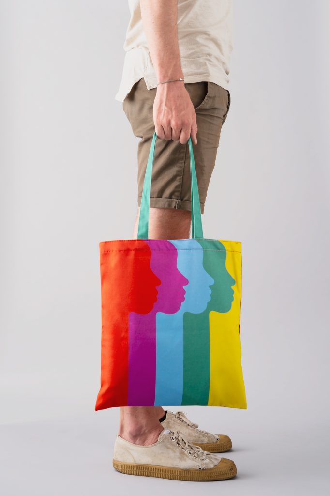
Rather than anchoring the identity to the work of an individual artist, Here Design crafted a single image from the profile silhouette of exhibiting artist Zoe Bedeaux to represent the works of the 100+ interdisciplinary artists.
The silhouette is offset in five colours – a palette developed in conjunction with exhibition designer Yinka Ilori – each reflecting one of the themes addressed in Get Up, Stand Up Now: Motherland; Imaginary Landscapes; Dream to Change the World; Masquerade; and Mothership.
This creates a design language that forms a backdrop to the exhibited works, ensuring the art speaks loudest and is not overpowered by the identity whilst remaining highly flexible to reflect the diverse and intergenerational nature of the exhibition.
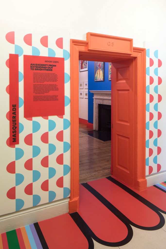
The challenge was to create an identity that would attract culturally engaged museum-goers and intergenerational audiences, some of whom might not typically attend exhibitions. Here Design worked closely with 3D designer Yinka Ilori to create an identity that functions as an energetic chronology, using vibrant colour, tone and abstract imagery to guide visitors of all ages and interests through the exhibited works.
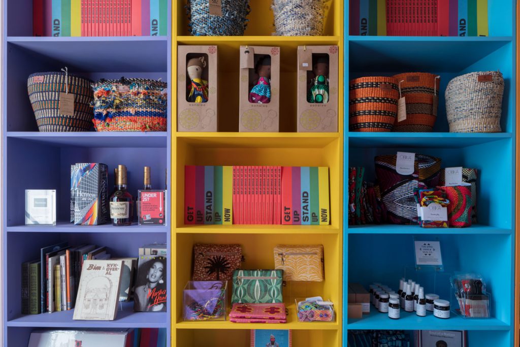
In addition to the two-dimensional branding material, Here Design’s in-house creative studio, Here Makes, designed and created branded products for the show that will be on sale in the exhibition shop, including enamel pin badges, pencils, socks and tote bags to appeal to visitors of all age groups as take-home souvenirs of the experience.
“As a creative studio, we’re proud to be involved with something so rich and important as this exhibition. Of all the projects we’ve worked on, this is certainly one of the most diverse. We specialise in not specialising which was a great benefit in creating so many touchpoints for the exhibition – from small pins, to out-of-home ads, to a giant flag emblazoned with the identity that will fly over the Somerset House courtyard for the duration of the exhibition,” says Caz.
Source: Here Design

You must be logged in to post a comment Login