Design Bridge New York share details of their work rebranding New Holland Brewing Co., restoring its position as a leader in the increasingly competitive craft beer market. Inspired by the spirit and symbols of Dutch culture in the brand’s hometown of Holland, Michigan, the striking transformation unites the brewery’s heritage with its distinctly Midwestern attitude, creating a fresh brand that connects with contemporary beer drinkers.
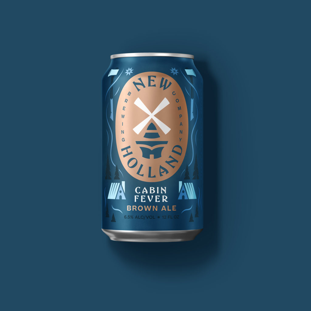
Mike Perry, Creative Director at Design Bridge New York, commented: “New Holland Brewing Co. was once a category trailblazer. As craft beer became an increasingly competitive market, the core brand’s distinct qualities and its notoriety had gotten lost in the crowd. Our challenge was to restore confidence in New Holland Brewing Co. to set it apart from the competition, revitalizing the brand’s unique Dutch and Midwestern heritage to build emotional connections with discerning beer drinkers once again.”
Prior to the global pandemic, the Design Bridge team travelled to the brewery’s home in Holland, a small Michigan city founded by Dutch Americans, to explore the area and get to know its people. During this trip they discovered that New Holland Brewing Co. hadn’t just built a brewery. The company had entirely transformed the area and people even referred to the city as “New Holland” as a result. Inspired by this historic influence over the city’s culture, and the deep-rooted connections it has with the people living and working there, Design Bridge sought to re-establish a strong sense of pride in the brand.
Mike Perry, Creative Director at Design Bridge New York, continued: “During our trip we were reminded of the concept of ‘gezellig’, an all-encompassing feeling at the heart of Dutch culture that spans comfortable to relaxing, enjoyable to gregarious. Embodying the brand’s spirit of togetherness, we combined this idea with the Midwest’s traditional yet progressively pioneering attitude to breathe new life into the brand.”
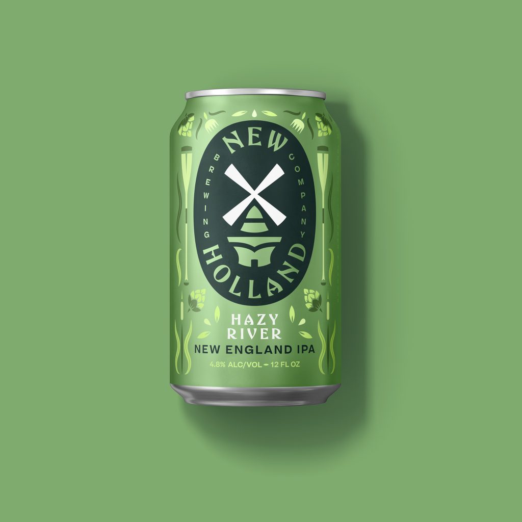
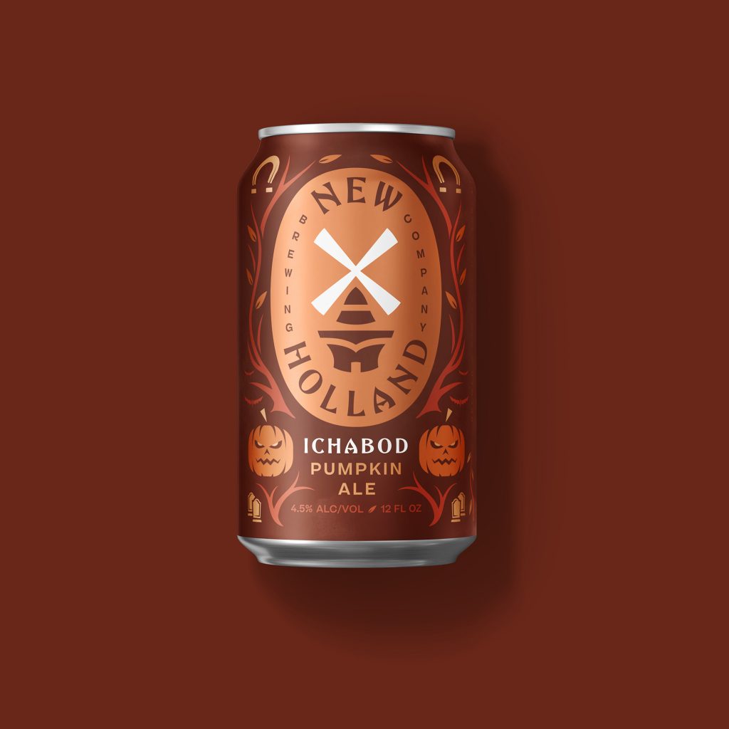
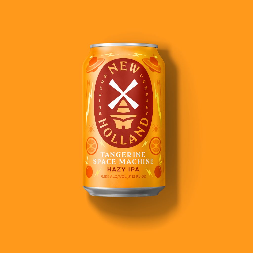
Drawing on the windmills that surround the area, the new visual identity centers around a striking and fresh interpretation of the brand’s unique windmill equity. A symbol of Dutch national pride, Design Bridge retained the brand’s core orange, but introduced a contemporary navy blue into the refreshed color palette. The team also collaborated on a custom typeface and new illustration style, which were inspired by Dutch delft pottery and vintage “welcome” signs uncovered on their trip to the city, bringing a modern twist on the traditional Dutch-American design aesthetic to the new visual identity.
When it came to the packaging, Design Bridge had noticed that craft beers were usually shelved higher than regular beers in stores, with only their top faces showing. To ensure that New Holland Brewing Co.’s products truly stood out, Design Bridge created a new design system that incorporates a large primary beautifully rendered on a simple color background to highlight each product and flavor, creating consistency and shelf visibility among the top panels of each variant’s packaging.
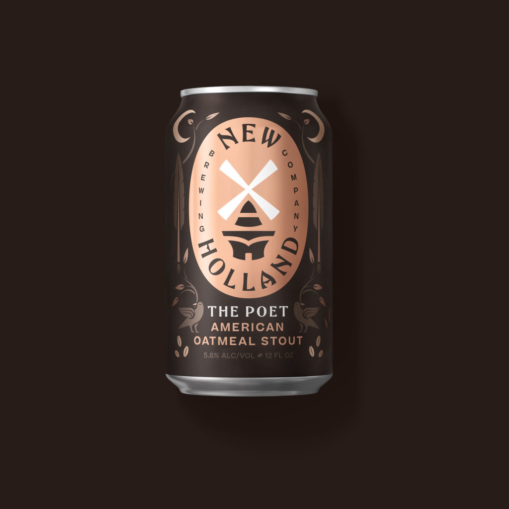
Adam Dickerson, Brand Manager for New Holland Brewing Co., commented: “The rebrand not only captured our true spirit but also uncovered amazing stories worth telling that were right under our nose. We learned so much about ourselves, and Design Bridge brought those stories to life in a beautiful and contemporary way. Their striking design has helped keep New Holland Brewing Co. relevant in the ever-shifting craft beer industry and we’re already seeing the positive effects; some of our rebranded brews are averaging a +36% increase in rate of sale vs. the same time last year, which is great!”
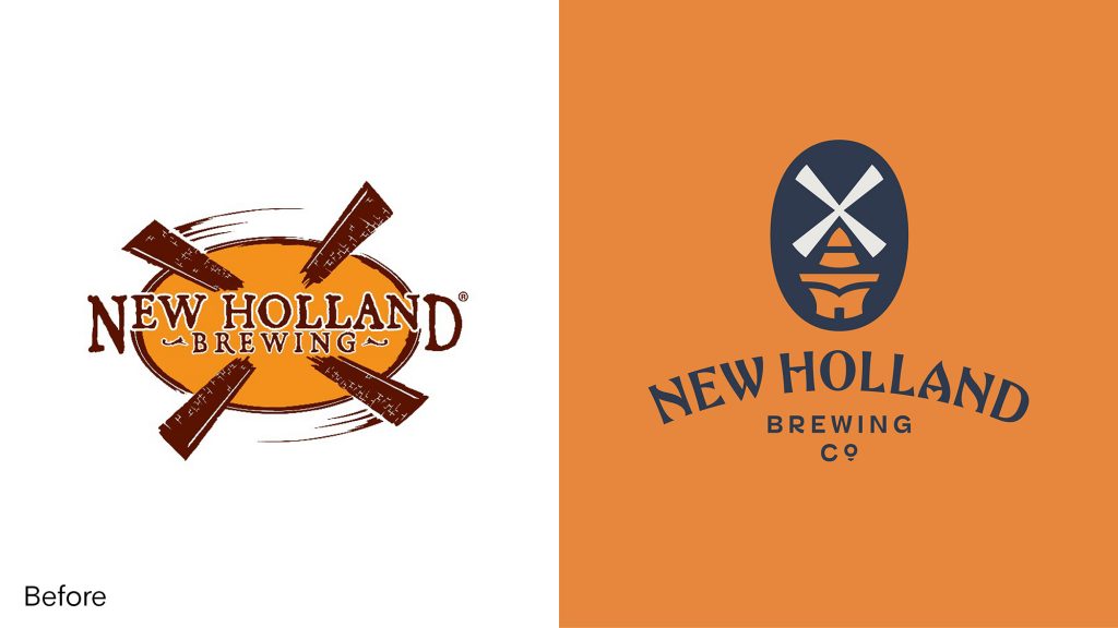
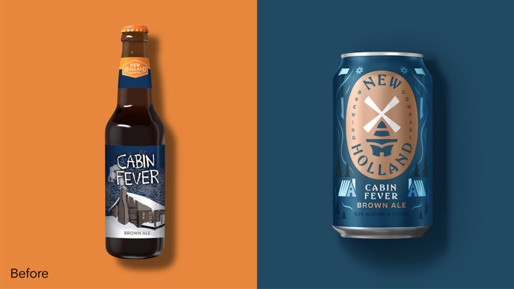
A cohesive brand that people love, New Holland Brewing Co. is now reflective of its roots as well as representative of who it is today and this boldly revamped brand world extends across all brand touchpoints including glassware, posters, signage, beer taps, mats, online and beyond.
Source: Design Bridge New York & FAB News

You must be logged in to post a comment Login