The premium supplement category is exhausting in its predictability – clinical whites and pharmaceutical sans serifs at one end, muted greens and softened wellness at the other. AEVUM, designed by brand & packaging design agency Greatergood, refuses both.
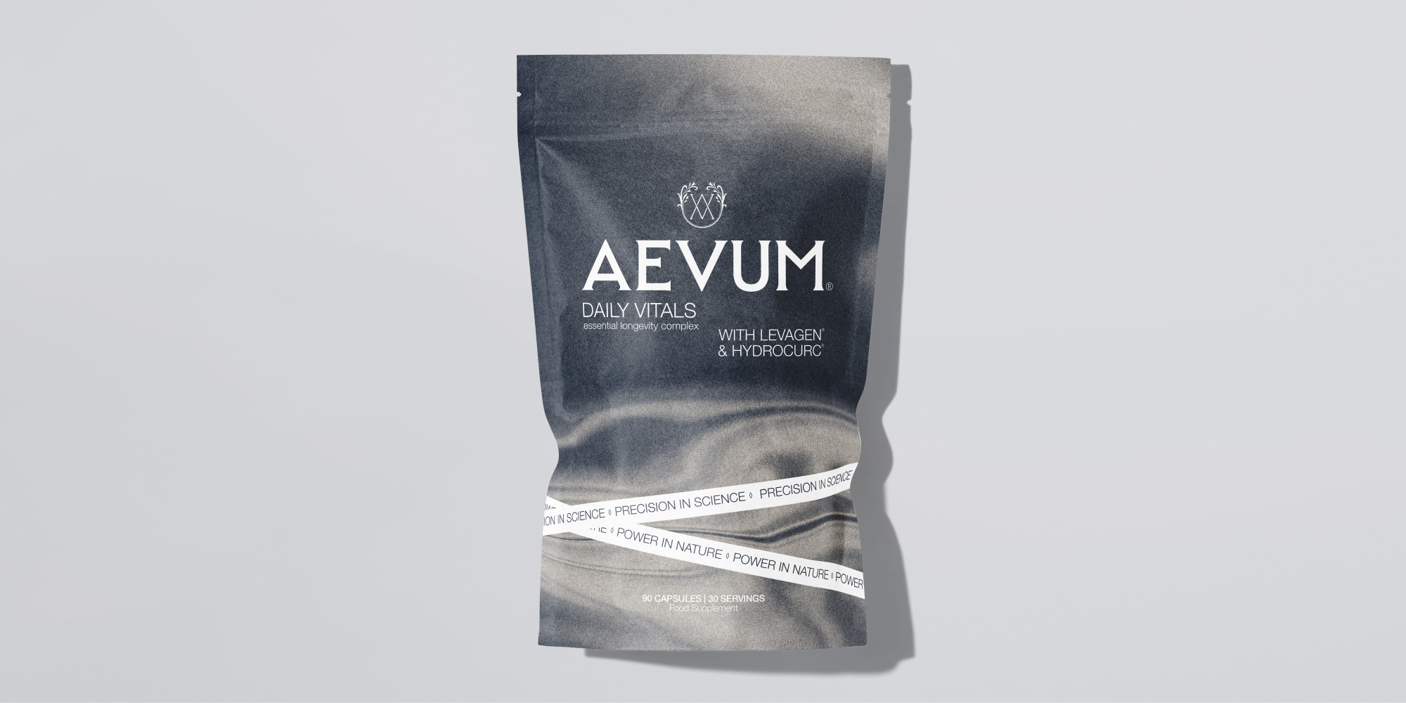
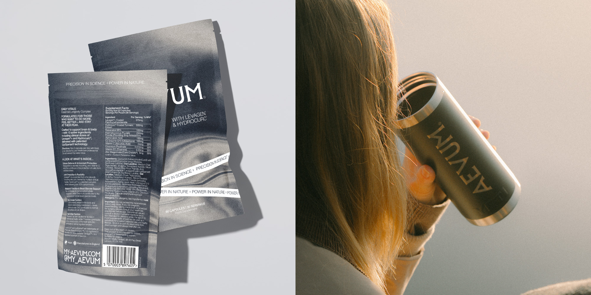
Built around one of the oldest symbols in human culture, the Fountain of Youth, the brand translates a longevity formulation into a packaging system that feels geological rather than clinical – still water rendered in monochrome against a deep slate grey. Imagery that communicates eternity not through aspirational lifestyle photography but through the quiet permanence of mirrored reflections.
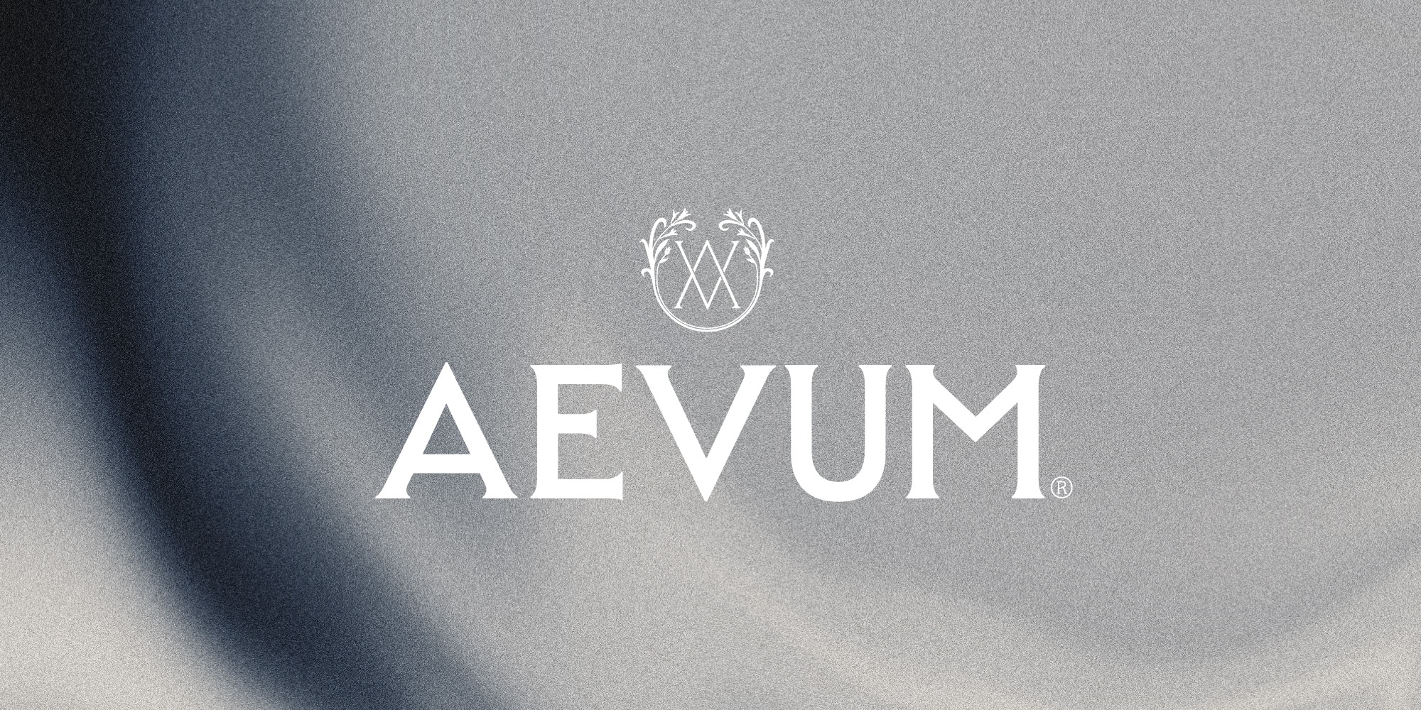
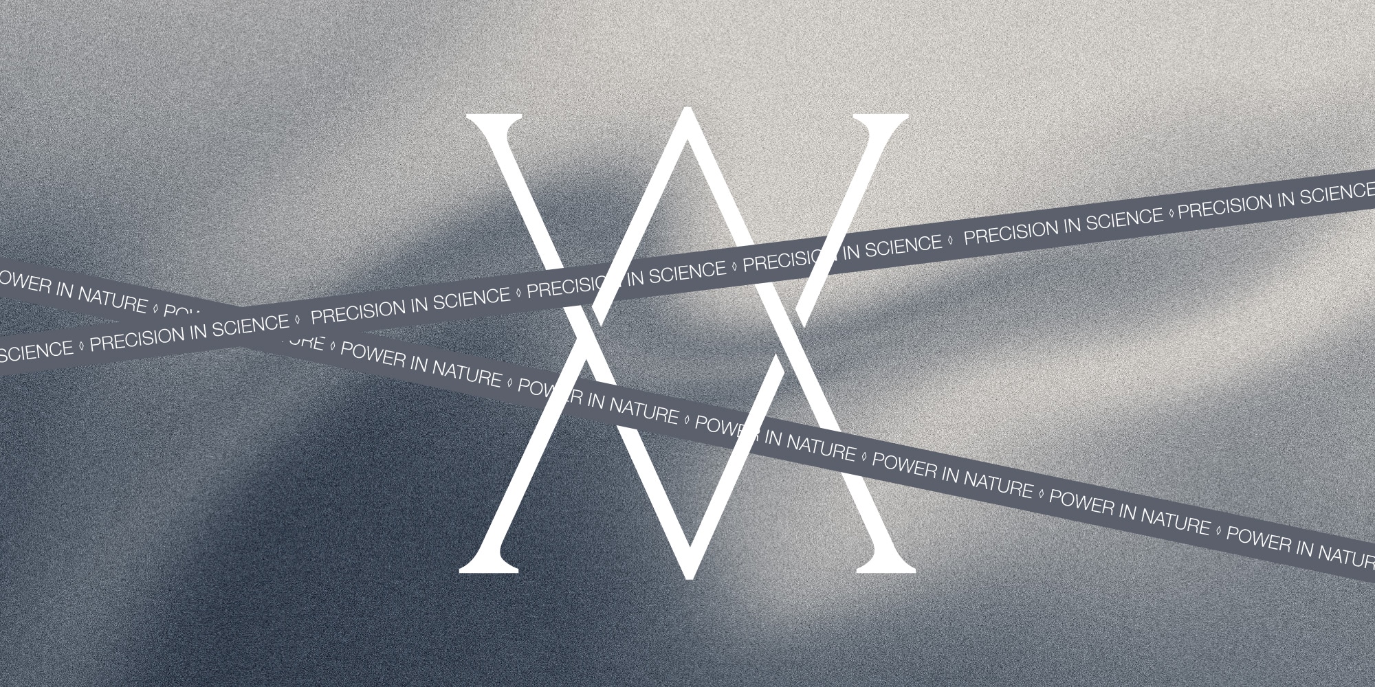
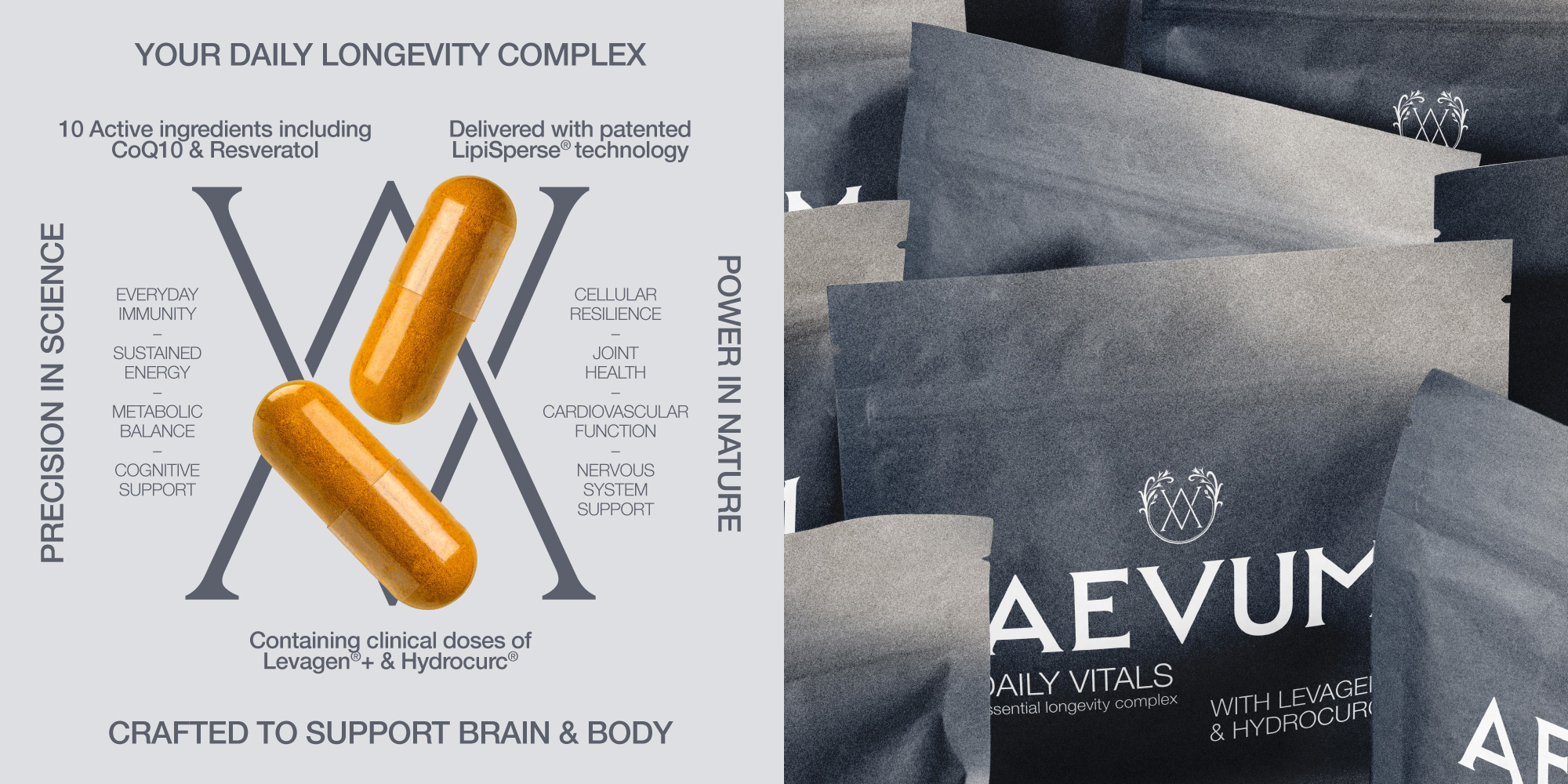
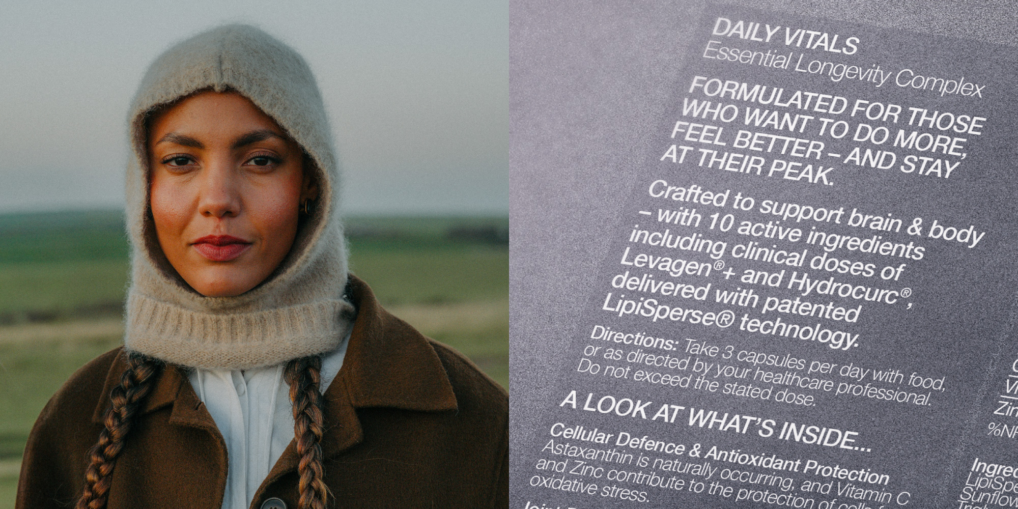
At the centre of the identity sits a bespoke ‘A’ and ‘V’ monogram, two intersecting letterforms enclosed within a botanical frame, the visual embodiment of the brand’s central tension: ‘precision in science, power in nature’.
What makes this one of the more interesting supplement identities to land recently is how completely the design earns its restraint. The wordmark is architectural and precise in a way that signals permanence over trend – as if carved rather than set – and the name itself, AEVUM, Latin for an age, for eternity, shaped every decision downstream. The brand effortlessly reads as premium without the coldness of pharmaceutical white or the genericness of black.
AEVUM have launched with a brand that justifies its premium positioning before a word of copy is read – timeless rather than trend-led, built to look as considered in five years as it does on day one.

Source: Greatergood
A luxury longevity supplement inspired by the Fountain of Youth added by newsroom on
View all posts by newsroom →
You must be logged in to post a comment Login