BrandOpus have created a new brand identity for AG Asia, who manage assets in London and Europe for ultra-high net worth clientele.

AG Asia first came to the design agency in need of an identity that would reflect their own ambitions. Being agile, adaptable and flexible, they wanted their brand identity to reflect their core values. An identity that would not only reassure clients and confirm their credibility but differentiate themselves in a crowded market.
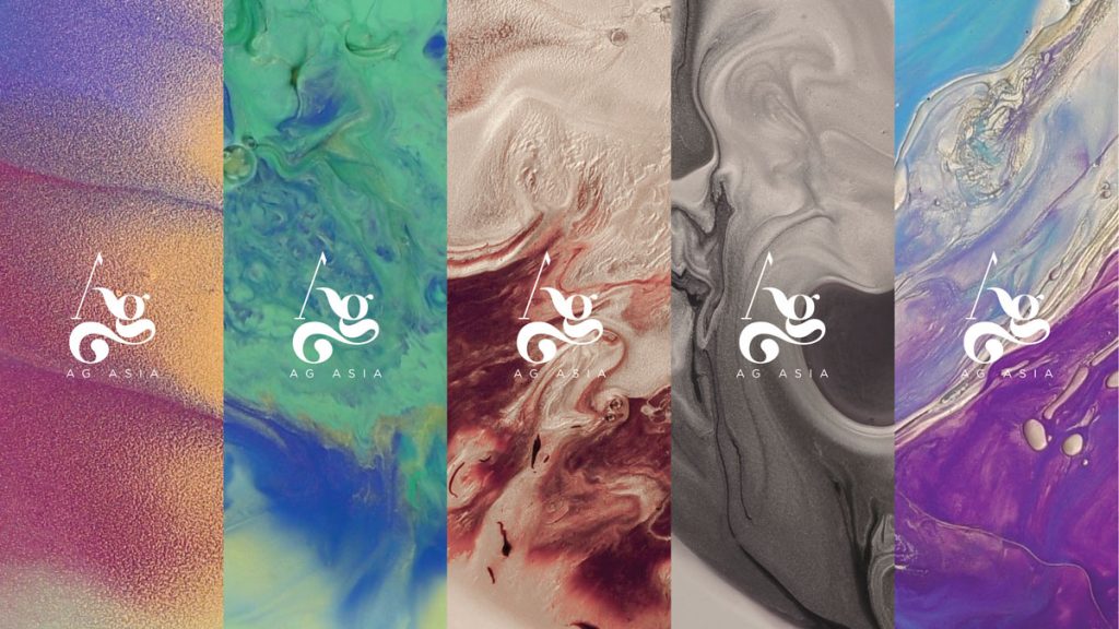
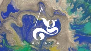
In order to drive impact, BrandOpus decided to build meaning into the existing name, AG Asia. To achieve this, they looked deeper and decided to take literal inspiration from the name itself, noting that AG is the scientific symbol for silver.
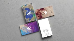
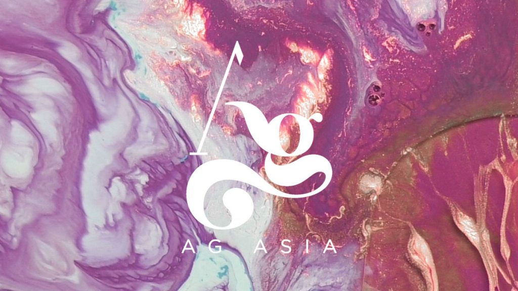
Rich in resources and inspired by the movement and fluidity of liquid silver the agency created bespoke beautiful and bold moving marbled patterns in house, that are being used across the brand world, including the website, stationery and collateral.
The beautiful patterns symbolise not only liquid silver, but the fluidity of AG Asia and helps to reflect their adaptability and bespoke approach to personal service.
The new identity for AG Asia now commands attention within the black, white and gold world of asset management.
John Ramskill, Executive Creative Director, BrandOpus says: “During the early stages of the project we came across an interesting story about a Bolivian man whose campfire brought up liquid silver from the earth revealing the world’s richest silver deposit hidden beneath. Using this story as inspiration, we crafted the identity and supporting motion imagery to symbolise a mountain with rivers of silver running down its face, reflecting the agility within AG Asia. Their versatility and adaptability are further symbolised by the fluid- art videos which demonstrate AG Asia’s unique approach within a crowded category.”
Source: BrandOpus
BrandOpus design adaptable new identity for AG Asia added by newsroom on
View all posts by newsroom →
You must be logged in to post a comment Login