International marketing services group St Ives has rebranded to Kin + Carta with a new visual identity designed by Carter Wong. The rebrand marks the transition of St Ives Group from its print heritage to a wholly digital business with Kin + Carta specialist agencies working together under a new methodology called The Connective to offer clients seamless and holistic digital transformation.
 Setting a foundation for the brand identity
Carter Wong was appointed to design a new visual identity that conveyed the Kin + Carta business proposition and seismic shift from its heritage business with clarity and personality. Working closely with writing agency Reed Words and the Kin + Carta team, Carter Wong’s creative captures the essence of The Connective and creates a foundation for the development of wider brand identity.
 ‘Kin’ means family, representing the heart of the business and seamless collaboration between group and client; and ‘Carta’ is representative of vision – the head of the business, as each specialist business within The Connective comes together to help Kin + Carta clients navigate the digital space.
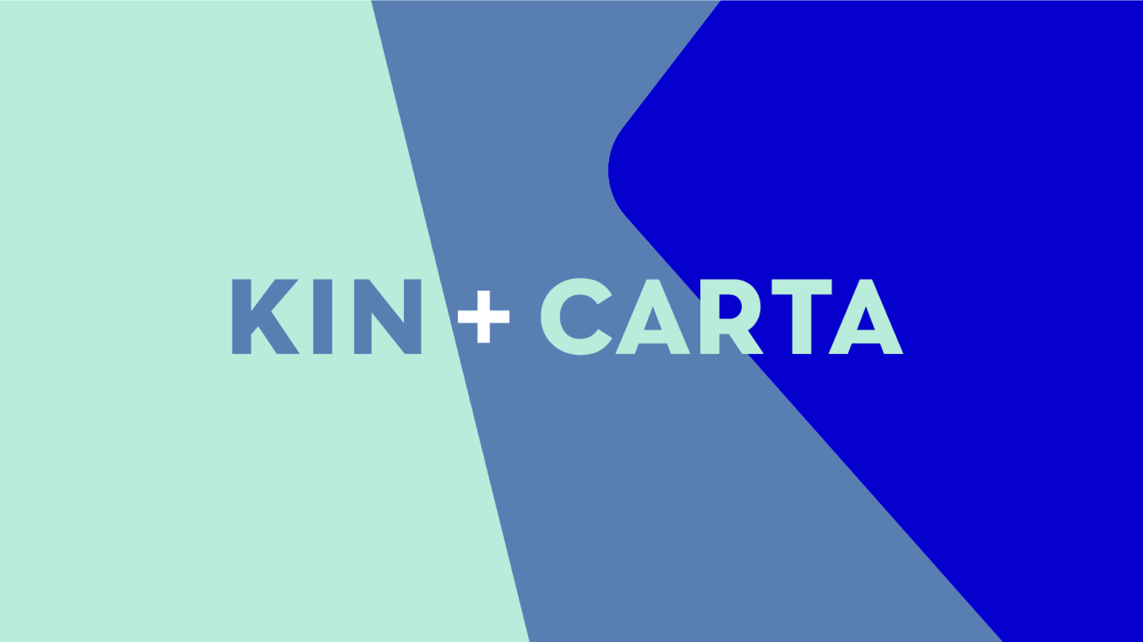
The logo expresses the Kin + Carta proposition, connecting the two words with a plus symbol to represent the bringing together of specialist teams to deliver a bespoke and seamless digital transformation offering to clients. A bold, capitalised typeface reinforces the strength of Kin + Carta’s holistic proposition.
 Creativity and conceptual thinking
Sarah Turner, Managing Director, Carter Wong, said: “We’ve built on the Kin + Carta team’s strategic thinking to create a thoughtful brand positioning that’s encapsulated in a bold new identity which clearly expresses its core values and position as a global connective. Working in collaboration with both Kin + Carta and Reed Words allowed us to slot straight into the team, making the project a seamless experience from start to finish.”
 Sarah Berger, Senior Marketing Manager, Kin + Carta, said: “The vibrant, multi-dimensional brand identity stands out in a crowded marketplace and Carter Wong’s brand architecture thinking is helping us define a new way of working across The Connective. It was a challenging brief and Carter Wong and Reed Words responded with creativity and conceptual thinking.”
Shaping a connective logo
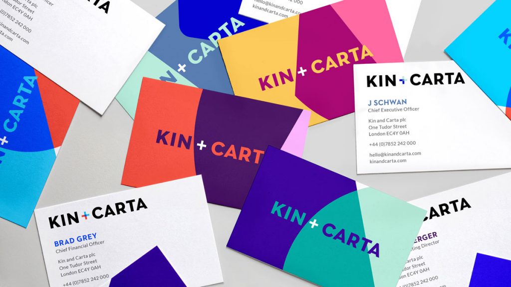
 The logo has in-built flexibility allowing it to be used seamlessly across all internal and external communications. Brightly coloured connective overlays in six tri-colour palettes enable Kin + Carta to amend the nuances of the visual identity to appeal to different sector audiences whilst retaining the strength of the core brand.
These overlays consist of an abstract ‘K’ and ‘C’, with forms that overlap and intersect like a Venn Diagram, reflecting the collaborative nature of the in-house teams bringing together ideas, disciplines, people and processes – individual but united under a single identity.
 Animated versions of these overlays are available for use across the wider brand world, with the connectivity of the shapes fluctuating – moving from interlocking to standing alone. The movement embodies Kin + Carta’s adaptable and flexible nature whilst also emphasising its ability to employ abstract thinking.
The multi-coloured brand landscape represents the diversity and multi-disciplinary nature of Kin + Carta, with each colour combination grounded in the core brand personalities of: Family, Collaborative, Vibrant, Visionary, Intelligent and Curious.
Source: Carter Wong
Carter Wong unveils new visual identity for St Ives Group rebrand as Kin + Carta added by newsroom on
View all posts by newsroom →
You must be logged in to post a comment Login