The Royal National Orthopaedic Hospital (RNOH) Charity unveiled a new identity by Here Design. The charity is responsible for the fundraising and administration of donations that enable improvements to the hospital’s facilities, pioneering research and exceptional patient care.
A fundamental partner to the UK’s leading orthopaedic hospital, the RNOH Charity must communicate clearly and effectively with a wide range of audiences, from the patients themselves to grassroots and corporate fundraising partners, medical professionals and governing bodies.
Over time, the strength of the charity’s identity had become diluted through the breadth of mediums through which they communicate, with a range of different logos and brand expressions in circulation. Here Design was asked to create a modern, simple identity for the RNOH Charity that encapsulated its history and could be easily used on a range of marketing materials without diluting the RNOH brand.
“The RNOH Charity provides outstanding support to a world-leading medical site and its invaluable specialist staff,” says Caz Hildebrand, Creative Partner, Here Design. “To continue this level of support, the charity needed a powerful, contemporary and highly-flexible identity to connect with a modern audience.”
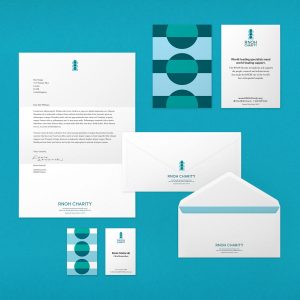
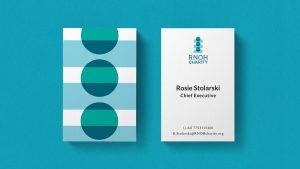
The new identity revolves around the human body, with Here Design introducing a theme of connectivity through the creation of sophisticated, approachable graphics and patterns that focus on support and physical connections. As the backbone of the RNOH, the core icon is a graphic representation of the spine, made up of flexible shapes that can be repositioned for a wide range of applications, from digital apps to apparel.
Stepping away from more traditional medical design codes, Here implemented a bright, uplifting colour palette to bring warmth and character to the brand. Combined with a set of playful graphic assets, this dynamic approach creates inbuilt flexibility within the brand identity, allowing it to connect with a wide range of audiences from patients to corporate partners.
These graphic shapes can be reconfigured to act as visual metaphors, such as vertebrae down the back of a t-shirt or coins falling into a fundraising pot, adding a level of playfulness and wit whilst clearly communicating the important work of the RNOH Charity.
Here Design also worked closely with RNOH staff to design a patient welcome pack to make hospital stays as comfortable as possible, including beautifully-designed useful items such an eye mask and ear plugs, and an information booklet on how to use the TV and radio.
The flexibility of the brand assets sees secondary shapes scaled and repeated to create eye-catching patterns used across fundraising packs, apparel, notebooks available in the hospital gift shop, the RNOH website and corporate materials. Currently in development is a digital app for patients, providing an educational platform including games for children, and way-finding and procedural information.
Josh Williams, Lead Designer, Here Design says: “Hospital can be an overwhelming place and small design touches can have a large impact on a patient’s stay. It can make the experience more human and reassure people in times of need, whether that’s through cheerful, positive assets, the uplifting copy in an ad campaign or simply offering a cosy pair of socks and clear, easy-to-read information about the hospital when they arrive.”
Rosie Stolarski, CEO of the RNOH Charity, said: “The RNOH Charity strengthens and supports the people, research and infrastructure that make the RNOH one of the world’s best orthopaedic hospitals, so we needed an identity that connected with these audiences on a meaningful level. Here Design has delivered a bold, colourful identity full of personality and positivity that will work fluidly across our digital platforms, print publications and beyond.”
Source: Here Design
Here Design delivers flexible, dynamic new identity for Royal National Orthopaedic Hospital Charity added by newsroom on
View all posts by newsroom →
You must be logged in to post a comment Login