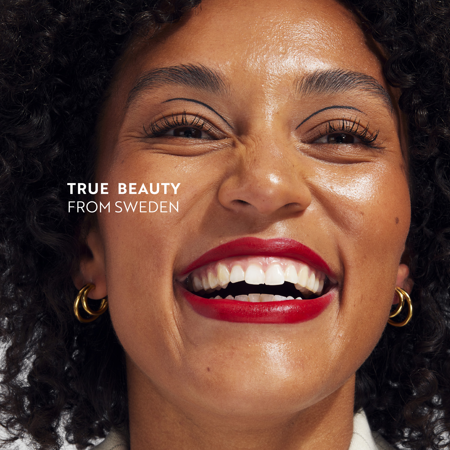
With an ambition to redefine beauty, IsaDora has presented a new brand platform, visual identity and packaging design created together with the Scandinavian consumer branding agency Everland. Inspired by its 40-year-old heritage, it brings to market what few others can do: Swedish genuineness.
Few brands have thrived beyond a decade in an industry notoriously obsessed with youth, picture-perfect models and assurances of miracles. However, one to have made it without these pitfalls is the Swedish makeup brand IsaDora, which can boast of being 40 years old while being in 40 different markets.
“IsaDora has something very few brands have: genuineness”, adds Carl Larsson, Creative Director and Partner at Everland. “We knew it was this special ingredient we had to bring out in the new brand.”
Together, IsaDora and Scandinavian consumer branding agency Everland worked on a new brand platform, visual identity and packaging design that would make all ages fall in love with the brand all over again.
Rasmus Helt Olsen, CEO at IsaDora, continues, “Being Swedish means being genuine added with subtle coolness. It’s honest, authentic and empowering. This moral compass helps us stay true, transparent, and responsible in everything we do. Ultimately, being inclusive allows everyone to set their own beauty standards, and for us to reconnect with a younger audience in a more modern way.”
Open, Original, Swedish
Before diving into the design, Everland carefully researched the company, category, culture and consumers. The team had to get an understanding of the offset, the aim, and the field the brand was playing in.
Along the way, they learned how IsaDora has been pushing the industry since its founding in 1983. The Swedish company even pioneered cruelty-free, ophthalmologically tested and fragrance-free products well before consumers and category standards demanded it.
“IsaDora doesn’t shout its achievements from the rooftops; it’s simply superior, already having done the better thing for decades. We highlight this kind of noble attitude in the new visual identity for IsaDora”, adds Carl Larsson.
“We want to redefine beauty,” adds Felicia Ibsen, Global Marketing Director at IsaDora. “Now, we have the visual branding tools to meet our ambitions, and they aren’t just superficial but deeply strategic, practical and commercial. They’ll help us reconnect with a younger audience in a modern way, all while being proud of what IsaDora has achieved and continue to strive for as we celebrate all kinds of beauty.”
Timeless Beauty in Detail
IsaDora redesigned its visual identity and packaging design based on the refined brand platform. The team at Everland helped bring out the makeup brand’s renewed confidence in every single design element, clearly emphasising its position in multiple markets and telling its long and proud history.
“Each element embodies honesty while it never compromises, yet still manages to bring forth the timeless grace of the Swedish makeup brand,” as Carl Larsson puts it.
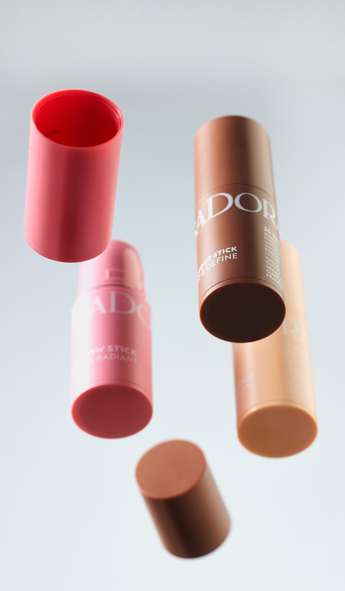
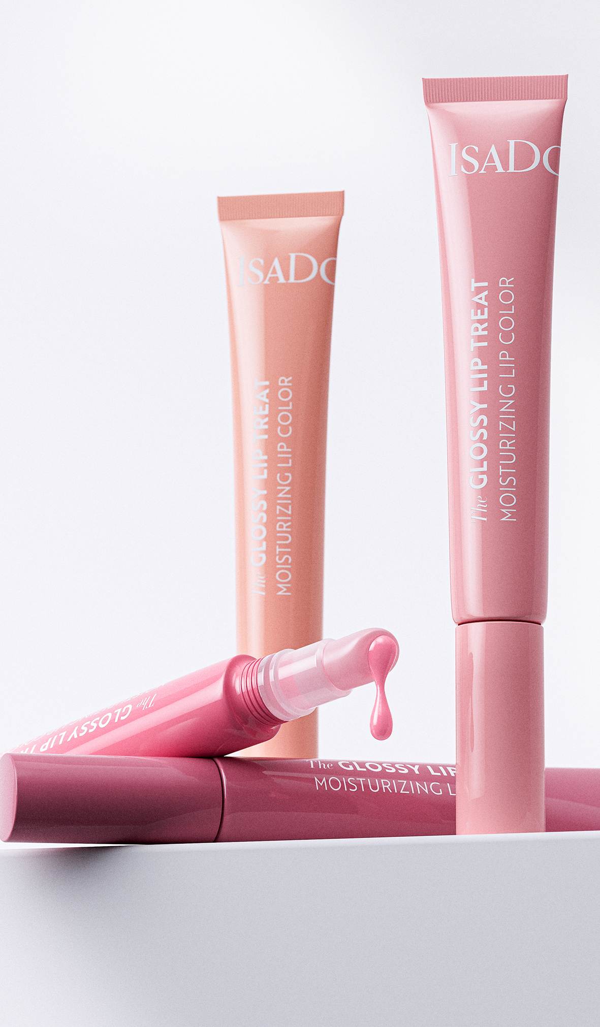
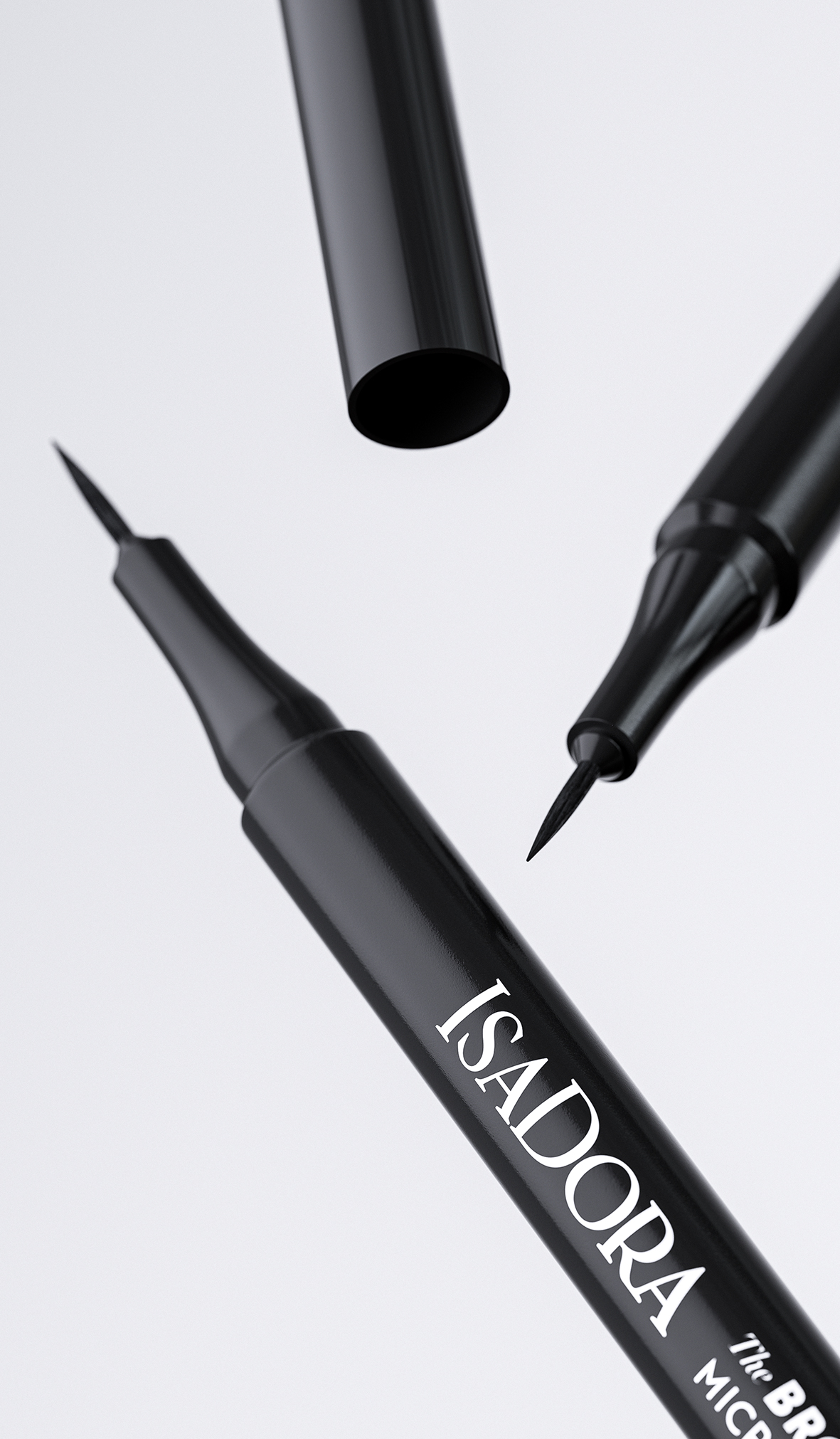
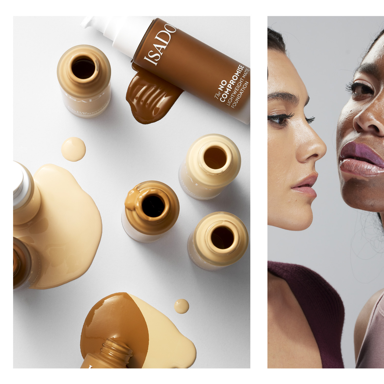
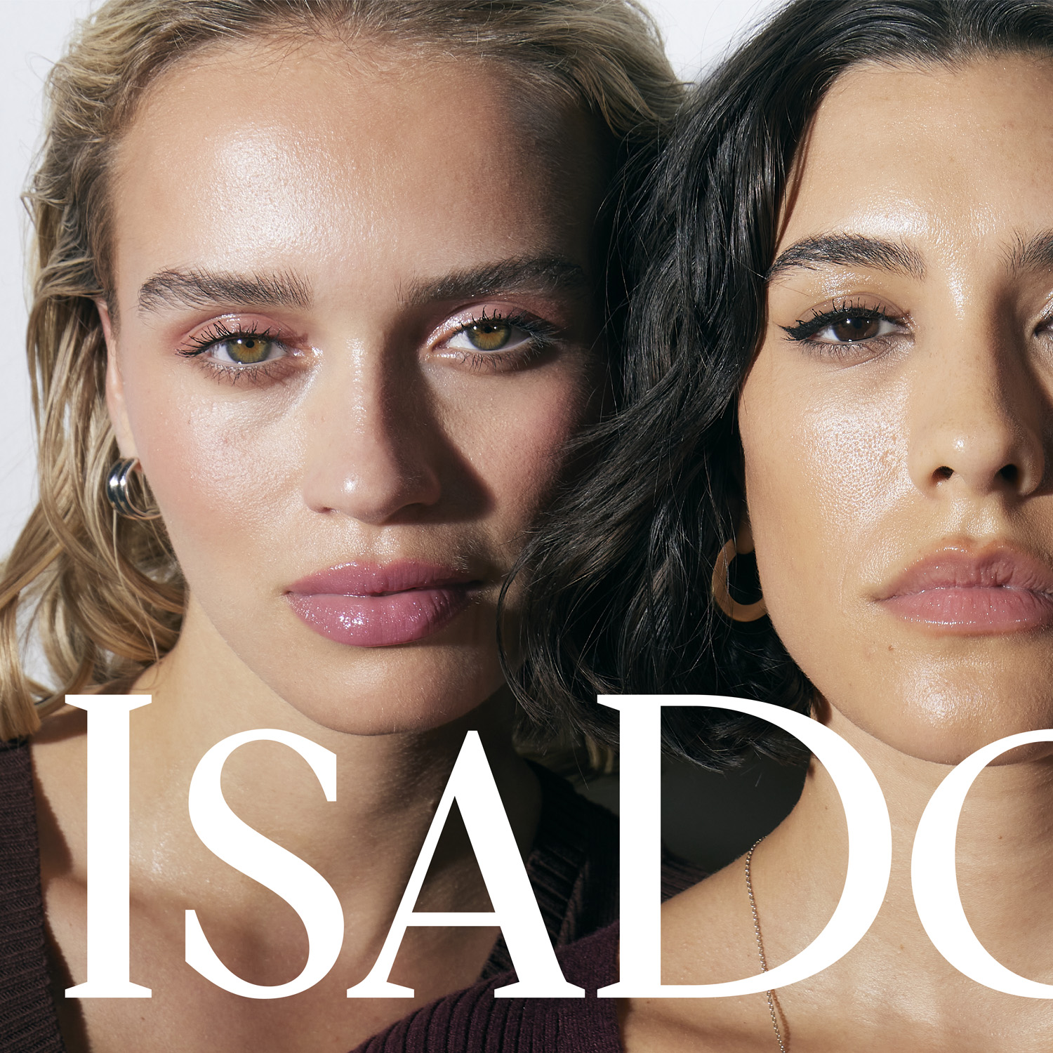
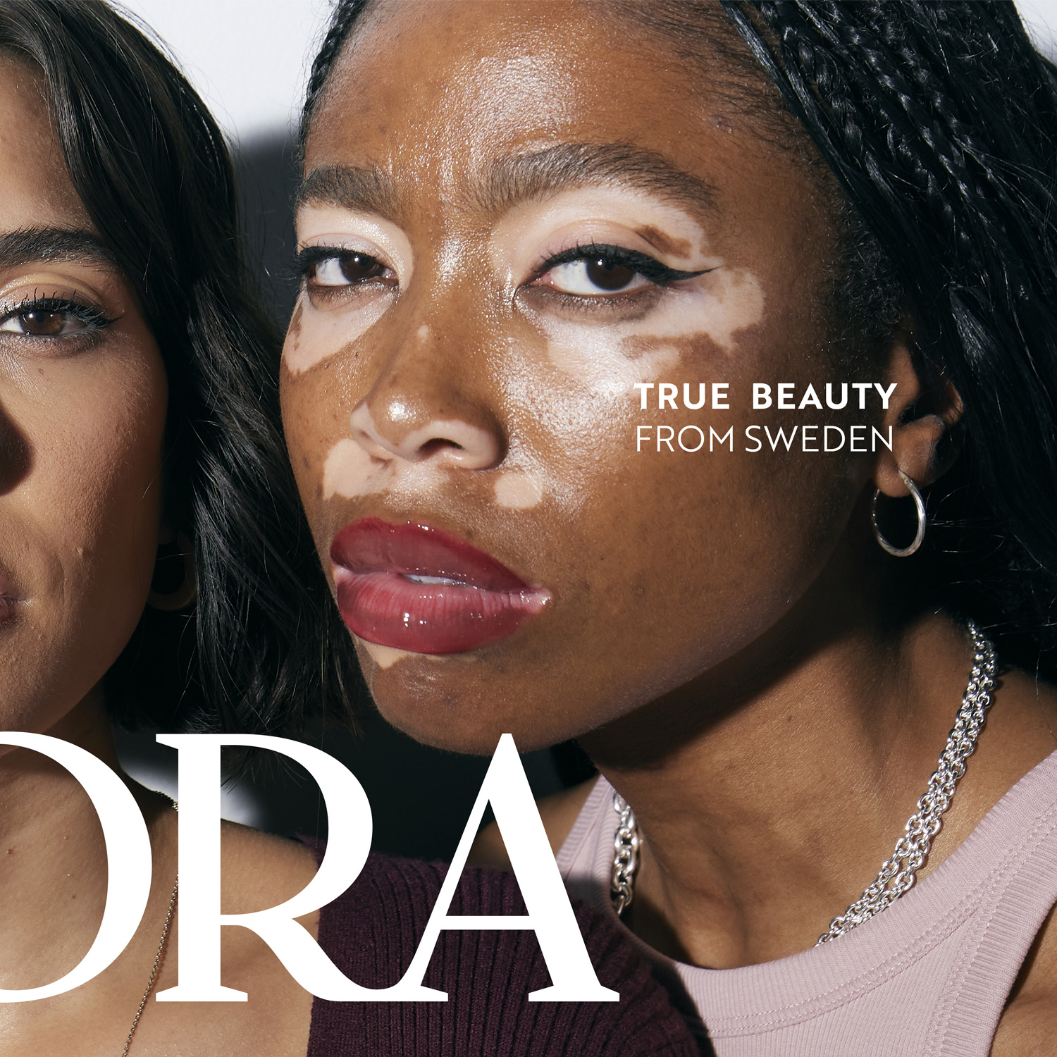
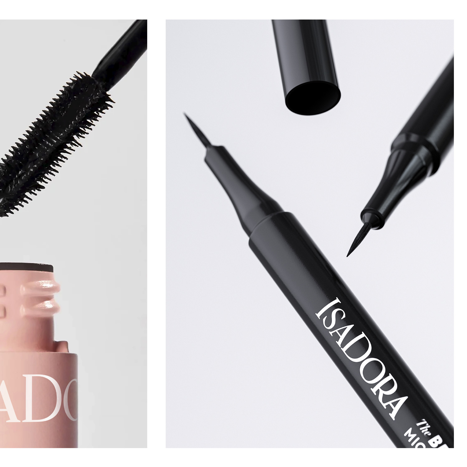
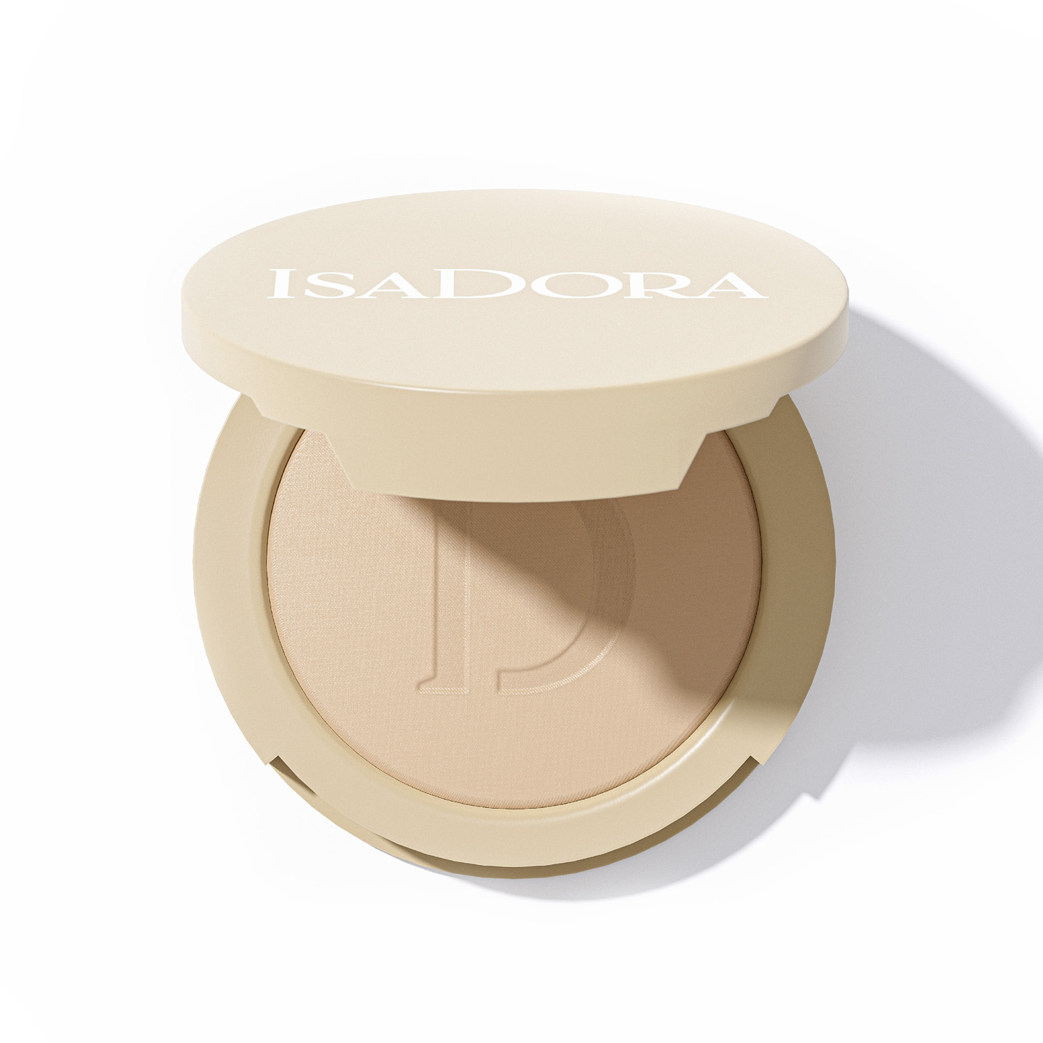
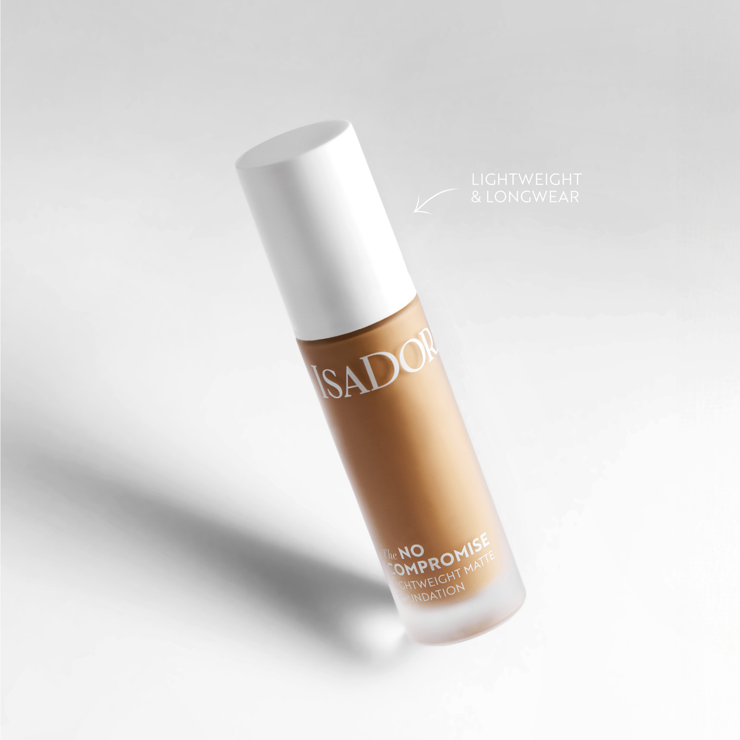
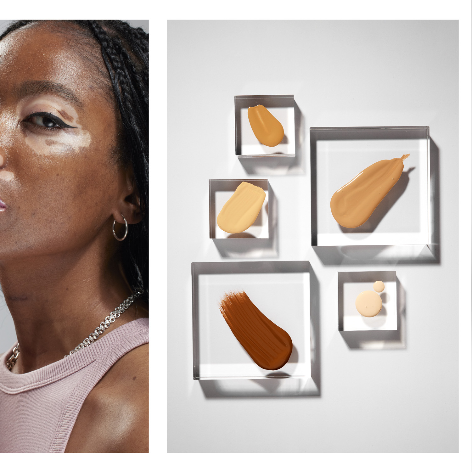
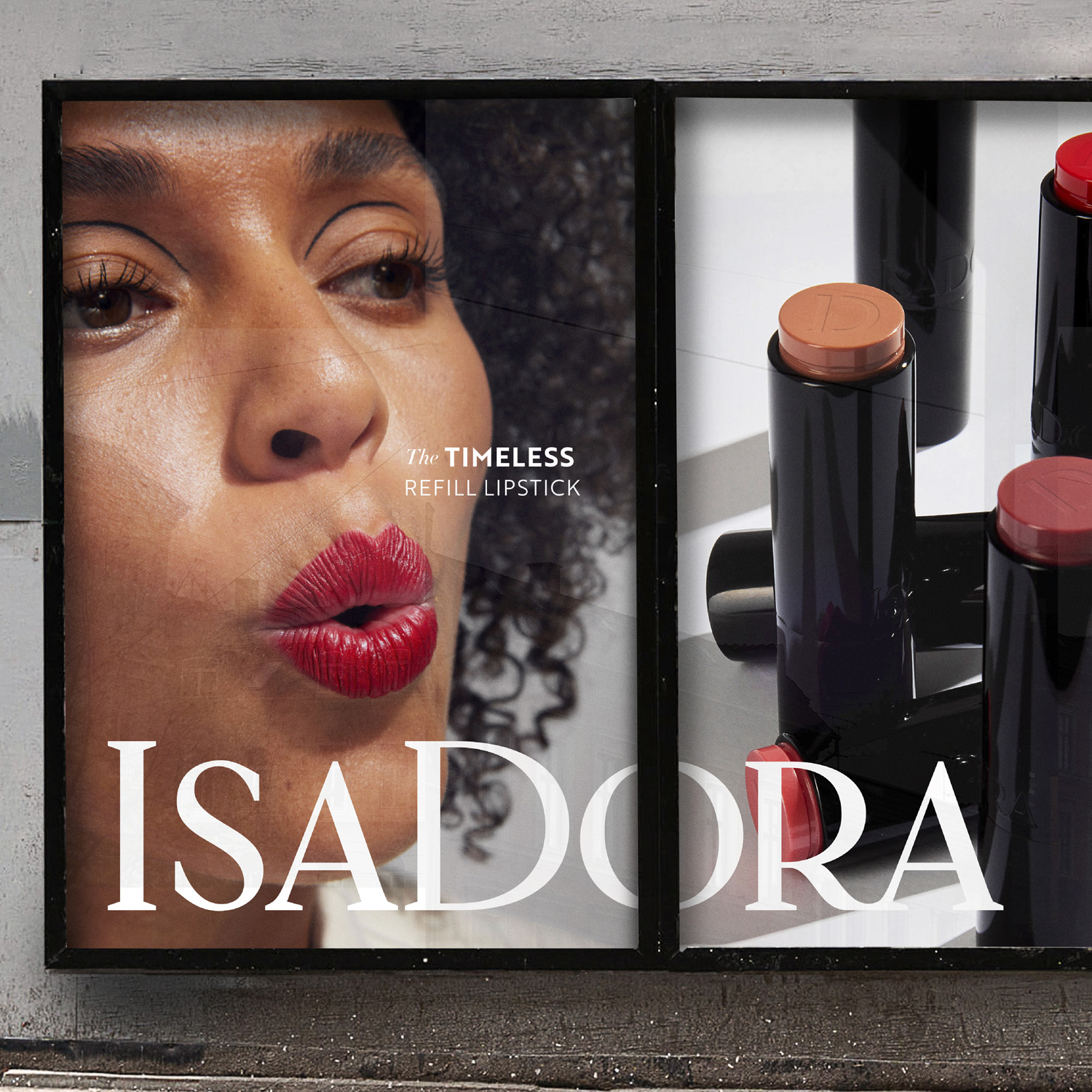
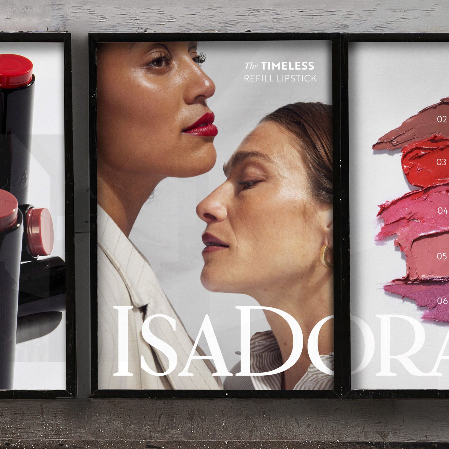
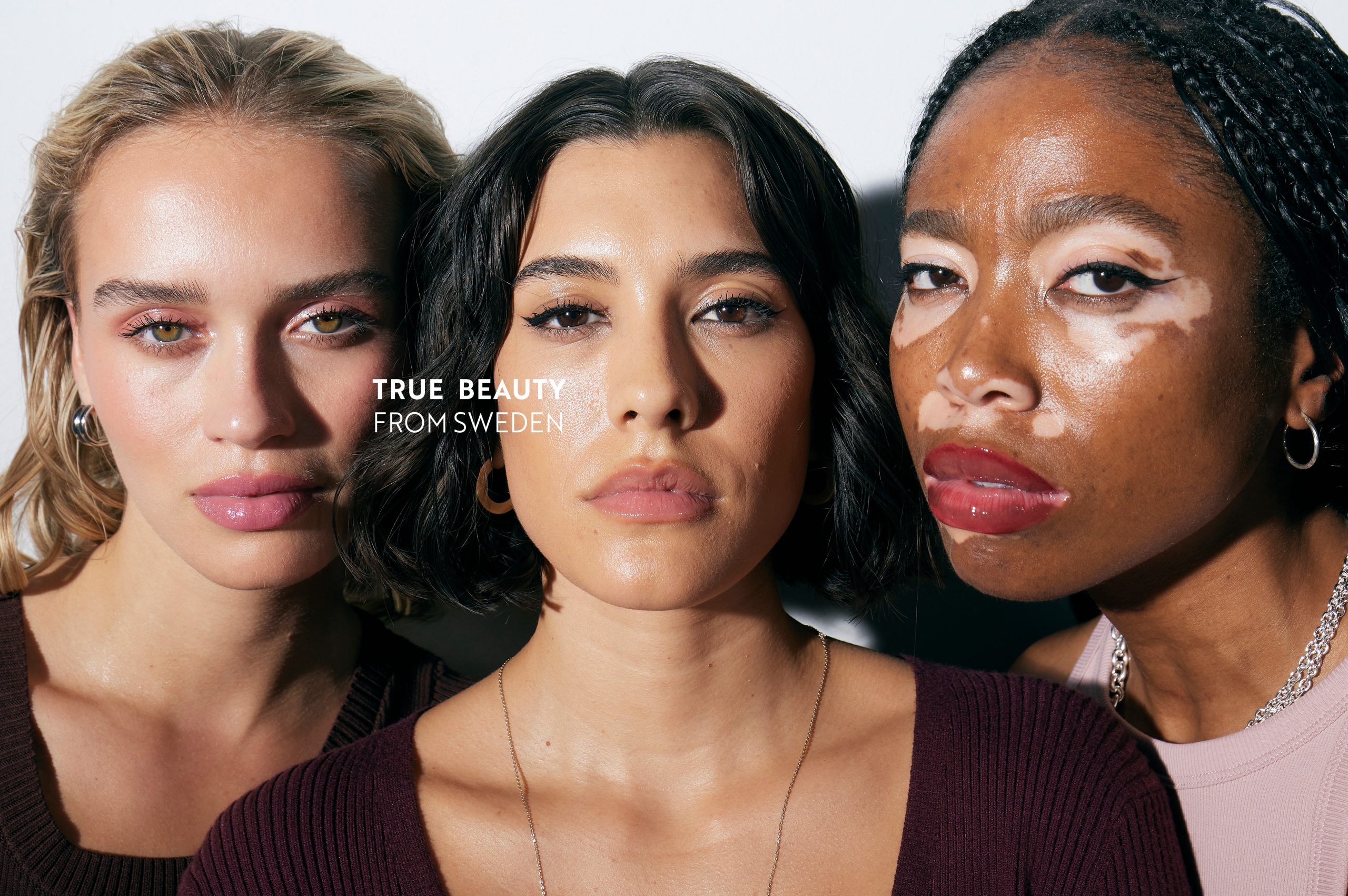
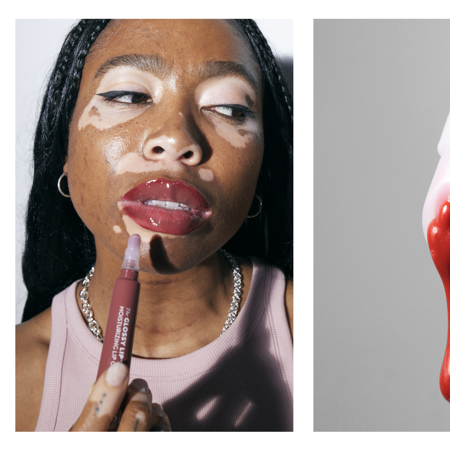
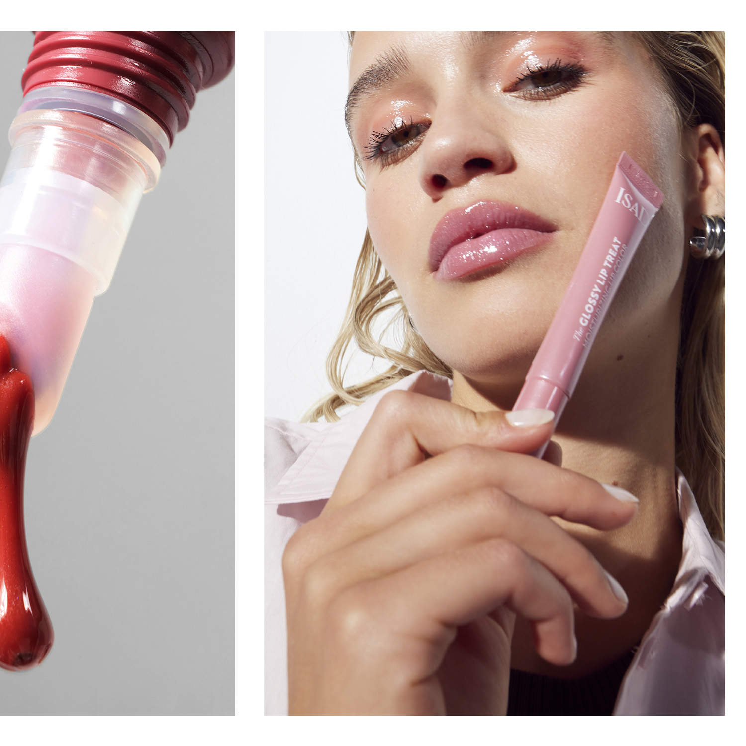
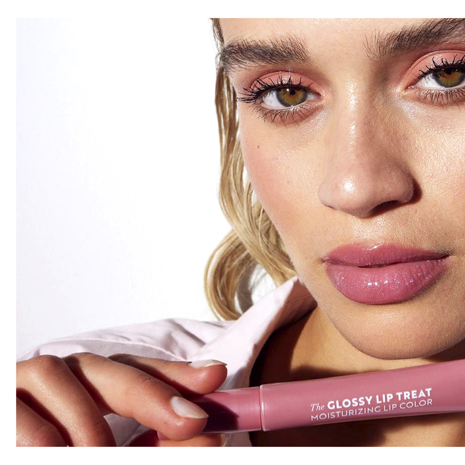
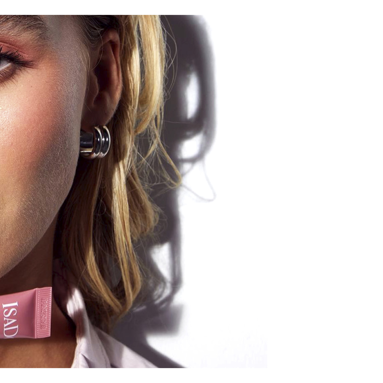
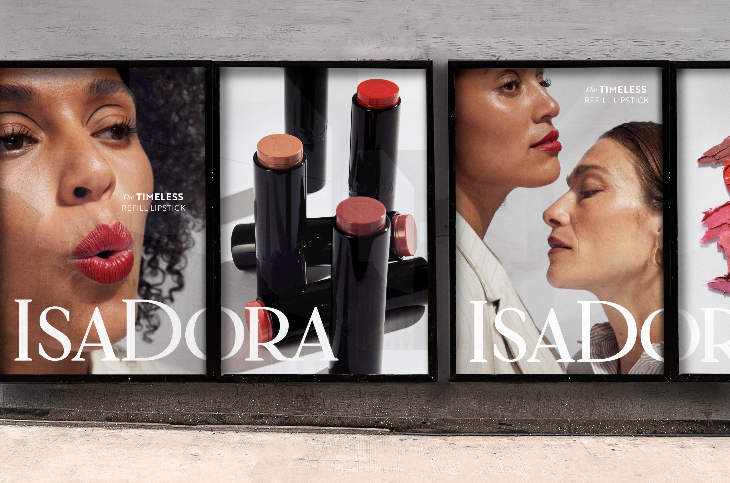
The logo is reworked to be more elegant and balanced with stylish serifs, which better reflect the brand values compared to the previous version. Multiple typefaces enable eclectic expression, mirroring Scandinavian minimalism. Its geographical and cultural roots are also visible in the redefined photo style, which is more inclusive and timeless.
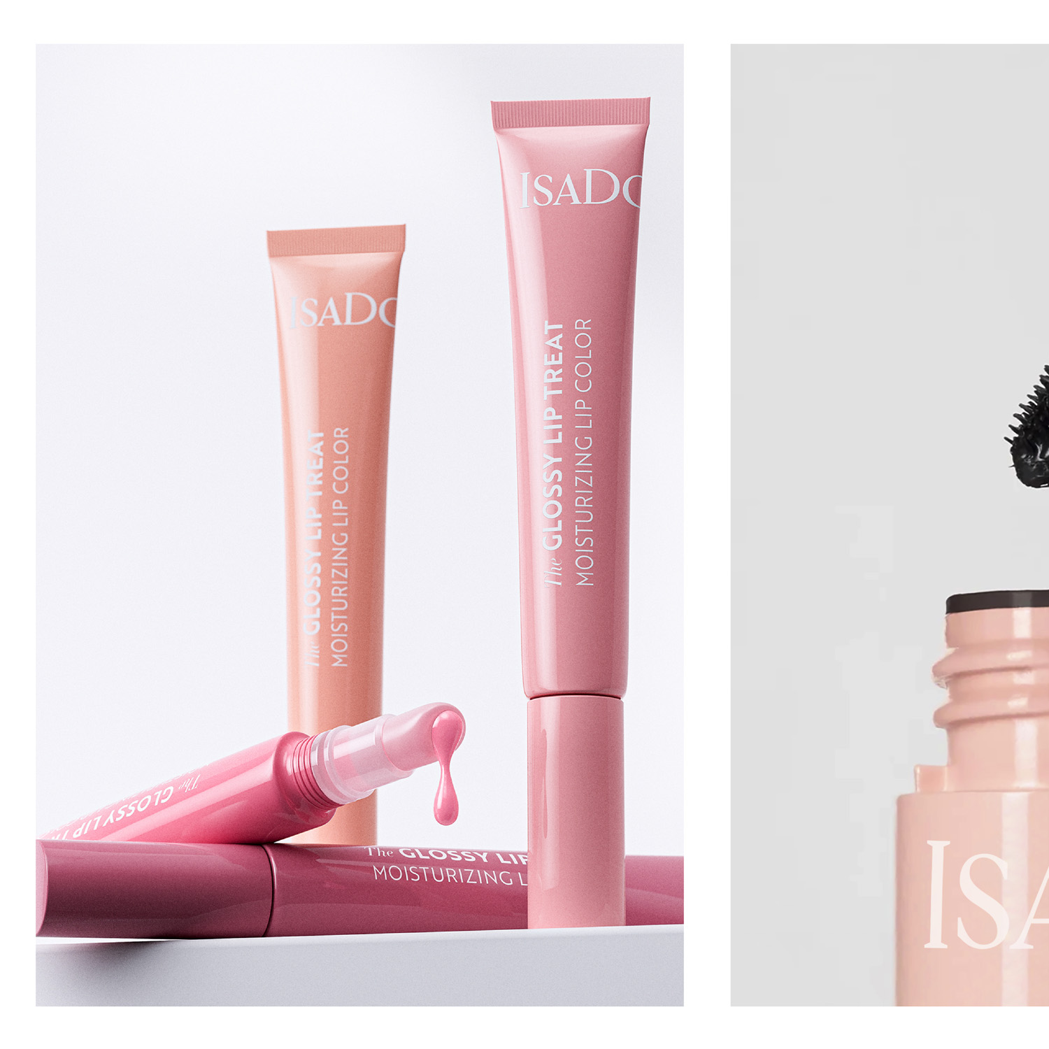
“We added ‘the’ to all product names,” Larsson continues. “A small thing, but it reflects the pride and care IsaDora puts in every product. All products are hero products, so to speak. That is also why we gave the packaging the same colour as the product. We aren’t afraid to show the content because we’re very proud of it.”
Need more information?
Explore the new visual identity and packaging design on IsaDora’s website, social media and in stores.
Learn more about IsaDora on its website: https://www.isadora.com/
Source: Everland
IsaDora Brings Out True Swedish Beauty in New Brand Design added by newsroom on
View all posts by newsroom →
You must be logged in to post a comment Login