For serial entrepreneur Marc Lore’s ambitious Wonder project, the agency created the new branding that was implemented across consumer touch points.
Creative agency Mrs&Mr has designed the branding system for Wonder, a food startup that is pioneering a new category of “fast-fine” dining. Wonder features some of the world’s best chefs, including Bobby Flay, José Andrés, Nancy Silverton, Marc Murphy, Marcus Samuelsson and others, along with award-winning restaurants such as Tejas Barbecue, Di Fara Pizza, Barrio Café, Maydan and more. They operate a collection of delivery-first restaurants that bring unprecedented convenience to at-home dining.
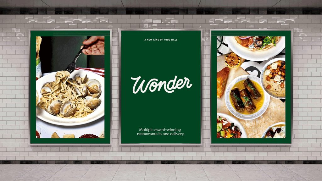
With 10+ locations now open throughout New York City and New Jersey, customers can mix and match from more than 30 celebrated restaurants in one simple and seamless order. But all that choice needed to be captured in a visual identity to tie all these restaurant brands together within the Wonder brand.
“In the unremarkable world of food delivery, where consumers are constantly compromising quality over convenience, Wonder needed a visual identity that was both inviting and elevated to reflect its remarkable yet accessible offering,” said Mrs&Mr founder and CCO Kate Wadia. “We created a system that lives up to the brand’s name to create a feeling of unexpected surprise and delight in a category that underwhelms and underdelivers.” The agency won the Wonder branding project in October 2022.
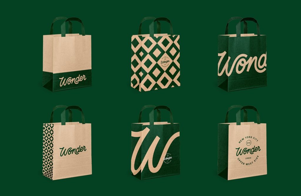
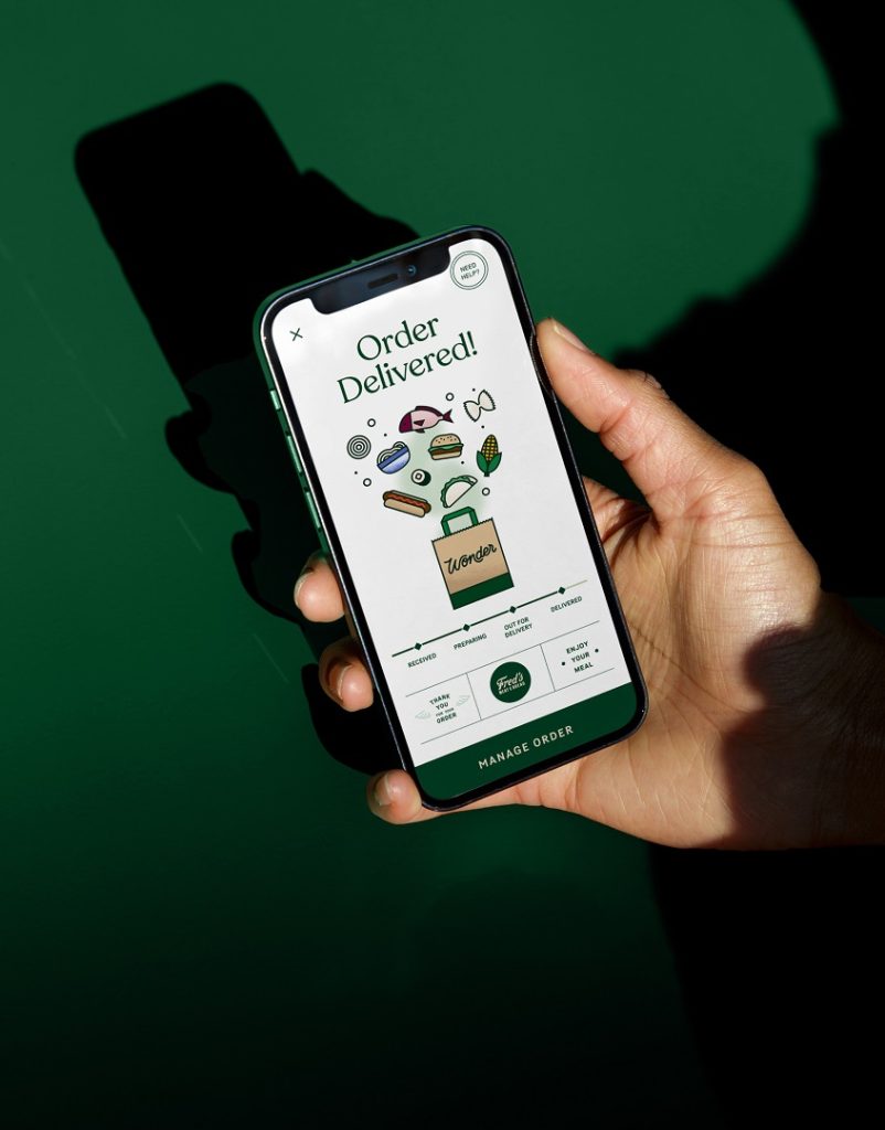
Mrs&Mr articulated the brand’s positioning and created the visual identity that was applied to every Wonder asset and consumer touch point. These included the logo, typography, color system, store signage, packaging, photography, uniforms, menus, delivery vehicles, promotional materials and physical designs.
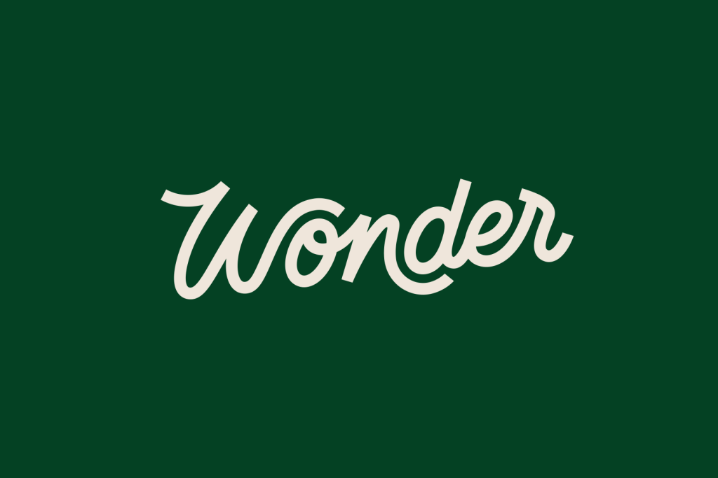
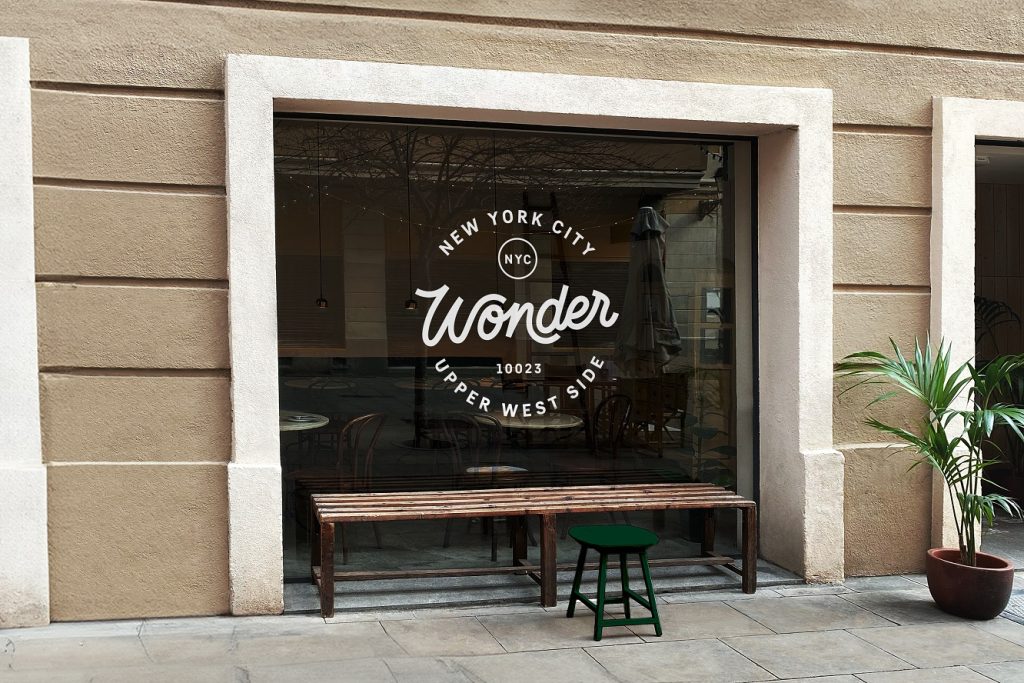
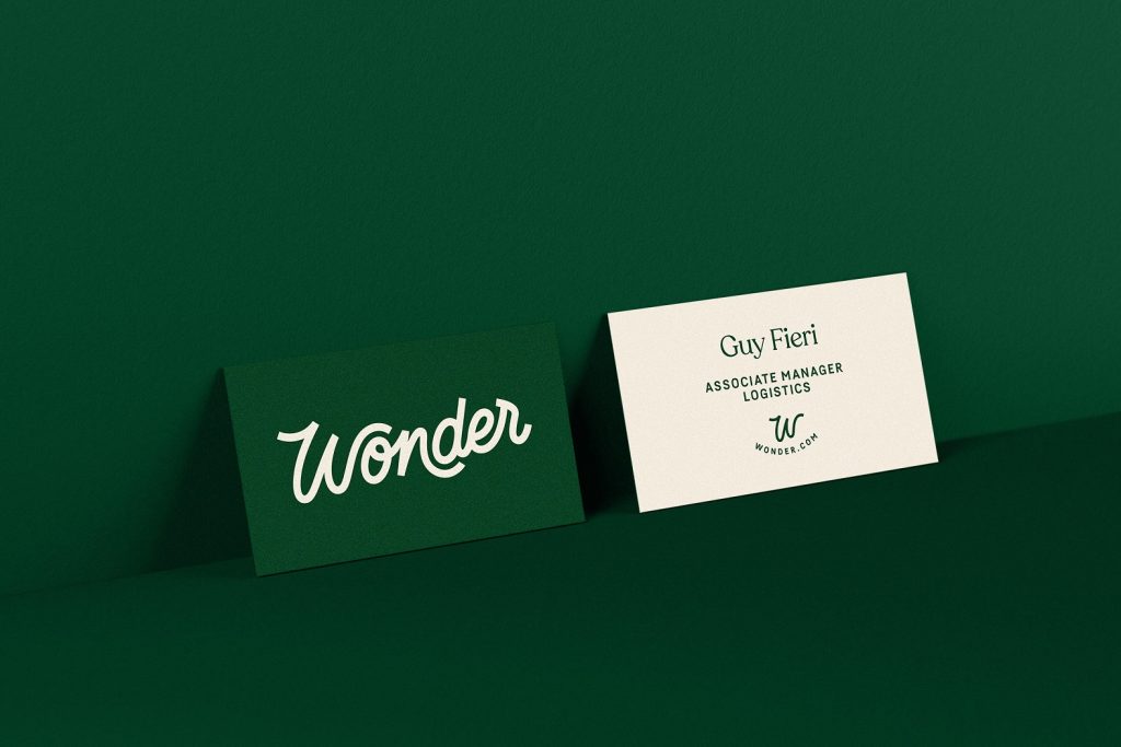
Restaurant branding has a long history of using script fonts in their logos. Mrs&Mr wanted to tap into this cultural tradition, which communicates heritage and establishment, but do so with a modern take. The hand-lettering we created for the new Wonder wordmark is a fully custom monoline script with flat terminals to give it a contemporary edge. The italic nature of the letter forms—paired with the swash of the W curved up over the o and then continued by the ascender of the n—creates a feeling of motion, fluidity and energy, allowing the logo to successfully communicate both heritage and momentum.
Wonder is a house of brands, so Mrs&Mr needed a color that would not clash with the many restaurant brands they partner with. The dark green works as a neutral, anchoring color that is both lush, appetizing and fresh.
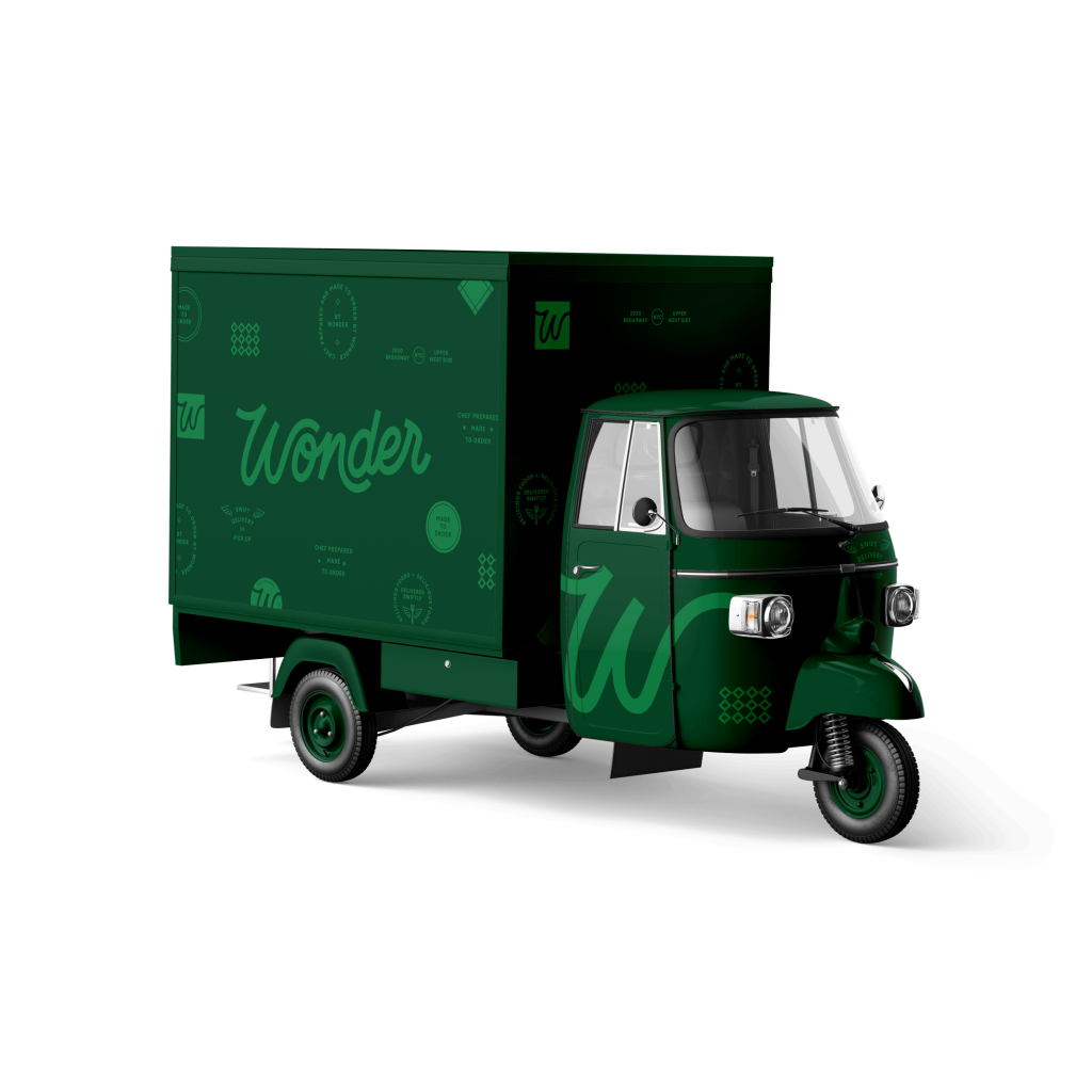
Inspired by the materials used in authentic French brasseries, the patterns we developed are reminiscent of vintage floor and wall tiles; repetitive geometric shapes in hues of green.
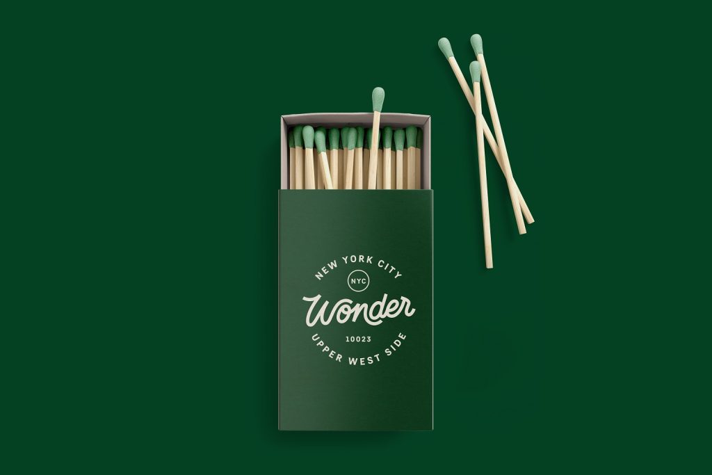
Iconography in the form of badges allows us to efficiently communicate an abundance of information and expresses the feeling of a stamp of approval. It was important to localize per store, so we built flexibility inside a framework into the iconographic system.
Most recently, Wonder acquired Blue Apron (the pioneer of the meal-kit industry) to further enhance its offerings and deliver chef-curated meals with high-quality ingredients to more customers across the country, which further stressed the necessity to design a brand and customer experience that captured Wonder’s super app for mealtime.
“At the end of the day, convenience and quality shouldn’t be mutually exclusive. Mrs&Mr designed our brand to bring this promise to life—whatever people are in the mood for. From fast-fine to fast-casual, Wonder makes remarkable food remarkably accessible,” said Lynsay Reynolds, head of creative and brand at Wonder.
Source: Mrs&Mr

You must be logged in to post a comment Login