Creative branding and communications agency Our Design Agency (ODA) reveals strategy, identity and design for digitally enabled building supplies start-up BUILT/.
 Challenger brand BUILT/ is shaking up the building supplies sector by creating an offering that appeals to builders who want an efficient and digital service at their fingertips.
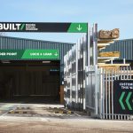
ODA’s challenge was to design a total brand experience, personality, tone of voice, and service proposition ideas, down to details such as uniforms across the omnichannel business. Understanding how the business could save builders time and money at every interaction was at the heart of their approach, with each element in the customer journey carefully considered. The first BUILT/ depot launched in Aston, Birmingham, with a second due to open in Birmingham this summer.
Build it and they will come
 Sarah Westwood, Creative Strategist, ODA, says: “We had to understand the needs of a new breed of professional builder and ensure we were doing everything from their perspective, without alienating those with less experience of on-demand services. Our proposition was: ‘Your 24-hour building site’, which we brought to life with BUILT/Building Supplies on Demand to reflect the ease with which builders could order and collect their materials. We knew that if we looked and behaved like other builders’ merchants we risked indifference so it had to feel like a step change.”
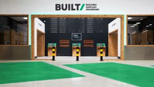
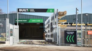
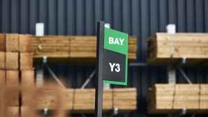
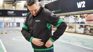
 ODA also worked with the team on developing service propositions including ‘Lock and Load,’ based on the click and collect model used on the high street. After ordering digitally, customers arrive in their vans to be directed to allotted bays, where staff wait with their items, ready to lock and load. ODA imagined the role of BUILT/ staff role as that of a pit crew, whose mission was to help customers get in and out as quickly as possible. This idea is reflected in their uniform design.
Built for efficiency
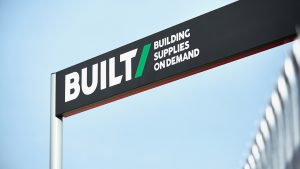
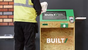
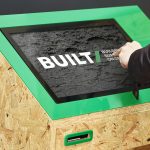
 BUILT/’s forward slash roots the identity system in the online world immediately, sitting well alongside other well-known digital brands, while the shape and iconography works in both physical and digital spaces. The identity system features throughout the store, highlighting the efficiency of the service.
A bespoke streamlined typeface takes inspiration from the forward slash, communicating the brand’s digital expertise. The heavy and streamlined font fits well within the building supplies sector.
 A strong differentiated colour palette helps BUILT/ to stand out among its competitors, where primary colours such as red and blue tend to dominate. Online product photography for the website is positioned at the same angle as the forward slash, creating a sleek and professional look.
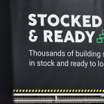
To help customers adapt to BUILT/’s digital offering, the store environment had to feel familiar while also communicating the principal benefits of the service: saving time and money. Recognisable raw materials such as concrete and chipboard feature alongside the personality and tone of voice that focuses on friendly efficiency, using punchy and professional language.
 Westwood adds: “Thinking about how every single aspect of visiting BUILT/ would deliver on the idea of saving a builder’s time and money led us to look beyond the design of the identity to consider the design of services, the role of the team and how customers would experience that on demand promise. We also created a truly omnichannel identity that works well across the kiosk, in print and online, across real world and digital. That was a huge challenge – and in the end a huge success.”
 “We’re a start-up business, who have seen an opportunity in the builder’s merchant space to digitise the retail model and improve the service levels builders face when sourcing from suppliers. We’ve redesigned the supply chain and builders’ warehouse format, and we’ve had an opportunity to do that with a blank canvas,” adds Nick Thomas, Founder and Managing Director, BUILT/. “We get a lot of positive remarks about the credibility of the look of the brand: it looks serious, works across all elements of our depot and website. The building supplies on demand idea from ODA was a stroke of genius because it really encapsulated what we were trying to go for and we have led with that right from the start.”


Source: Our Design Agency
Our Design Agency launches strategy, identity and design for BUILT/ added by newsroom on
View all posts by newsroom →
You must be logged in to post a comment Login