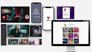
Red Bee, the creative and branding agency, announced the launch of broadcaster Telemundo’s refreshed brand design.
 As the leading Spanish-language broadcaster in the United States, Telemundo is recognised for redefining Hispanic media and content. Red Bee was tasked with leading the rebrand and campaign launch. The agency’s work encompassed; devising the creative-strategy that became the ethos of ‘Together Unstoppable’, driving and delivering the consumer brand campaign that launched during the 2018 FIFA World Cup, and developing the brand redesign, including a new network logo.
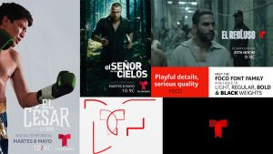
The key objective of the brand refresh is to continually drive attribution back to the master brand. To achieve this, Red Bee shifted the network towards a tighter branded house model, aligning all sub-brands, genre brands and show logos under the hero Telemundo “T” icon and developing a consistent logo position to lock into show titles. The result is a stronger, more consistent presence across all platforms – TV, digital and out of home.
The Red Bee team took inspiration from the original Telemundo logo concept that shows “two worlds coming together” which reflects the audience’s shared American and Hispanic identities, and gave the marque a simple, clean look that works much more impactfully in multiscreen environments than the previous iteration.
 The team also introduced a new logotype and brand font, Foco, for use across all elements of the brand identity, as well as a refined colour palette that makes much stronger use of the brand’s heritage red. The new brand visuals were developed to embody the brand’s strong sense of movement and dynamism, with an active identity that doesn’t sit still and which works impactfully across all platforms where the brand is seen by its audience. Red Bee also created specially-shot idents that burst with energy and movement, starring Telemundo talent, and which give the brand increased prominence on-air.
Charlie Mawer, Executive Creative Director at Red Bee, said: “The Telemundo brand refresh set out to tackle some key issues and to position itself as a serious player in a competitive, changing media environment. We wanted to ensure the genre-busting new shows from Telemundo were attributed back to their brand, so we focussed our efforts on developing a tightly-defined, clean brand identity that is consistently applied everywhere the brand is seen. Above all, every design element originates from the new brand position of an ‘unstoppable momentum’. We have loved every minute of this project and are very excited to see how the brand embodies its new spirit.”
“Our brand refresh complements how we are redefining Hispanic media and keeping pace with the evolving consumption habits of today’s Hispanics,” said Karen Barroeta, SVP, Marketing and Creative, Telemundo Networks. “We set ourselves apart as the network that continues to defy norms and set a new standard in Hispanic entertainment with premium, original content across all platforms. Red Bee has captured all of that and more with this work.”
Source: Red Bee

You must be logged in to post a comment Login