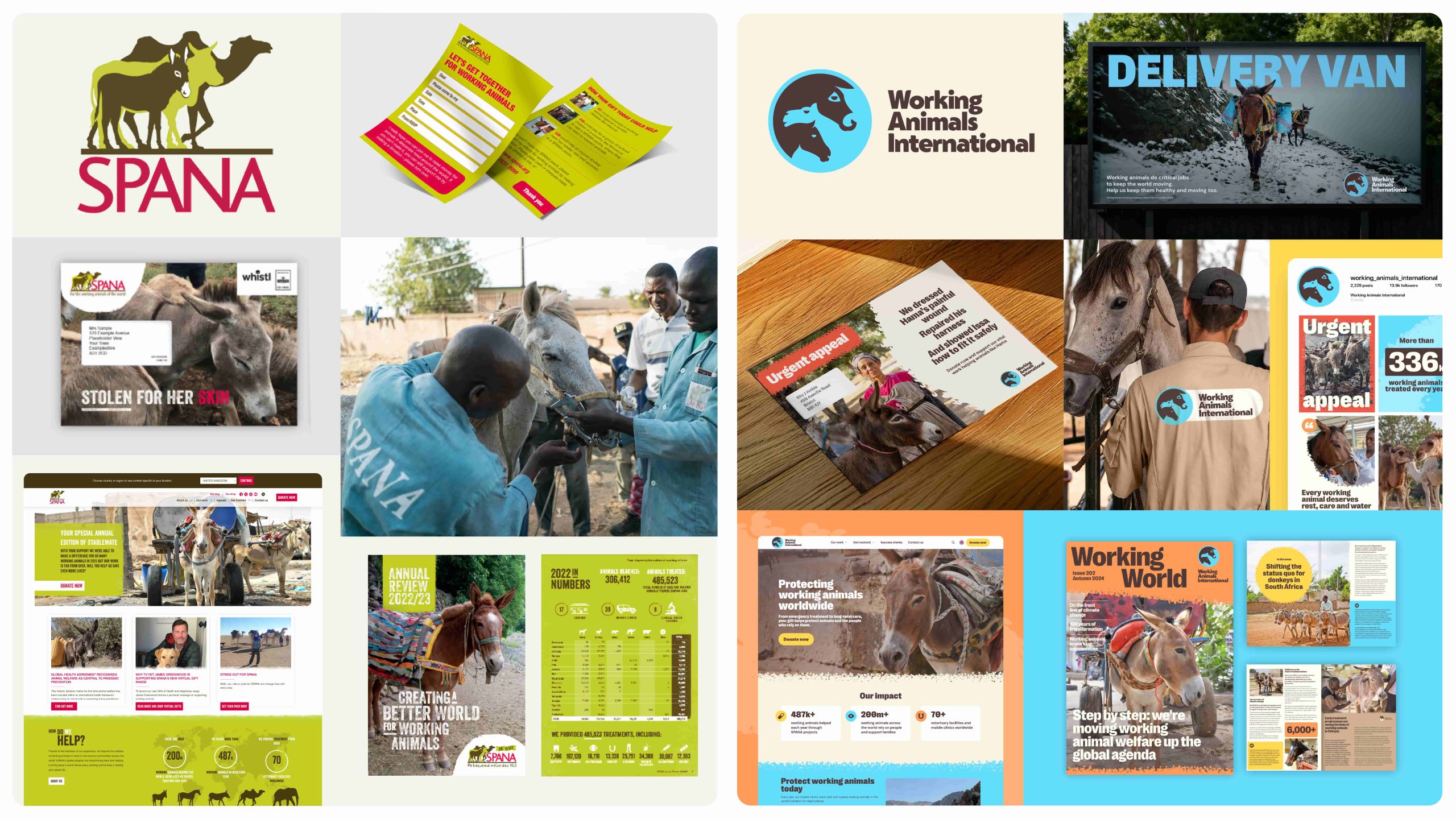
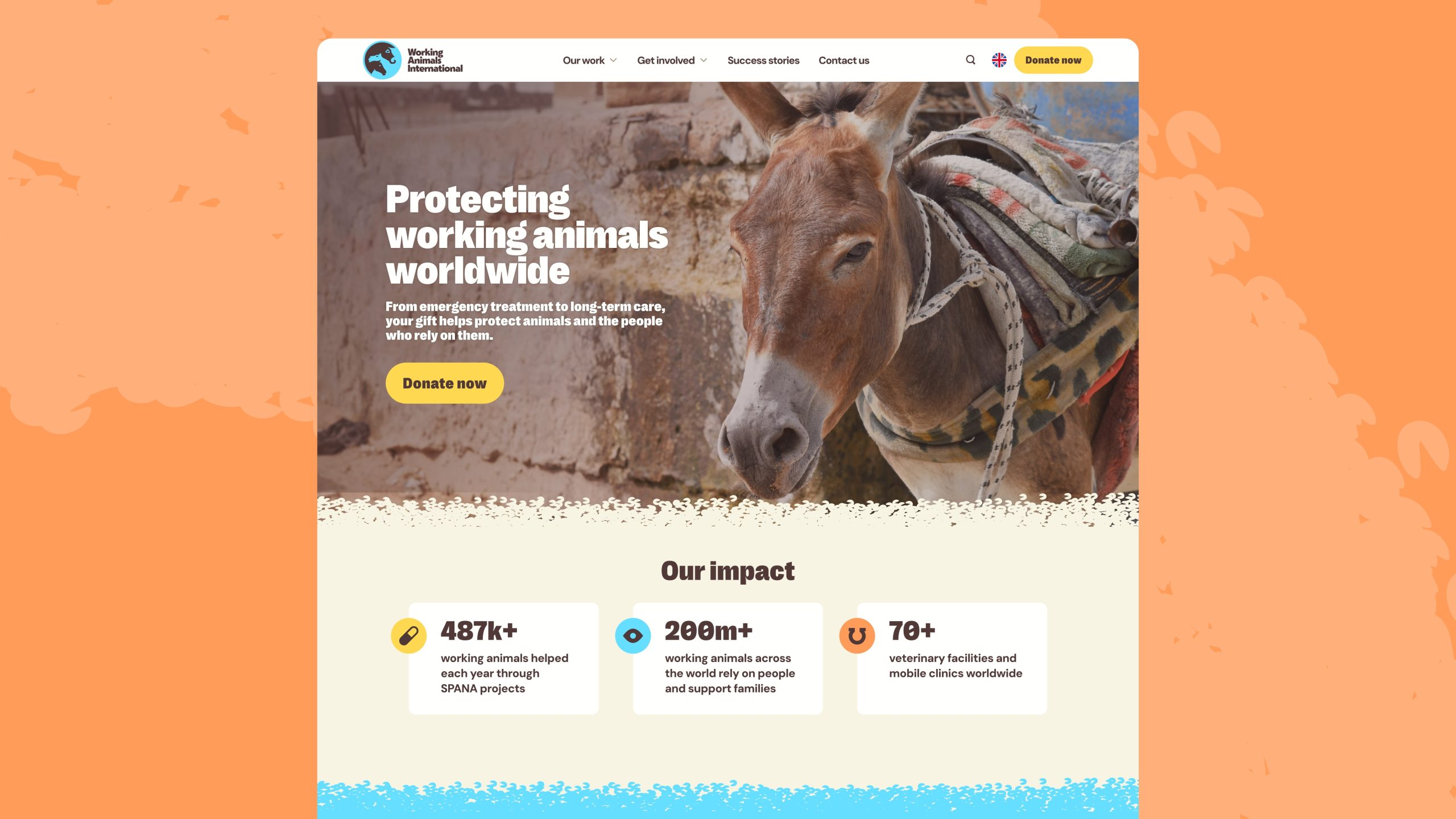
Animal welfare charity SPANA has rebranded as Working Animals International, a name that more clearly reflects its global mission to support working animals and the communities that depend on them.
Since 1923, the charity has been dedicated to improving the lives of working animals, beginning in North Africa and later expanding to the Middle East, Asia, Africa and Latin America. Based in the UK, Working Animals International works through a series of locally-based partners , increasing access to veterinary care, helping owners develop the knowledge and skills to care for their animals, and campaigning for policy change.
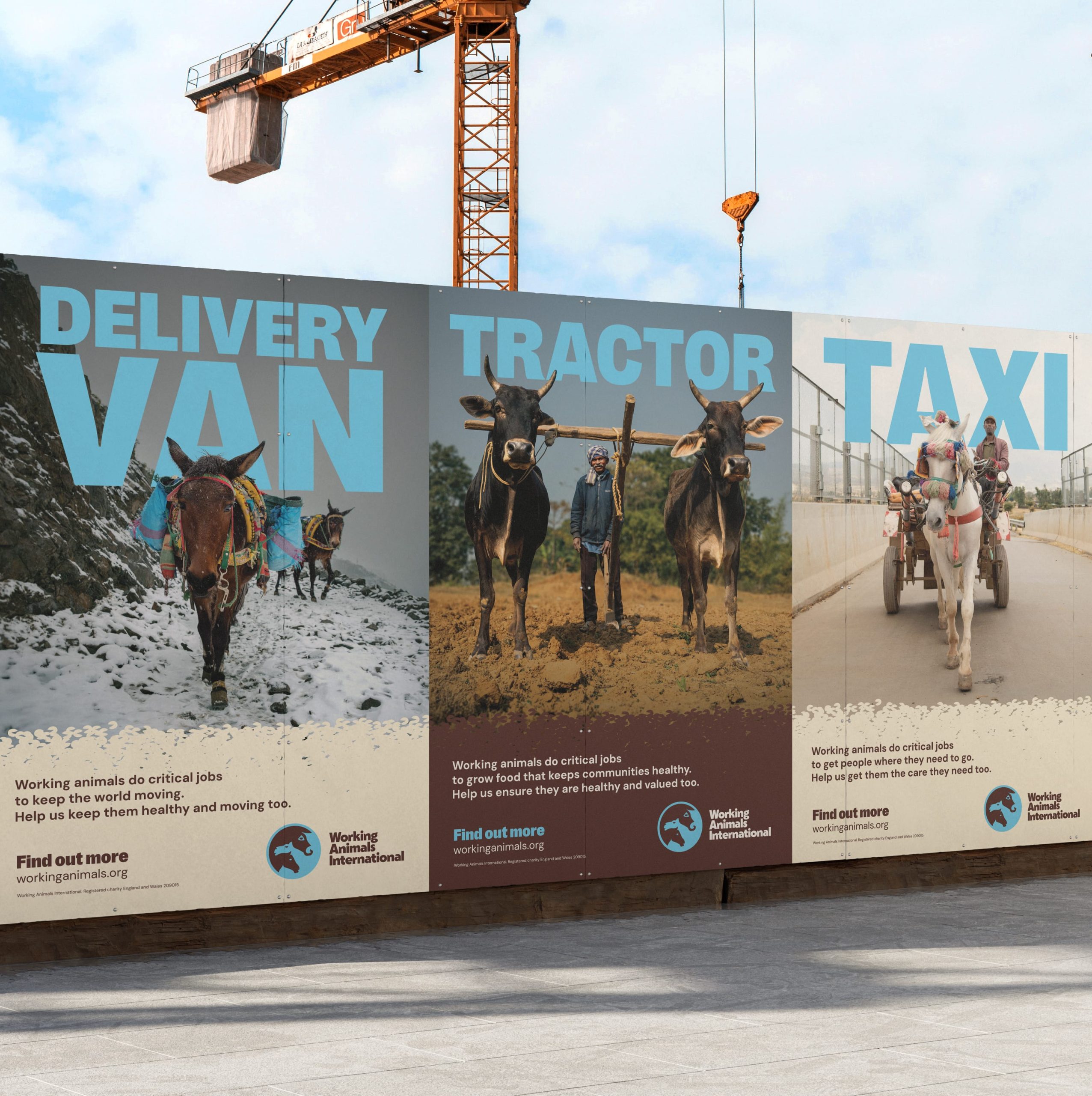
Working animals such as donkeys, horses, mules, oxen and camels support an estimated 600 million people worldwide to earn a living and access food, water and transport. Despite their essential role, their welfare is often overlooked. The charity’s new name and brand highlights both their importance and the urgent need to improve their welfare.
Designed in partnership with London-based creative brand agency The Clearing, the new name, brand strategy and identity system builds on the charity’s legacy and communicates the full scale and sophistication of its impact. The launch of the brand coincides with an above-the-line UK advertising campaign, the concept of which was developed by The Clearing, then produced and rolled out by Bristol-based creative agency Enviral in line with the new brand identity.
Design
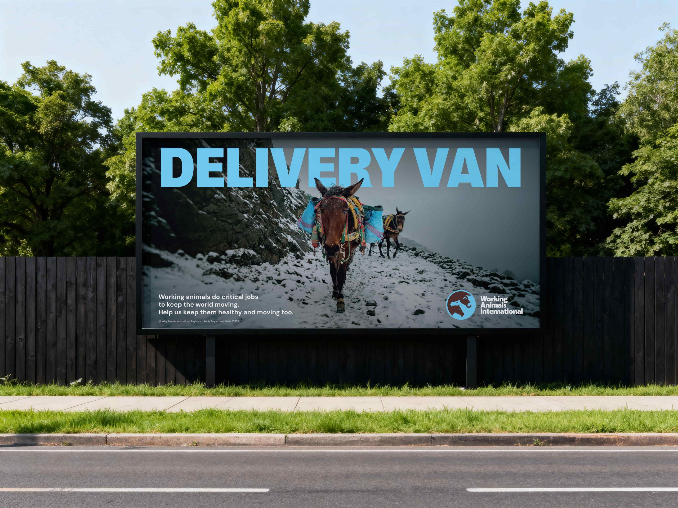
The new identity system and name have been built on the brand promise, “Impossible to overlook”. A declaration that the silent suffering of working animals, their vital role in communities and their right to care will not be ignored, dismissed, or accepted as a “fact of life”. It’s a demand for attention and a call to action.
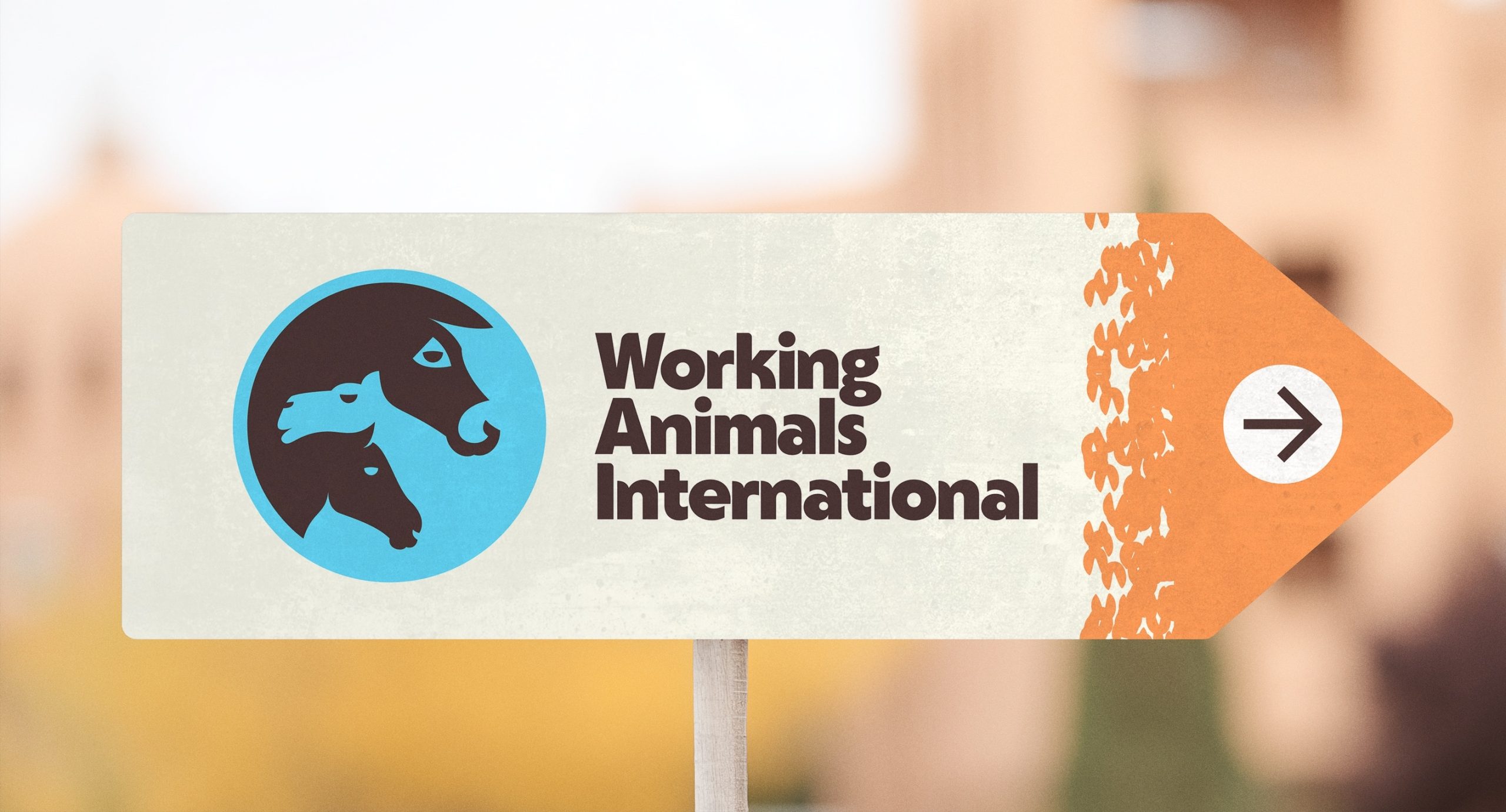
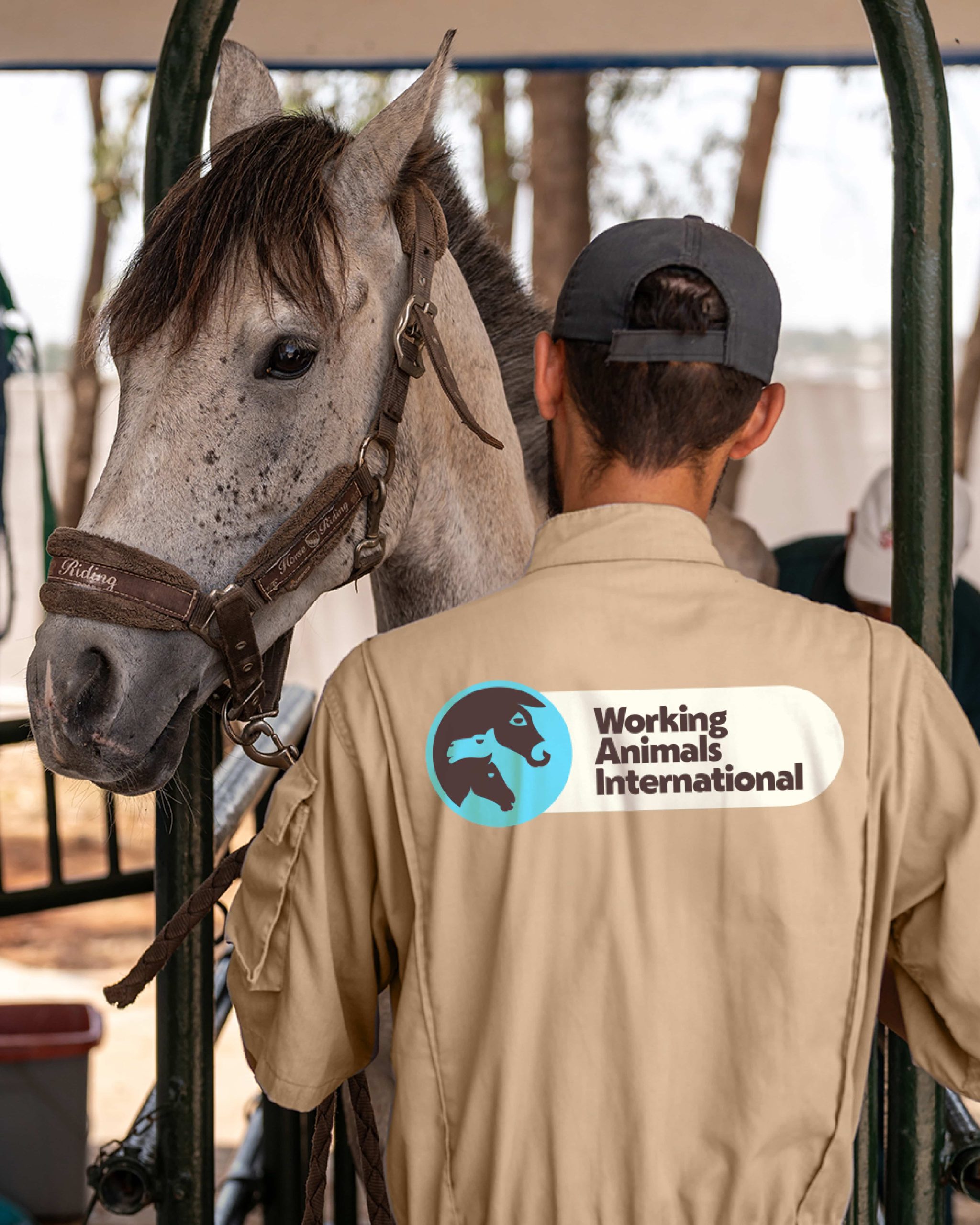
Fixed elements include a new globe logo, featuring the intertwined profiles of a horse, camel and donkey – just three of the animals supported by Working Animals International’s work and a way of making the charity’s cause immediately clear. The globe symbolises the scale of the challenge they face. The primary and secondary colour choices represent nature’s elements.
The tone of voice reflects the brand attributes: resolute, illuminating and transformative. The basis for communicating impactful stories, and clear points of view using everyday language that will inspire others to care and take action to improve the lives of all working animals.
The primary font, Right Grotesk Casual, aims to communicate stature, scale and urgency. DM Sans has been selected for its legibility and easy access as an open source font.
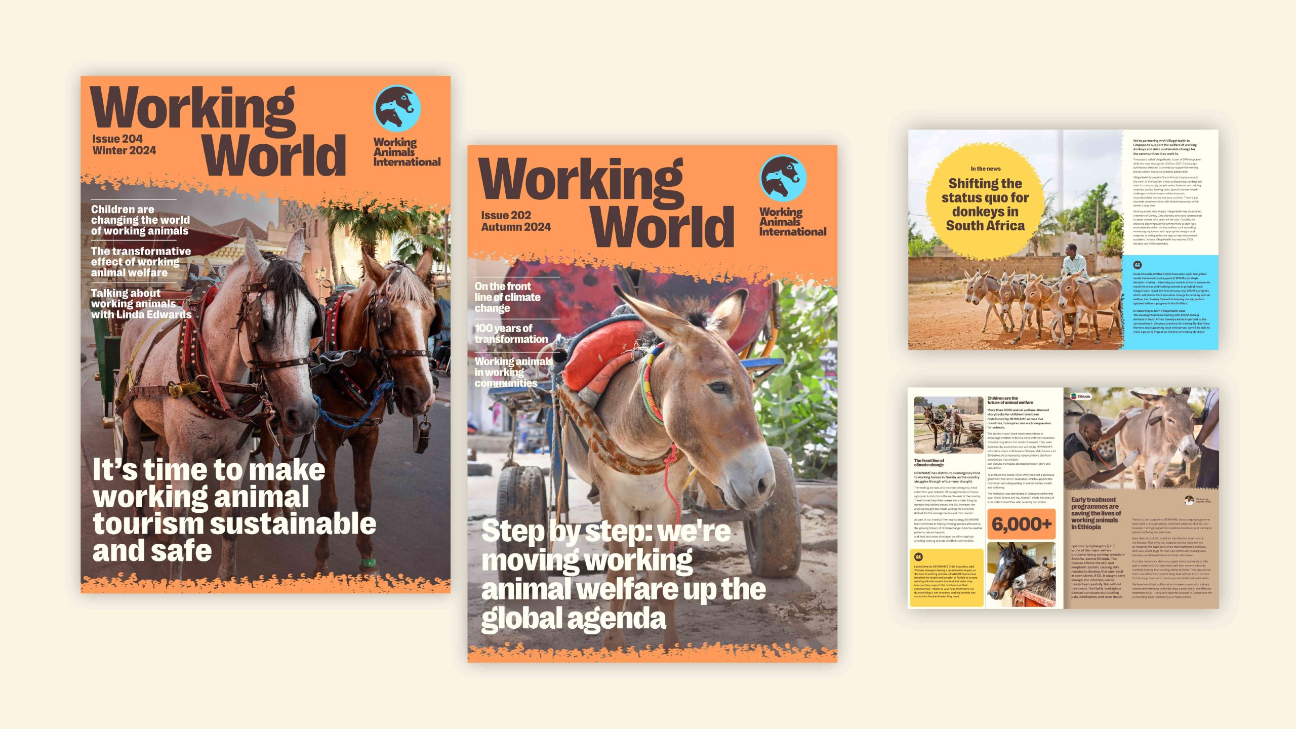
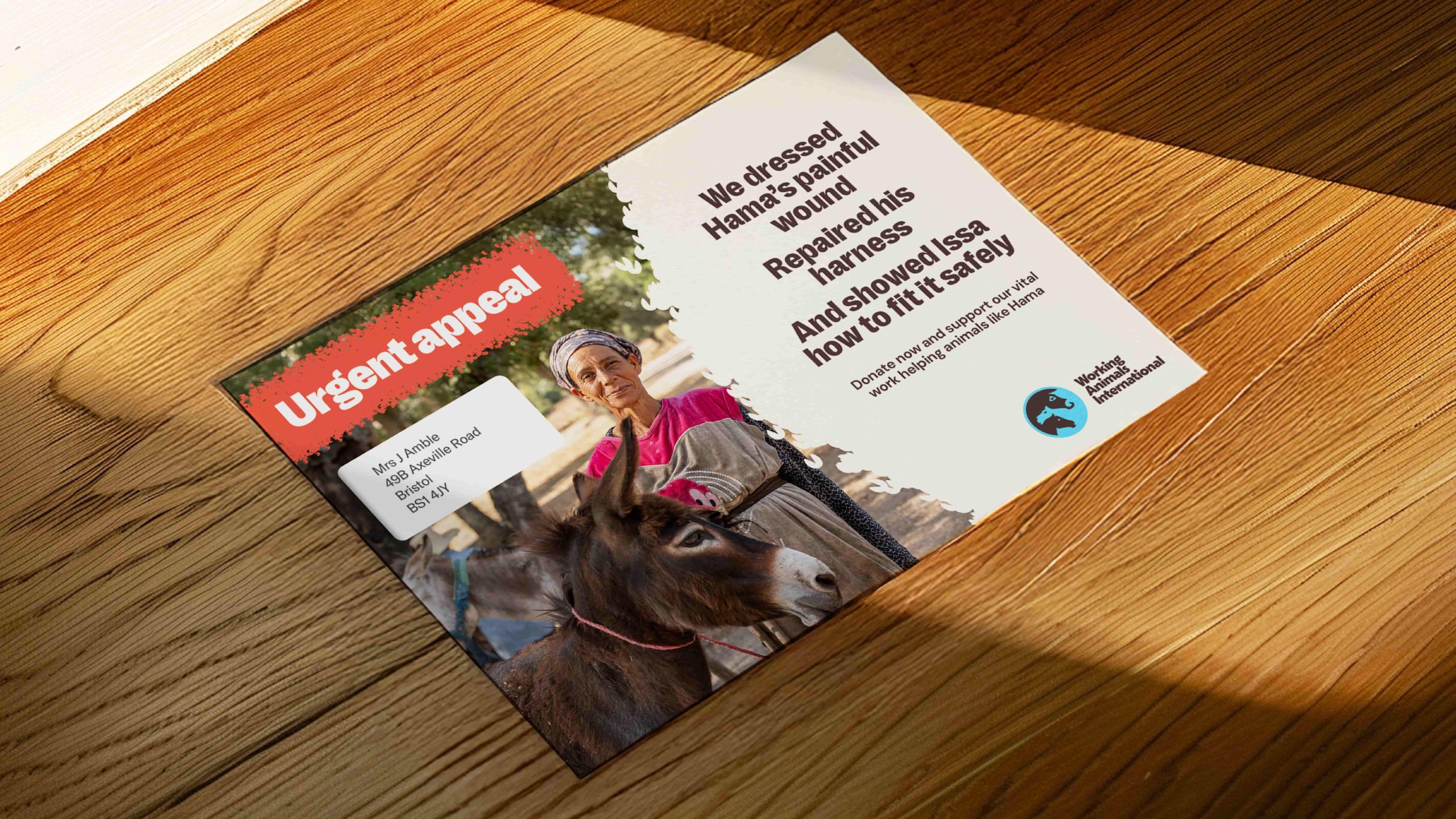
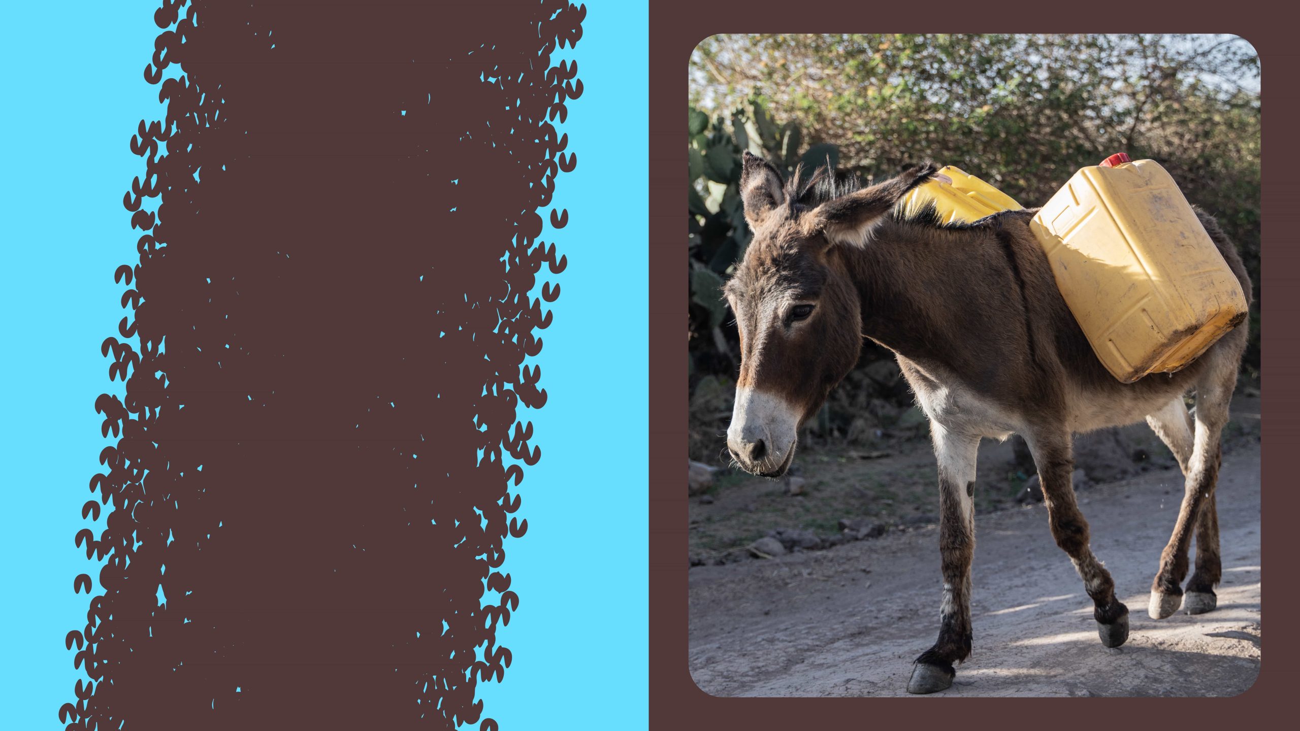
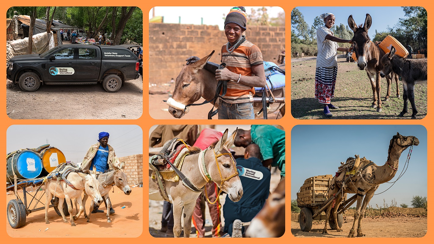
The core visual elements are supported by a distinctive hoof-like graphic pattern symbolising the constant journeys of working animals and their owners, often across arduous terrain. It’s used within the brand to convey a sense of direction and energy. Photography shows the partnership between working animals and the communities that rely on them.
Linda Edwards, Chief Executive at Working Animals International, said: “We are proud to launch our new name and brand. Our mission remains the same, but our new identity makes it clearer, more recognisable and easier for people to engage with and support.
“With a stronger voice, we are working towards a world where working animals are properly valued and cared for. When they thrive, so do the communities who depend on them every day – for income, for food, and for access to essential services like getting to school or to hospital.”
Working with The Clearing, the new brand was developed through an extensive consultation period involving supporters, donors, colleagues, and partners across multiple countries.
The rebrand goes beyond a change in name. It reflects the organisation’s growing impact, building on its established work in partnerships, policy influence, and improving the lives of working animals.
Jonathan Hubbard, Co-founder and Creative Director at The Clearing, said: “Working animals are the lifeblood of communities around the world. The boldness and simplicity of Working Animals International’s new name and identity will help the charity to continue its mission to improve their lives, and the lives of the communities they support, making their cause impossible to overlook.
He continued, “Our approach to designing the brand was to tell that story in a simple and clear way that would resonate with the local parnterss and communities the charity wants to engage with, as well as potential donors and other supporters. For fundraising audiences we needed to highlight the vital role working animals play for communities living in some of the most challenging environments, a concept lost in our high-tech and mechanised world. This became the basis for the advertising campaign supporting the launch.“
Linda Edwards added: “This marks an important moment in our history. For more than a century, we have combined practical expertise with compassion to support working animals and the communities who depend on them, and that work continues to grow.
“As climate pressures and economic uncertainty grow, working animals and the communities who rely on them are under increasing strain. We must be in the strongest possible position to support them, and this new identity allows us to do exactly that.”
As part of its new brand launch, the charity is hosting a photography exhibition, Impossible to Overlook, at the Fujifilm House of Photography in Covent Garden, London, from 22 to 26 April. The exhibition showcases the essential and often unrecognised role of working animals around the world, profiling the work of photographers Harsha Vadlamani in India, Maheder Haileselassie in Ethiopia, Charmaine Chitate in Zimbabwe, and Abdellah Azizi and Badr in Morocco.
Source: The Clearing
SPANA rebrands to become Working Animals International added by newsroom on
View all posts by newsroom →
You must be logged in to post a comment Login