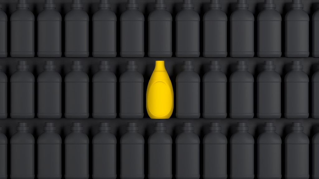
Distinctiveness has been proven, time and time again, to be more important than differentiation when it comes to marketing priorities. Distinctiveness is about being individual, recognisable and valued above and beyond the competition. It’s about creating ownable codes that instantly signal the brand and evoke a myriad of associated benefits and values. We believe it’s the key to successful, more compelling marketing and 3D design is without doubt one of the most effective disciplines to deliver it.
It’s worth defining specifically what we mean by 3D or structural design, as, for a number of reasons, it’s not necessarily the most understood marketing tool. 3D design is the physical manifestation of a brand’s personality expressed through numerous physical qualities including form, tactility, surface detail, functionality and much, much more.
Successful 3D design should be desirable, covetable even. It should delight and reward visually, emotionally and physically. It should be totally fit for purpose and above all, unmistakably from the brand. It can influence a change in consumer behaviour, it can disrupt the category norm, it can create a memorable and instinctive fiddle factor. Ultimately, it has to be grounded in feasibility, but that should never limit or compromise creativity. 3D design is the ultimate key to unlocking the distinctiveness that brands desire.
So, if 3D design offers such rewards, why don’t more brands effectively employ it to improve their distinctiveness? Well, for a start, it’s complex and typically has considerably longer lead times than 2D graphic projects. It’s also logistically more challenging. But, that’s why we love it! If you collaborate with the right specialist team, with the appropriate expertise, astounding projects can be delivered whilst still working within all production and technical constraints.
3D design’s true value
The value of 3D design is vast. 3D can have a significant impact on the fortunes of a brand in too many ways to list here but these are our top 3…
- DISRUPTION & STANDOUT
3D design can help you walk the talk.
The true test of any design is on shelf where brands stand shoulder-to-shoulder with their rivals and vie for your attention. This is where design works hardest to cut through the noise, communicate brand purpose and messaging and often to stimulate connections in consumers’ minds with other emotive brand communications that they have been exposed to.
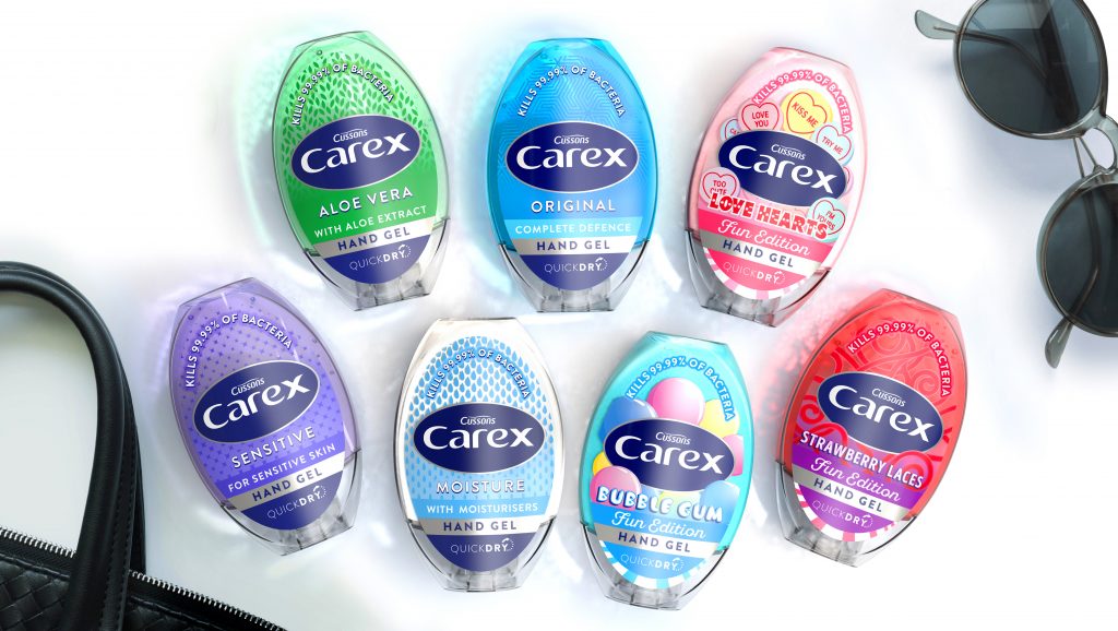
Our Carex anti-bac hand gel redesign is a great example of this. By creating an ownable elliptical pack structure inspired by the brand mark which nestles beautifully within the palm of your hand for easy, portable dispensing, the 3D design really enhances the brand narrative. A much bigger label canvas also helps, allowing the branding to increase by 50% and giving more space for the clear and concise communication hierarchy. The result is a truly distinctive pack, unique within a category made up of conservative and uninspiring little bottles. The packs also deliver on the second benefit of good 3D design: great functionality.
2. FUNCTIONALITY & PHYSICAL INTERACTION
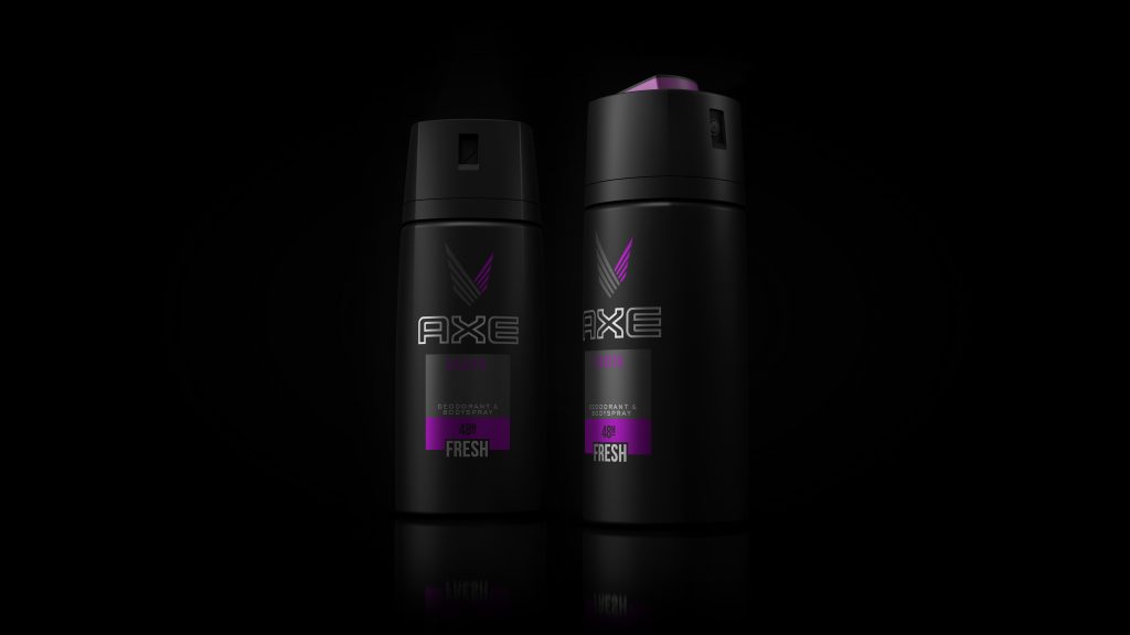
Seymour Powell’s elegant ‘Polaris’ redesign for Axe/Lynx body sprays is a sublime example of 3D design and functionality winning consumers’ hearts and minds.
The agency partnered with engineers DCA to create an iconic form with emotive ergonomics that deliver the playfulness and engagement that sit at the very heart of the brand.
A twist of the top activates the pack, elevating the button and allowing it to incline backwards and present itself to the consumer in the optimal, ready-to-use position. When you’re done, you simply twist the top back to its starting position to lower the button and stow it away for next time. This twist to open and close gesture has become the shorthand for Axe/Lynx deodorants for well over a decade now and was first established prior to the launch of Polaris, back when the swiping gesture, that feels so intuitive to consumers now with their smart phones, was still in its infancy.
3. DELIVERING SUSTAINABILITY
3D design also plays a vital role in delivering sustainable packaging solutions by helping brand owners bring their products to market with a reduced environmental footprint.
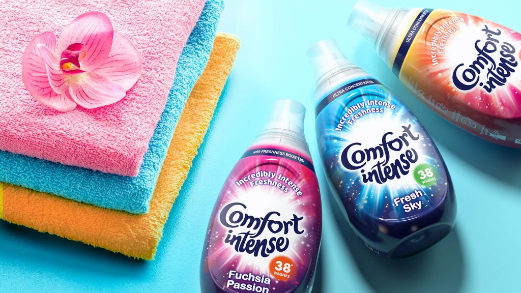
Comfort Intense shows how innovative 3D design can deliver a single-minded proposition with bundles of personality whilst also using significantly less packaging than that of the competition.
The launch of Comfort Intense heralded a new era in the fabric conditioner market, offering a more intense, longer-lasting fragrance, while using less than half the dose of existing fabric conditioners. With a reduced pack size, it was clear that the brand’s structure and graphics would have to work much harder to create strong stand out against its larger competitors. We created a characterful droplet shaped bottle epitomising the intensity of the concentrated formulation while oozing personality and desirability – a totally new approach within the category. As part of the new structure, we developed a precision pouring spout to encourage consumers to more accurately dispense a much smaller dose and a deliberately compact cap reassured them of product performance. A strong ‘explosive’ graphic further enhanced stand out as well as bringing life to the intense fragrance proposition. The design ultimately changed consumer behaviour whilst highlighting the benefits of the ultra-concentrated formulation to establish smaller dosage and help maintain a 32% price premium over standard semi concentrated Comfort.
All of this was achieved whilst using significantly less packaging than the standard bottle and cap.
This in turn achieved an impressive 57% reduction in water used, a 43% reduction in waste and a 27% reduction in green-house gases per wash for Comfort Intense (15ml dose) versus standard Comfort (35ml dose).
Once again, 3D design delivered desirability and the key to purchase intent which in turn led to the astounding success of the product and its sustainability story.
Shaping category codes
With big change can come big responsibility. 3D design doesn’t just change the codes of a brand – it can change the codes of an entire category. That’s because it can go beyond creating distinctive brand assets to create new category norms. Two words: Toilet Duck.
Toilet Duck revolutionised the toilet cleaning market in the 1980s using 3D design. In fact, the entire brand was built on the foundations of a unique pack structure with a neck that could reach where no loo-cleaners had gone before. This established an enhanced functionality story without even mentioning the product inside. Today, 40 years on, most toilet cleaning products come in a bottle with a twisted neck, all inspired by Toilet Duck’s timeless innovation. Copy-cat brands and products are an inevitable part of successful 3D innovation but that shouldn’t deter innovators who will benefit from first mover advantage as well as the odd patent. Me-too copycats will rarely invest in their packaging to the same degree, as they are focussed on lowering costs and selling acceptably inferior products and experiences (although the gaps are certainly closing), not extraordinary ones.
In fact, the best defence is to continue to innovate and that’s exactly what Toilet Duck did. 30 years after launching their original innovation, they launched their mould-breaking Fresh Discs brand: a fragranced limescale repelling, toilet cleaning system which adheres to the toilet bowl without the need for a germ-ridden plastic holder. Another brilliant example of 3D design and innovation solving real life problems and enhancing user experience.
The misconceptions of 3D design
Despite the obvious rewards of 3D design, the category is riddled with myths and misconceptions which inhibit exploration of 3D within the marketing mix. These elements can keep 3D design from being in scope at points when it may very well be the answer to a brand’s key challenges.
The first hurdle typically comes down to money because changing a bespoke pack structure can be an expensive business. Of course, the investment in 3D design can be considerably higher than for a graphic-only approach, but 3D can arguably disrupt so much harder than 2D. Longer term, a 3D redesign may also create substantial savings by using more cost-effective materials (lighter, cheaper, production efficiencies etc) and by employing structural design more efficiently and effectively.
Lynx/Axe significantly improved their sustainability credentials by eliminating plastic from their global gifting portfolio and amalgamating their premium gifting range into fully recyclable, hexagon-to-circle boxes. This exciting holistic gifting redesign used familiar brand assets but substantially elevated their aspirational appeal and did so with much greater efficiency as the need for multiple moulds and thermoformings was eliminated and only one common footprint was required. Not only was the gifting experience fundamentally improved along with exceptional stand out on shelf, but this smart approach allowed for greater flexibility for different pack combinations with the internal plastic tray substituted for a branded paper gift bag.
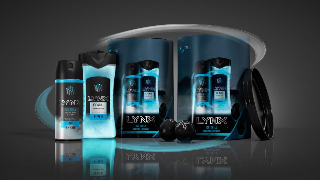
Not all 3D projects start with a blank canvas. There has been a growing trend towards adapting existing 3D or building on stock packaging as a cheaper and more efficient alternative to an entirely bespoke 3D build. This is understandable for smaller organisations, but it is also becoming more common with bigger brands as it keeps costs down and offers shorter lead times whilst allowing them to stay one step ahead of the competition.
When compared to 2D, 3D will inevitably seem like a big investment; potentially the kind of investment that’s more comparable to communications budgets and media spend than to a packaging design overhaul. This is an interesting way of looking at 3D investment. Isn’t 3D worthy of the same budgets that communications enjoy given it can do so much of the comms heavy lifting? Done well, it should drive strong reappraisal by allowing a brand to leverage its point of difference. The right 3D design can achieve tangible, long-term results versus an ad campaign that can feel short term and transient by its own nature.
Another inhibitor to 3D projects getting out of the starting blocks is the fear of facing the wrath of retailers. Retailers are ultimately looking for sales performance and store efficiency and they are increasingly demanding that suppliers comply with their strict parameters to enable them to achieve this. Failure to comply can and will result in delisting. The ultimate power the likes of Wal*Mart, Target and Tesco wield is formidable, but the desire for efficiency doesn’t mean a lack of appreciation for innovation. Retailers want brands to invest in innovation – it can raise awareness of a previously stagnant category and stimulate improvements from which everybody wins.
When all is said and done, one of the greatest barriers to exploring 3D design possibilities is a lack of understanding of what these projects require and what rewards they can reap. As we’ve said before, 3D projects are complex. They involve specialist teams; supply chain, production as well as bottle closure and label manufacturers. These projects take the average marketeer out of their comfort zone. They may look to their incumbent agency who they’ve worked with in the past on graphic design projects. But a good design agency isn’t necessarily a good 3D agency. Without a team with the required talent, experience, knowledge and expertise, results can fall short of the aspirations associated with the original investment. So, a few tweaks are made to the existing 2D design and everyone just carries on as normal. It’s a missed opportunity, which is a real shame.
When the marketing team is ambitious, but lack experience in 3D, a strong and experienced 3D partner to support them on the journey is paramount!
2D and 3D are different beasts. It’s not like getting a BMW mechanic to MOT your Mercedes. It’s more like asking an electrician to do it. They’re both valuable and important but ultimately different skills.
So, to help you on your 3D journey we’ve collated our three golden rules to help you take a few steps closer to realising the opportunities on offer:
- Get advice and support from 3D design experts who offer an integrated service and know how all the elements of a 3D project need to work together seamlessly
- Use a 3D partner who will appropriately challenge your internal technical teams who are notoriously and understandably conservative
- Select an agency who can think ‘outside the box’ yet play within the rules. This will allow you to deliver compelling and inspiring brand appropriate 3D solutions without relying on sky hooks and fantasy!
- Choose PB Creative!
Yes, we said three golden rules but we’re sneaking in a fourth. We’ve been doing this for over a decade now. Our approach at PB seamlessly combines brand strategy, structural and graphic design for some of the world’s biggest consumer brands as well as for some of the most innovative new start-ups. Get in touch, we’d love to help grease the wheels of your next 3D project!
BY Pete Hayes, Managing Partner at PB Creative


You must be logged in to post a comment Login