NOT Wieden+Kennedy unveil ‘A new dimension of work’, a new design system and visual identity for the world’s largest work marketplace
Branding and design agency NOT Wieden+Kennedy today unveil their latest work, a comprehensive design system and new visual identity for leading freelance talent platform Upwork.
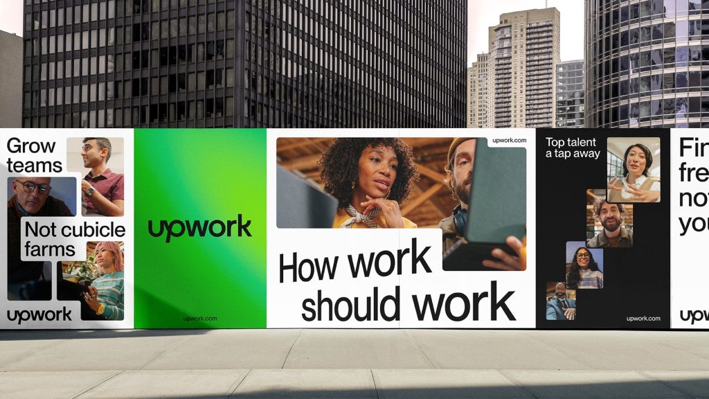
After a competitive pitching process, Upwork appointed NOT Wieden+Kennedy to evolve its visual identity. The goal of the project was to enhance global brand awareness and differentiation through a more cohesive and consistent brand and product experience for its customers, where everything – from social posts to the click of ‘project completion’ in the product – would feel uniquely Upwork.
‘A new dimension of work’ is the concept at the heart of Upwork’s refreshed visual identity. This concept reflects a world where work works for everyone—where companies gain agility through access to top talent and ideas globally, and where work fits into people’s lives, rather than the other way around.
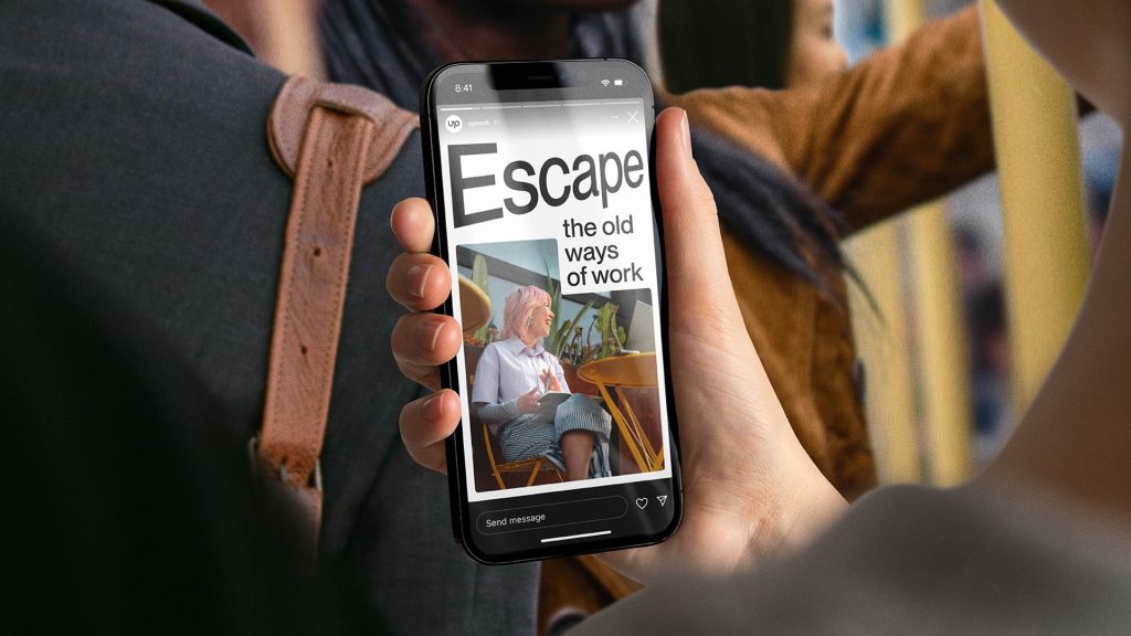
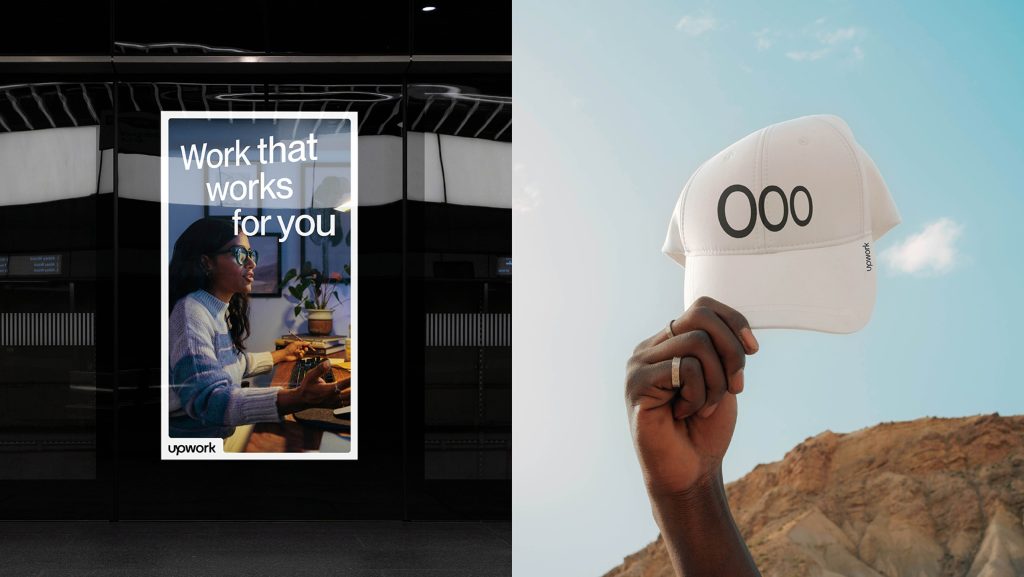
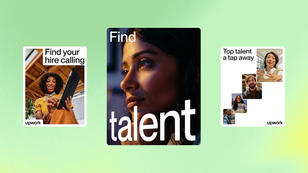
To capture this vision, the new visual identity is sleek, minimalist, and purposefully designed to convey a constant sense of forward momentum and growth. This is done through a new typographic system with dimensional treatments, created with a purpose-built fluid grid system that allows endless permutations of shape and image – appropriately embodying the flexibility of the future of work.
The visual update strengthens cohesion across customer touchpoints by refining the brand colours. The palette has been streamlined to increase brand awareness and create a more unified experience while adding depth and dynamism that differentiates Upwork from its competitors. Touches of glimmer have also been added for additional invigoration and energy.
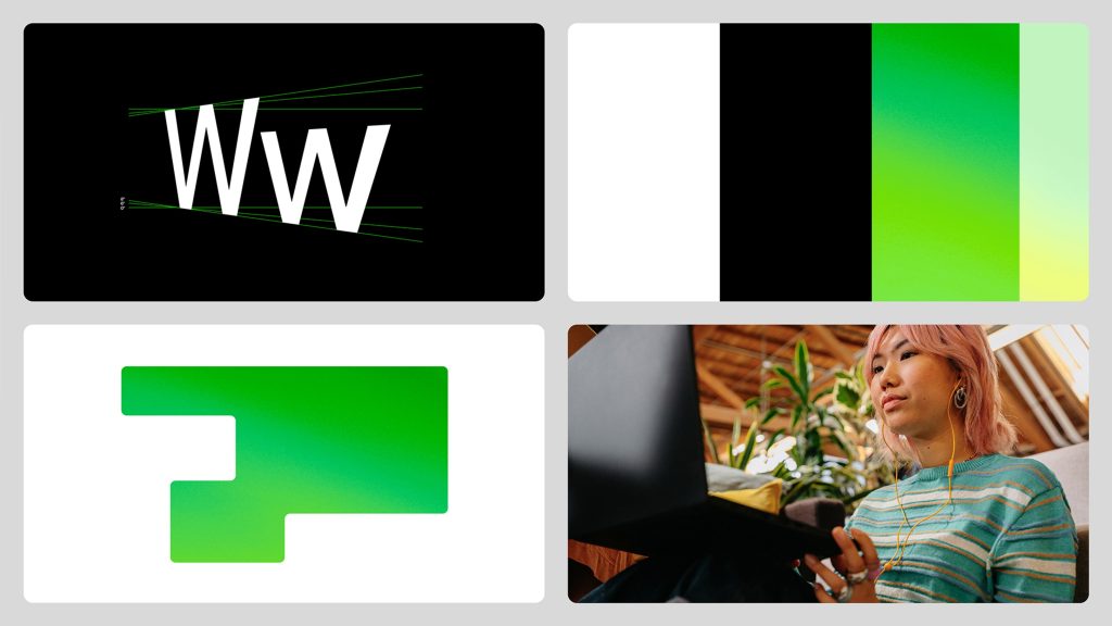
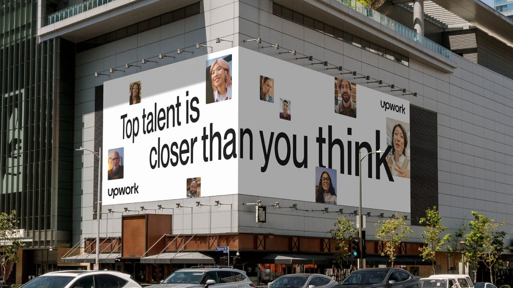
To reflect a world of work that never stands still, motion behaviours are also present throughout the new visual identity. The grid system animates to react to content and messaging, and the typography creates a sense of looking into the future. Meanwhile, the colour is now on a gradient rather than a static colour, so that it’s always in motion itself.
Over the course of 18 months, the teams worked closely, with the agency conducting interviews with employees and customers, and reviewing hundreds of brand touchpoints. The new identity has been rolled out across select surfaces and will soon appear across every customer and company experience, bringing a unified look and feel to every interaction.
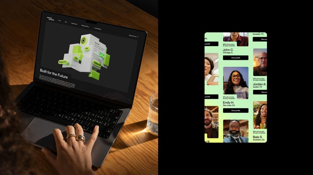
Bryan Harvey, Group Creative Director, Upwork comments: “When creating this design system we wanted to create something that spoke to the vision of Upwork. That meant creating a suite of design tools and principles that could express the essence of our brand in a multitude of beautiful ways, while also driving consistency across every place you experience it. We are so excited to have this design system foundation that we can layer on top of all the brilliant creative ideas and thinking that will drive the future of innovation and business for Upwork.”
Adam Rix, Head of NOT W+K comments: “Upwork is an incredible business, and we’ve been inspired by both what they stand for and the incredible talent of the team we’ve collaborated with. Not content with just a better world of work today, Upwork is building a better future of work every day – a world of work that is fluid and adapting to people’s needs. It’s been a privilege to bring this vision to life through our platform of ‘A New Dimension Of Work’, and to create a visual identity where every element we’ve designed brings this to life.”
Source: NOT Wieden+Kennedy

You must be logged in to post a comment Login