 With the hot summer months in full swing, beer lovers are reaching for their favourite cold brews to beat the heat. But as consumers venture down their grocer’s beer aisle, they are met with an onslaught of brands vying for attention in a sea of packaging.
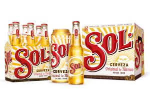
When MillerCoors recently relaunched the Mexican import brand Sol, they partnered with Chicago-based, brand agency Soulsight to redesign a vibrant new look & feel that stands out amongst the competition and further solidifies the brand as a high-premium offering.
 Steeped in 119 years of history, Sol is a storied brand that was inspired by a ray of sunlight streaming through a hole in the brewery’s roof. Drawing upon this moment of inspiration, the brew master created a refreshing, lighter-bodied lager to differentiate itself from the darker beers of the era.
With so much history behind the global brand, Soulsight’s creative team had to master the fine balance of repositioning and modernising it with fresh energy, while retaining its iconic heritage to ensure the redesign didn’t alienate existing brand loyalists comprised of 21- to 29-year-old consumers.
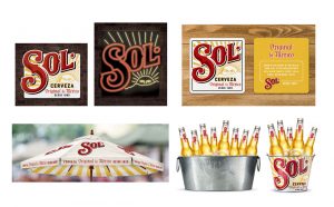
 “We had a lot of conversations about how to capture the spirit of this brand, and the main touch points we kept coming back to is the old signage around Mexico — the old tin signs and the murals,†said Graham Ebetsch, senior design director at Soulsight. “We wanted to leverage the brand’s heritage in a really meaningful way to create a strong sense of place by drawing out the colours and vibrancy of the heart of Mexico.â€
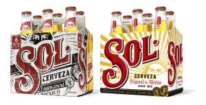
The initial step included taking stock of which core equities to carry into the new look & feel. Soulsight identified two of the most prominent and recognisable design elements conveying the brand’s personality — its bold, red script and sun graphic. The team worked to clean up the on-pack communication then refined the brand mark to be more appealing and approachable.
 Applying a meaningful treatment of the sun iconography (a visual representation of the Spanish word “Solâ€) gives the brand a sense of placement with the sun shifted lower and more vibrant rays radiating across the pack to illuminate the script. A brighter colour palette replaces the previous black and white dominated background, lending a fresher, more optimistic feel.
“We’re bringing back the sun to Sol,†said Elizabeth Hitch, marketing manager for Sol. “With the brand having such a rich, consistent design history, it would be a total miss if we did not restore its heritage-inspired iconography and bring it back to the United States for this relaunch. The idea was to connect with consumers with a message rooted in authenticity and optimism. The new packaging is the first step in making that connection.â€
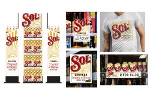 The sun is not the only nod to the authenticity of Sol’s Mexican heritage. Medallions placed at the bottom of pack and the top of the cans serve as credibility cues through a stylised interpretation of the gold medals awarded to the beer around the turn of the century. New on-pack messaging adds clarity in communicating that this is an authentic Mexican lager or Cerveza, Original de Mexico.
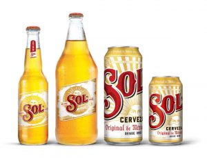
The refreshed design was applied to all of Sol’s offerings, including bottles, 12 oz. cans, single serve 24oz. cans, and six-pack and 12-pack cartons. Additional global applications of the rebrand include on- and off-premise look & feel, in-store POS, interactive consumer experiences at festivals and events, as well as holiday rollouts slated for 2019.
Source:Â Soulsight

You must be logged in to post a comment Login