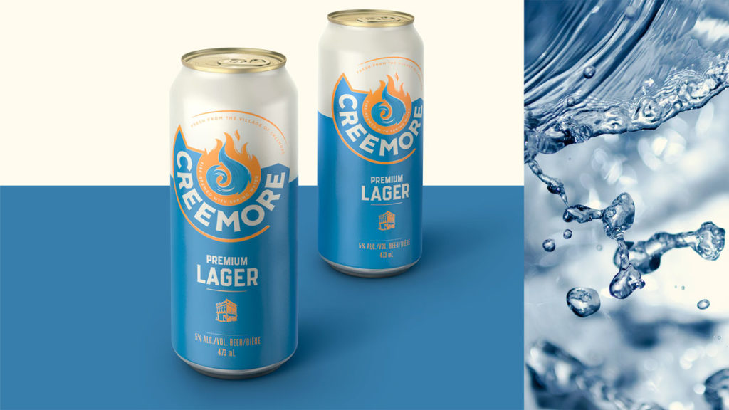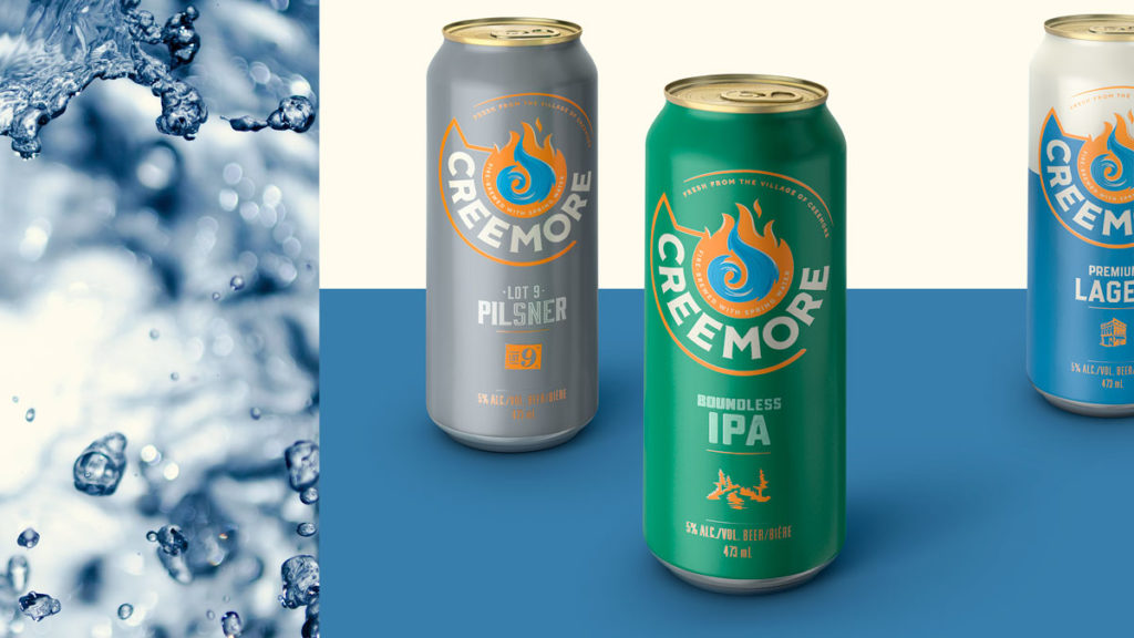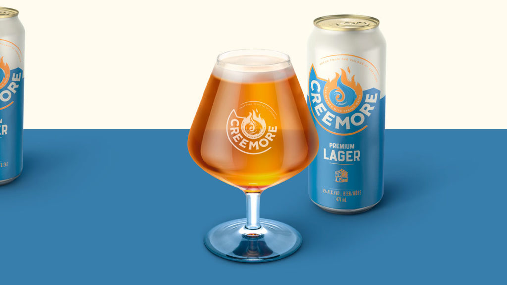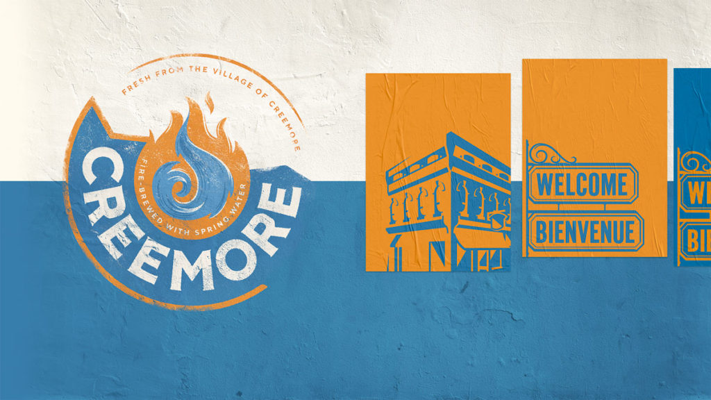
Global branding experts, BrandOpus, have worked with Creemore, a Canadian craft beer brand; creating a new brand strategy, visual identity and packaging.
In 1987, their founder John Wiggins set out with passion and dedication to create a beer that celebrated the small Ontarian community of Creemore. Brewed with only the finest Creemore Spring water, then fire-brewed in copper for complexity and taste. This mix of fire and water resulted in a distinctive fresh beer loved for its depth and character.

Creemore briefed us to reinvigorate and bolster their brand, with a new look and feel that would drive reappraisal with current and new drinkers. Eager to move away from the niche of the craft category, whilst maintaining its rich foundations, small-town personality and the spirit in which it was founded.

Acknowledging the founding spirit, Creemore is about stoking the fire of inspiration and igniting the next possibility. As a beer with real substance and history, the visual identity embodies the core values of looking to the next chapter, awakening opportunity and celebrating the future. The new identity heroes Creemore’s blend of fire and water, embracing its heritage and locality, whilst staying true to its roots.

Kim Dunphy, Creative Director at BrandOpus says, “Our aim was to showcase Creemore as an advocate for inspirational ventures. Not wanting to lose what’s special about Creemore the place and its strong sense of community, we visited the town of Creemore, felt their spirit and saw first-hand how important the brewery is to its community. The new visual identity and brand narrative now reflects their passion and uniqueness and stays true to years of brewery history.”

Source: BrandOpus


You must be logged in to post a comment Login