
RepHike is a young company, based in Buffalo, New York, that helps brands find their ideal micro-influencers and manage campaign collaborations.
 The world of online micro-influencers is a pretty new one, but already the market is saturated with many players who look and sound the same. BTL Brands, a start-up focused design studio based in east London, immersed themselves in the sector and carved out a unique, relevant and authentic personality for RepHike – one that stands head and shoulders above the crowd.
 The more BTL studied the competition and learned about “micro-influencers”, the more they were able to get under the skin of what the project was really about. The competition is characterised by vibrant colours, technical marketing jargon, a fixation on data and tech, digital illustration and generic digital fonts. They look, feel and sound very similar. Everyone talks about these so-called micro-influencers as if they were just data points for the brand’s bottom line.
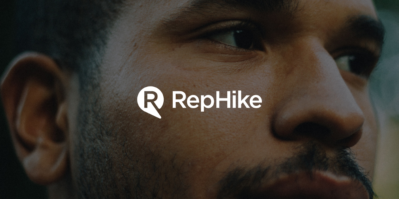
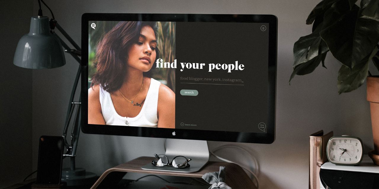
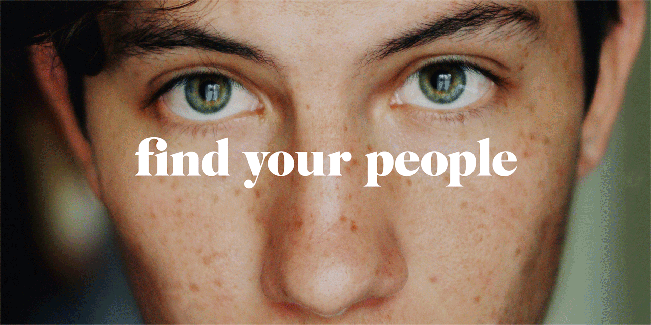
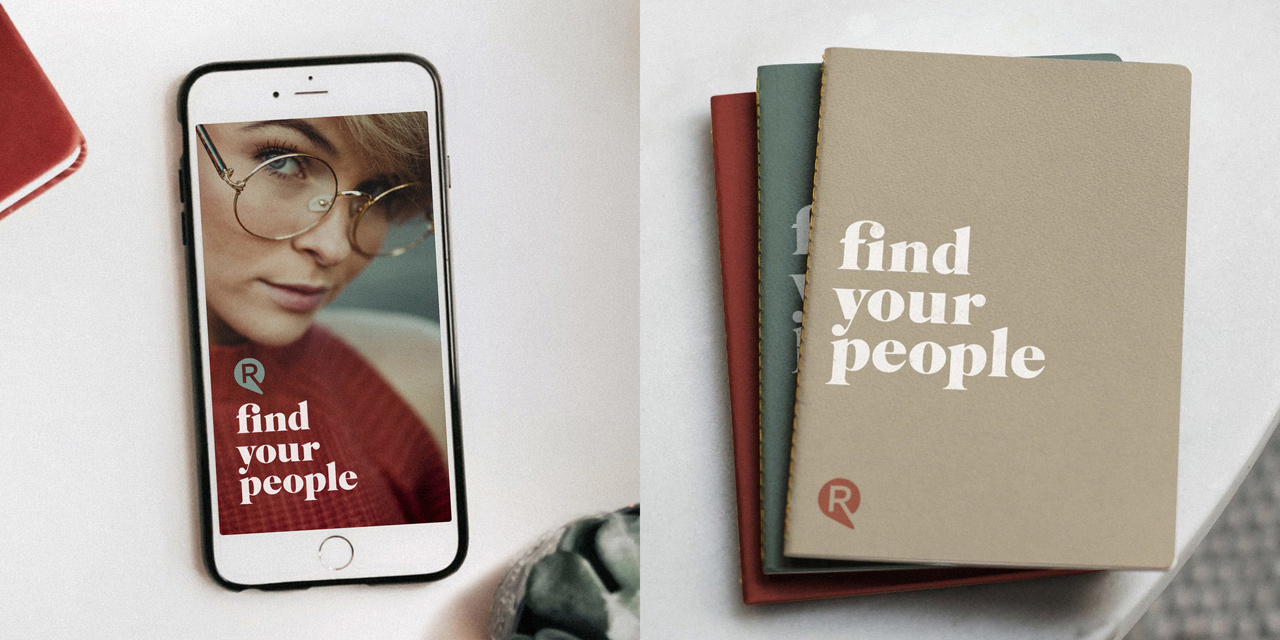 These observation gave the design house a clear direction. Unlike the competition, the RepHike brand identity would be characterised by natural colours, plain speak, a focus on people, photography and fonts with humanity and personality. The brand message find your people became the prominent piece of communication, with the name RepHike taking a back seat. Whenever possible BTL Brands avoid the word micro-influencer, talking instead about people or creators.
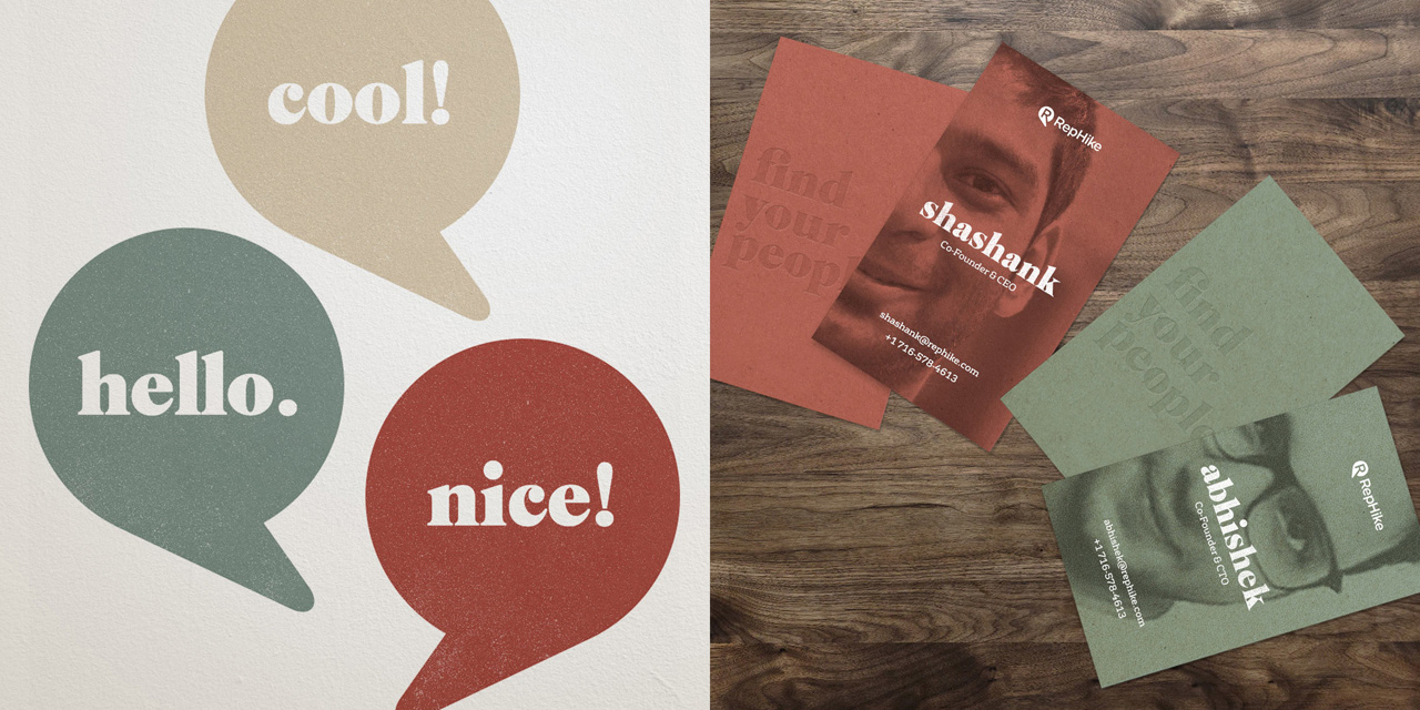 Though the identity is primarily about people, the company name needed to remain RepHike. The logo needed a refresh that worked alongside everything else, without overshadowing the photography or the find your people message. It needed to be relevant and minimal. An R for RepHike merged seamlessly with a speech bubble form gave BTL a simple and elegant logo that references conversation, doesn’t try too hard, and ties neatly into the logo typeface.
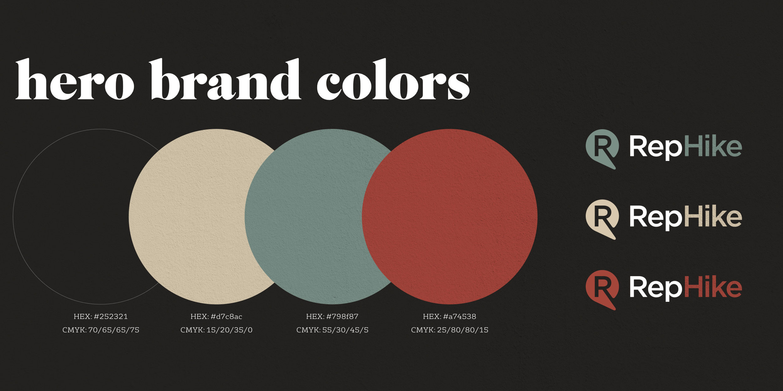 In contrast, the old logo featured vibrant colours and gradients (which already forced it into a bucket with the competition), and a shape that was needlessly convoluted and irrelevant.
The typeface had an uncomfortable mix of rounded and sharp edges, which the agency cleaned up with a simple, contemporary sans-serif.
Source: BTL Brands
BTL Brands provides fresh new branding for influencer marketing hub, RepHike added by newsroom on
View all posts by newsroom →
You must be logged in to post a comment Login