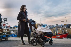
Micralite is relaunching its brand to the parenting market with a fresh proposition and campaign by creative agency isobel.
 Developed by two fathers and engineers over 20 years ago to let parents get out there with minimum fuss, Micralite created the first truly hybrid stroller combining the benefits of larger off-road strollers with compact smaller lightweight ones.
isobel recognised an opportunity for Micralite to stand out from a sea of pram brands that either paint a glossy picture of family life or focus on coping with it – neither of which are entirely motivating for parents. The result is a new brand identity that reflects the ‘life-enhancing’ properties of the product and is rolled out across packaging, website design and a brand film airing online and in cinemas.
New owners of Micralite, Silver Cross briefed isobel to create a proposition and campaign that would celebrate the unique style and performance of the Micralite product and appeal to parents beyond its niche following.
 Micralite strollers are designed with the entire user journey in mind, ensuring parents can continue to live their lives – now with a child in tow – without being inhibited in any way. It’s this thinking and resulting product design that inspired isobel to develop the new brand proposition of ‘thoughtfully engineered’.
Reflecting the true experience of using a Micralite stroller, the brand film ‘Fly’, created by Ben Stump and Simon Findlater at isobel, shows a series of babies and toddlers appearing to fly in mid-air as they travel through various different scenes. The film focuses on the brand’s engineering qualities, stating that ‘the best engineering should go unnoticed’.
 As Christi Tronetti, isobel Marketing Director explains: “We’re always looking for what makes a brand or product unique. We met with the original founders of Micralite in a backyard tool shed and they talked us through how they set about building the hybrid stroller, why it’s better and how they considered both form and function. Frankly, we were blown away and everything we’ve done highlights how well-designed the strollers are.”
The new brand identity for Micralite is also engrained in a product truth – the fact that it collapses from the centre rather than the bottom, ensuring it’s both sturdier and easier to fold. isobel has developed a striking and modern logo that showcases the key design difference that sets Micralite apart from its competitors and confirms the company’s engineering credentials.
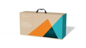
 The redesigned product packaging ‘heroes’ the logo so that one angle reveals the product while another sweeps to the back of the pack encouraging the customer to turn it around and investigate. The aesthetic is simple in nature, much like the product design, but the colour scheme pops on shelf.
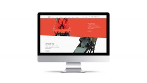
Isobel’s website redesign incorporates the angles of the logo creating a clean yet intuitive design that invites consumers to discover the brand while also learning about important product features.
Sam Donnelly, Brand Marketing Manager at Micralite says: “Together with isobel, we’ve made huge changes to both the product and the brand based on real challenges parents face on a day-to-day basis with little ones in tow. But we’ve ensured that we empower parents to feel like they can maintain their personality and style after having children. As brand guardians for Micralite, the isobel team have ensured that our unique brand proposition is reflected consistently across every consumer touchpoint.”
Audio PlayerSource: isobel

You must be logged in to post a comment Login