Color Me Up’ is a conceptual in-home hair coloring packaging design, on a mission to inspire change: to disrupt the swathe of category uniformity we bear witness to across all markets.
The inspiration behind the design began with a deep dive into the category, resulting in some incredible statistics; 85% of women color their hair at least once every eight weeks and 68% of women feel instantly more attractive after having their hair colored. In-home hair coloring has an enormous consumer base, committed to regular and highly emotionally driven purchases.
Although product technology and NPD has made great advances in recent years and in-salon brands have taken positive steps to revamp their packaging design particularly with new structural formats, the packaging design for in-home solutions hasn’t changed one iota.
Whichever country you’re in, whichever supermarket or drugstore, you’re faced with a wall of barely distinguishable brands and carbon-copy design — impossible to navigate and amusingly akin to the cat food aisle. The vast majority of the front of pack design is designated to a beautiful caucasian model staring directly and suggestively at you, overlaid with brand and variant information, plus a tirade of small print in the most showy and old fashioned gloss finish.
The visual representation of the intended results are completely unattainable, something which is further enforced by the range language — ‘excellence’, ‘perfect’ and ‘expert’. Of course brands are, rather patronisingly, playing on emotional drivers to purchase, but consumers are under no illusions of suddenly being transformed into a silky haired goddess.
There’s also something painfully ironic about the category wide use of the same design cues and packaging look and feel. Brands and products whose sole purpose is to help evoke change and celebrate creativity, are in fact visually all exactly the same — devoid of any imagination or flare. Choosing to dye your hair signals a desire to look different and is often used as an expression of your unique personality, yet all market options look exactly the same.
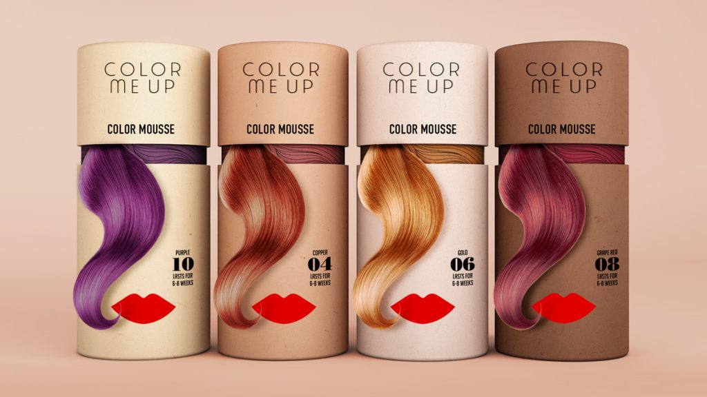
‘Color Me Up’ seeks to offer a refreshing alternative packaging design, one focused on ease of navigation, inclusivity, honouring diversity and authentic positive messages.
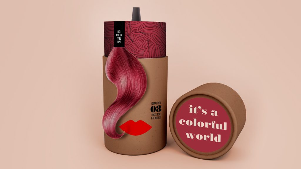
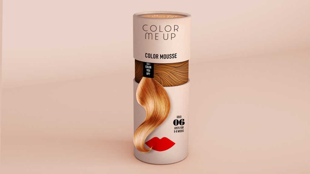
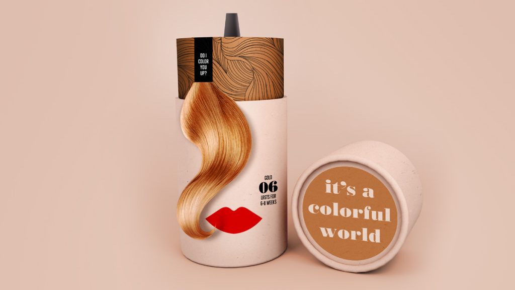
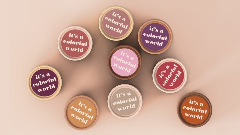
Using a recycled and recyclable round tube format, the structural packaging comes in a shade of natural skin tones, representative of broader consumer ethnicity and allowing for pairings of hair colour to compliment different skin colors, supported by a clear variant number system. It’s a colorful world after all — a message which is reinforced on the top of the tube packaging, celebrating differences in terms of both skin tones as well as hair colour choice.
The brand name ‘Color Me Up’ is a reference to the positive mood the brand seeks to help create in its users; committed to helping consumers feel more confident and attractive but without marketing unrelatable visuals or setting unrealistic expectations.
Navigation is made simple with the cardboard ribbon colored hair pieces attached to the inner tube of the packaging, providing consumers a large color reference in store and as a tear off at home serving as a visual memo for their next purchase. The consistent use of the red lips on pack serves as both a visual reference to a face for added stand out on shelf, as well as a globally recognised symbol of strength, power and pride.
‘Color Me Up’ concept design is modern, credible and relevant — empowering its consumers to celebrate diversity, change and creativity.
Credits – Sandra Wiggers, Senior Designer
Source: Anthem Worldwide

You must be logged in to post a comment Login