Digital marketing company Jellyfish takes the iconic airline’s visual identity to the next level for overseas markets
Leading digital marketing business Jellyfish today announces a partnership with one of the world’s most iconic airlines, Japan Airlines, to create an entirely new look and feel for the brand.
Jellyfish worked alongside the airline’s international marketing team to develop a new graphic system that expands the power and flexibility of the brand’s visual identity for audiences outside of Japan.
Inspired by the brand’s future direction, and with a brief to align its tradition and unique culture, Jellyfish was responsible for creating:
- An updated tone of voice reflecting Japan Airlines’ commitment to providing exceptional experiences, reliability and Japanese hospitality
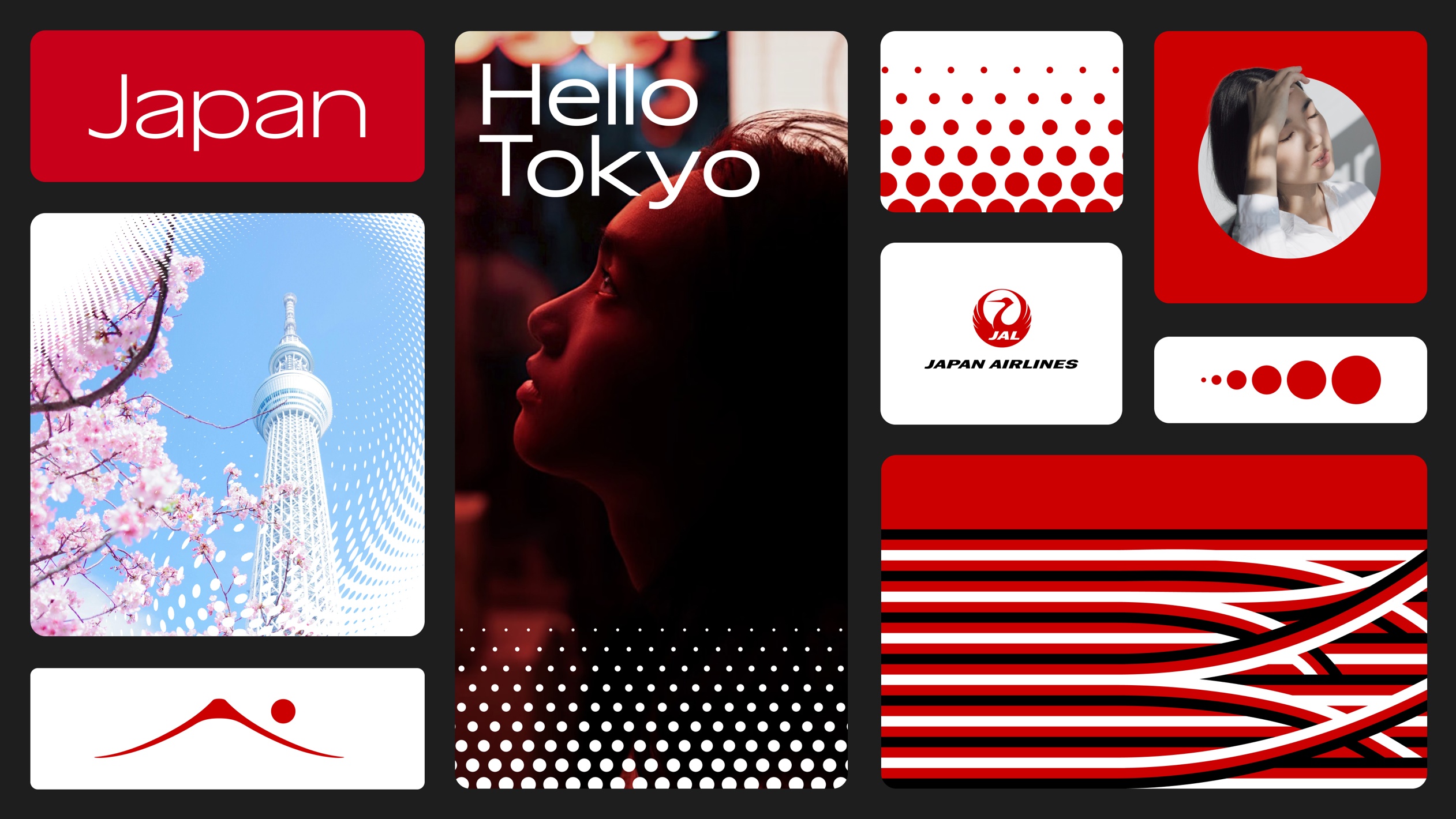
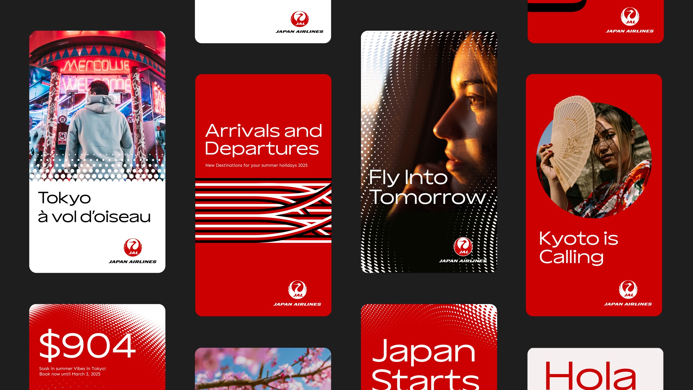
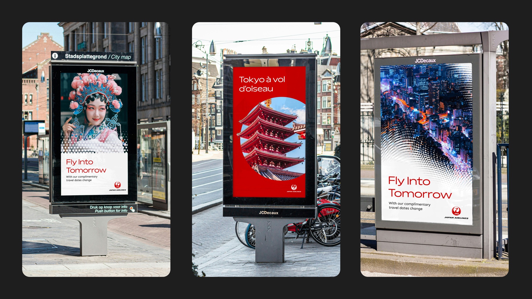
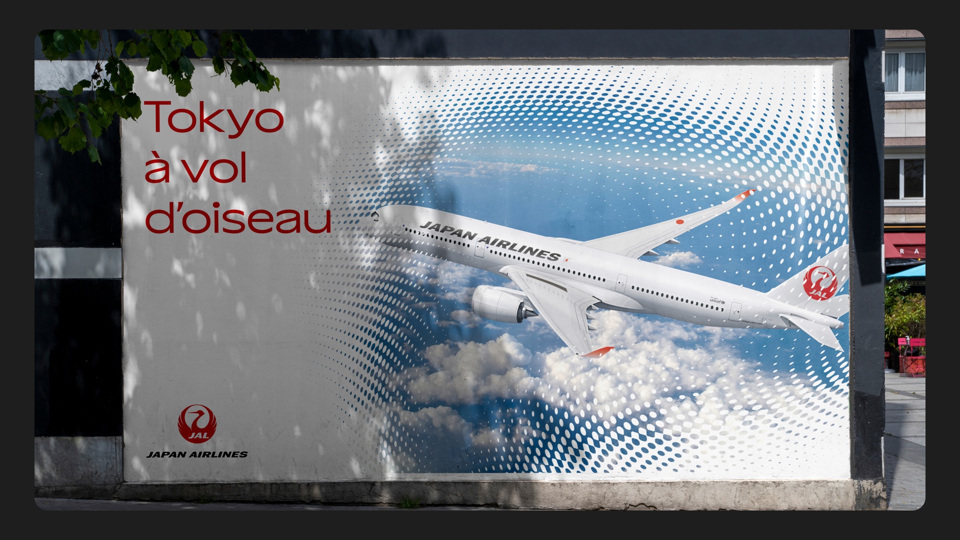
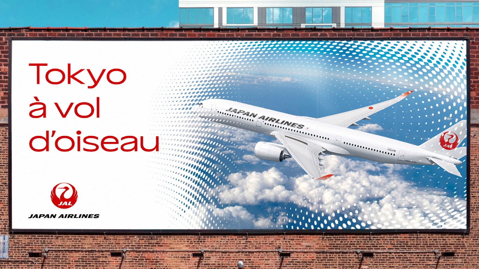
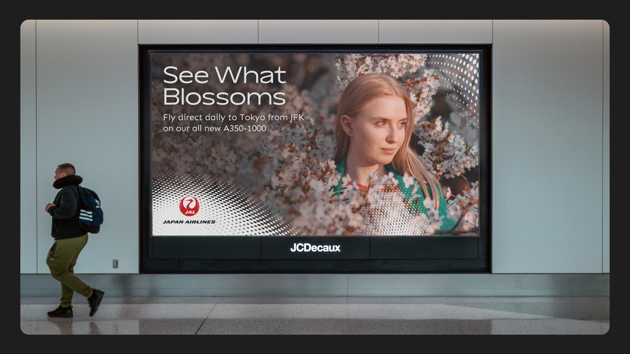
- An entirely new design system comprising different graphic elements that make brand assets distinctive and memorable – including the introduction of the Japan Airlines dot pattern, inspired by the Japanese flag and Japan Airlines’ iconic logo. As a mnemonic device, the patterns offer a memorable cue for the brand and create a sense of movement through a series of dots that can scale and adapt in infinite ways. The dynamic patterns can stand on their own, overlay onto simple backgrounds and imagery – and act as a graphic device to transition between imagery, text, color and video
- Logo lockup updates to ensure consistent use and fit for digital applications, whilst retaining its heritage
- A new approach to typography including a new brand typeface, Aksen, inspired by the dynamic curves of the Tsurumaru, Japan Airlines’ iconic logo. Its swooping forms and wide stance evoke both the golden age of jet travel and a focus on a positive future
- The introduction of new iconography and illustration that complements and aligns with Japanese culture, inspired by the curves of the crane, as well as the variation of the thick and thin strokes present in brush calligraphy
- A simplified brand color palette
- Fresh photography direction
Minako Kent, International Marketing MD, Japan Airlines, says: “Tradition and culture lie at the heart of our ethos, and we also recognize the importance of delivering a fresh, consistent look-and-feel for our customers across all channels and regions. We partnered with Jellyfish because of their agility and one-stop service in media, data, tech, and creativity — they fully understand the needs of brands in today’s world. Because of this, we’ve been able to reimagine our whole visual identity to create a world-class omnichannel experience befitting our iconic brand.”
Meanwhile, Michael Walsh Kirwan, VP Creative at Jellyfish, says: “Japan Airlines came to us with a significant challenge – to breathe new life into a storied brand that was due a refresh across global markets. We’ve created an entirely new visual identity that ushers in a new era of modernity, flexibility and dynamism for the brand, and we’re excited to see it rolled out on an international scale”.
David Heasty, Design Lead comments: “Collaborating with Japan Airlines on the redesign of their visual identity was a dream project. Each design element was carefully crafted to honor the legacy of Japan Airlines while infusing it with a fresh, contemporary energy that speaks to the spirit of innovation that is so core to the brand’s ethos. We embraced the challenge of reimagining the airline’s visual identity and exploring new possibilities to create something truly timeless.”
Key members of the Jellyfish team included Rich West, VP Creative and Experience; Tom Kelley, Client Partner; Elaine Choi, VP Client Management; Beth Lewis, Senior Project Director; Amy Crowther, VP Brand Strategy; and Ashley Niedringhaus, Content Director.
Source: Jellyfish
Japan Airlines elevates global visual identity with Jellyfish added by newsroom on
View all posts by newsroom →
You must be logged in to post a comment Login