International brand design agency JDO has rebranded Cutrin Nordic Expressions, a comprehensive range of expert haircare products specifically formulated to enhance the beauty of Nordic hair.
With decades of expertise and an expansive product portfolio for home and the salon, Cutrin combines high quality, the ancient power of the northern environment, the latest technology and unique local experience.
Over time, however, its brand expression had become ubiquitous in the category. With dated packaging and a portfolio that had become muddled with poor navigation, the brand needed a complete overhaul to fulfil its potential as the definitive expert in Nordic hair solutions.
Cutrin turned to JDO to create a contemporary premium brand reflecting the products’ core values and benefits whilst establishing a cohesive portfolio with clear navigation and differentiation across the range.
Inspired by Scandinavia’s minimalist approach to design and the region’s affinity with their unspoilt countryside, JDO developed the creative direction, ’Nordic Nature inspired by Human Hand.’ This became the guiding brand principle and inspired a single-minded look and feel.
JDO created a new brand positioning which celebrated Cutrin’s Nordic style and provenance whilst juxtaposing the concept of weakness with strength. With such an expansive product range, the design team decided to move to a stronger, united brand block whilst maintaining strong product differentiation.
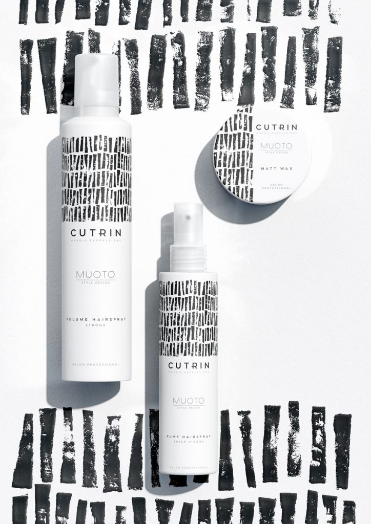
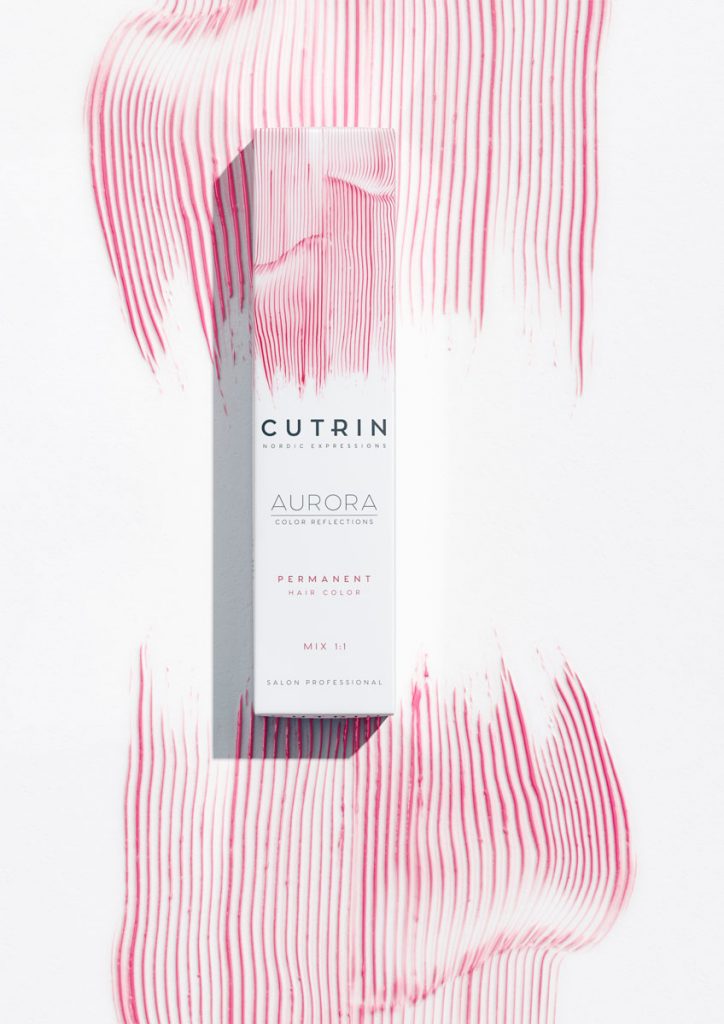
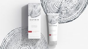
A beautiful matt pure white canvas serves as the backdrop, laying the foundation for a cohesive, minimalist Scandi feel. Offset against this are handcrafted illustrations, inspired by nature. Each illustration not only defines each range, but also emotes the product’s qualities like gentle or nourishing.
The logo reflects confident expertise with the strong utilitarian feel associated with Scandinavian typography. Extended kerning provides a premium, cosmetic-fashion feel whilst the extended bar on the ‘R’ plays into the runic traditions of the Norse.
“With this redesign, Cutrin embraces its opportunity to own a unique and compelling position in market,” comments Ben Oates, Founder and Creative Director at JDO. “Our challenge was to strike the right balance between serenity and strength, whilst creating belief, not only in the efficacy of Cutrin’s products, but also in its authentically Nordic roots.”

“Cutrin has long been committed to enhancing the natural beauty of Nordic women,” Nina Simojoki, CMO at Cutrin Nordic Expressions. “JDO understood our ambitions and created a solution that successfully balances contemporary chic with timeless style. In reflecting a profound sense of Nordic provenance, we believe this redesign will powerfully resonate with our consumers, both aesthetically and emotionally.”
Source: JDO
JDO take Nordic hair care brand Cutrin back to its roots for global redesign added by newsroom on
View all posts by newsroom →
You must be logged in to post a comment Login