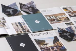
 Branding agency me&dave has created the new identity for Barts Square, a low-rise mixed-use quarter in the heart of London, which developer Helical launched to buyers on 8th March.
The collection of apartments, communal areas, office spaces, retail outlets and a major new restaurant is being developed on a 3.2-acre site close to 800-year-old St Bartholomew’s Hospital, and combines sensitively constructed new-builds with redeveloped auxiliary buildings formerly connected to the hospital.
Helical asked me&dave to develop a brand strategy that speaks to a mature domestic market and reflects the rich history and mystery of the neighbourhood, as well as its modern City credentials.
Old Meets New
 Located in EC1, Barts Square is about as well-connected as it gets, with St Paul’s Cathedral, Farringdon Station (with the soon-to-be-opened Crossrail) and the financial district just minutes away. Yet its tucked-away cobbled streets and tranquil courtyards make it feel a world apart; the perfect place to enjoy the City but also escape it if you want to.
Mark Davis, Creative Director of me&dave, says: “Barts Square offers a characterful alternative to the more ‘showy’ steel and glass towers being built throughout the capital. It is intimate, sophisticated and full of beautiful architectural detail, with glimpses of London’s iconic skyline. Our challenge was to celebrate this amazing development in a quietly confident way that speaks to an ‘inner-directed’ consumer who appreciates great design. Helical wanted a direct approach, so we kept things clean and simple to communicate a self-assured, positive message that would appeal to a private, older demographic.”
Intimate City-Centre Living
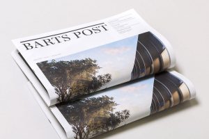
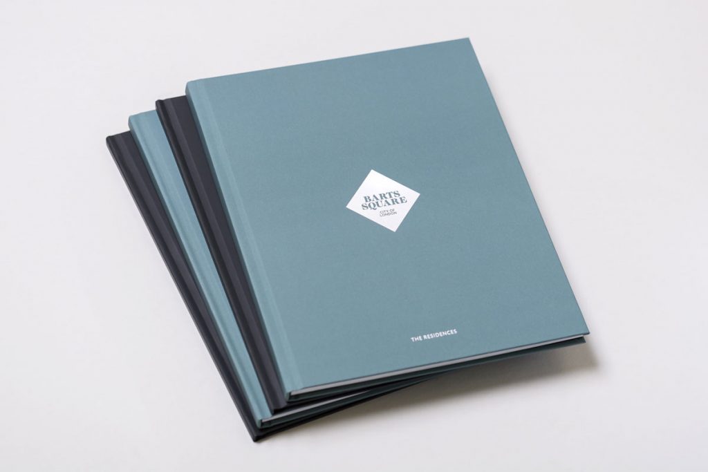
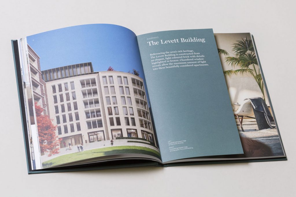
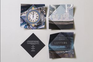 me&dave’s creative response captures the development’s quiet charm within a vibrant urban area. The brand campaign features heavily in print advertising and is supported by two host brochures – one for the main development and one for the six available penthouses – with beautiful computer-generated images, created by The Boundary, depicting the interiors’ ‘grown-up’, sophisticated aesthetic. The agency is also producing Barts Post, a free quarterly newspaper outlining the scheme’s unrivalled opportunities from a lifestyle and investment perspective.
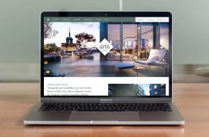 The marketing suite, art-directed by me&dave, amplifies the brand message, which respects the site’s medieval footprint and old-school values while keeping an eye on the future. Located within view of Smithfield Market on the edge of the site, it has a timeline on the walls outlining the area’s long history, as well as displays that give an idea of the warm and harmonious materials used – grained timber, polished marble, glazed tiling, buffed stone.
Each building at Barts Square has its own distinct ‘personality’, as do the apartments, which were individually designed by Johnson Naylor. Shared amenities offer an extension to the private units, including a screening room, gardens, lounge and bar. Altogether, it’s one of the capital’s most connected yet off-the-beaten-track developments, beautifully presented in a way that blends innate character with contemporary design and convenience.
Nikki Dibley, Development Executive at Helical, says: “As ever, me&dave completely understood and grasped the brief and delivered a pared back yet effortlessly stylish campaign, perfectly reflecting the design ethos of the scheme. The agency’s committed and imaginative work brings the scheme to life and has already played a huge part in securing sales.”
Source: me&dave

You must be logged in to post a comment Login