 London-based strategic brand agency Path has evolved its award-winning design for Oppo, a premium range of healthy ice creams. The refreshed new look will support the brand’s expansion into the mainstream and its extension into ready-to-eat desserts. Launching nationwide this week, the new packaging reflects Oppo’s ‘Taste Sensation.’
Last year, Path helped Oppo find the ‘sweet spot’ by creating a premium identity that brought together the best of both worlds – delicious indulgence and healthy choices. The rebrand brought the ice cream challenger a significant increase in sales, listings in upmarket grocers including Waitrose, and a prestigious Pentaward. This success has continued with the brand now being sold at both Sainsbury’s and Asda. Looking to strengthen its appeal with mainstream consumers as well as add new flavours and products to its portfolio, the Oppo Brothers (Charlie and Harry Thuillier) once again engaged Path.
 The task was to develop a robust design strategy that would make the brand more approachable, dialling up its health credentials whilst also shifting its position from a luxurious indulgence to one of an everyday temptation.
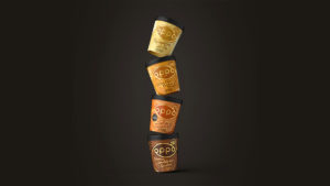
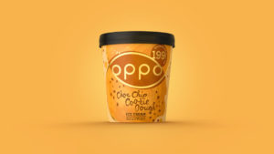
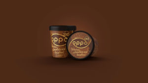
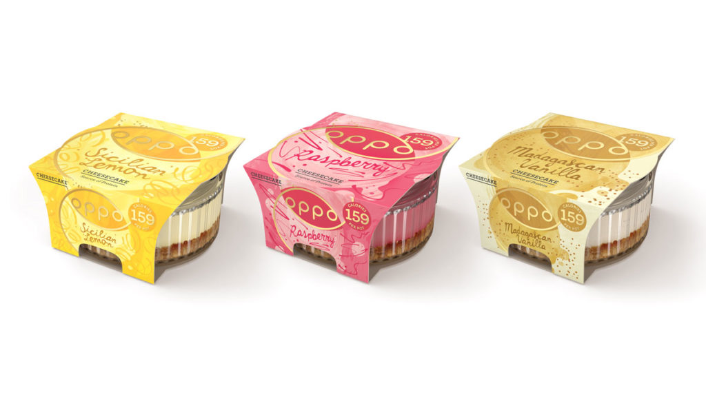
Oppo’s new design takes an abstract approach to communicate their tantalising taste and natural goodness. Using untreated textures and handcrafted qualities, the design celebrates imperfection and emphasises Good Temptation – the kind that reconciles the desire to indulge with a healthy option. Typography in swirls and drizzles, dollops and drips of colour, and texture in dashes and splashes all work together to convey Oppo’s natural deliciousness and increase its taste appeal.
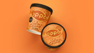 Whilst Oppo’s ‘sweet spot’ remains, outlined in gold, in the centre of pack, the introduction of a new pastel colour palette infuses friendliness whilst also supporting variant differentiation. When opening the lid, the consumers discover messaging to tempt them – ‘Spoon Me’ and ‘Bowls are overrated. Dive In.’ This playfully naughty tone of voice creates a greater level of engagement and approachability whilst allowing Oppo to retain its premium position.
The design has also been rolled out across Oppo’s new line of ready-to-eat desserts, which is currently being offered in three delicious cheesecake flavours including Madagascan Vanilla, Sicilian Lemon and Raspberry.
 “The challenge of this redesign was in strengthening the communication of natural goodness without losing the feeling of indulgence. To do this, we needed to take a creative approach that wasn’t obvious,” comments Gökçe Şahbaz, Creative Director at Path. “By focusing on the sensation of the Oppo experience, we were able to dramatise the healthy qualities of the product in an almost subliminal way, whilst also expressing the brand’s promise of ‘Temptation you never need to resist.’
Oppo founder, Harry Thuillier comments: “Oppo is temptation you never need to resist, so we wanted the branding to illustrate that sense of taste, texture and naturalness you’re looking for when craving something sweet. With flavours like our new Choc Chip Cookie Dough, we crafted the pack you pick up on shelf to represent the party in your mouth that happens when you dig in. All while retaining the Oppo sweet spot between health and indulgence. Kudos to the team at Path for bringing #GoodTemptation to life!”
Source: Path
Oppo Expresses ‘Good Temptation’ with a Redesign by Path added by newsroom on
View all posts by newsroom →
You must be logged in to post a comment Login