Over the last 65 years, McDonald’s restaurants have become beloved for quality food and convenience. With over 60 million touchpoints every day, packaging matters.

Pearlfisher partnered with McDonald’s for a multi-year redesign of the brand’s global packaging system. At the center of the redesign is a graphics system, which serves as a single visual framework for the brand’s portfolio of products, capable of transforming the modern expression of the global icon and evolving brand perception along the way.


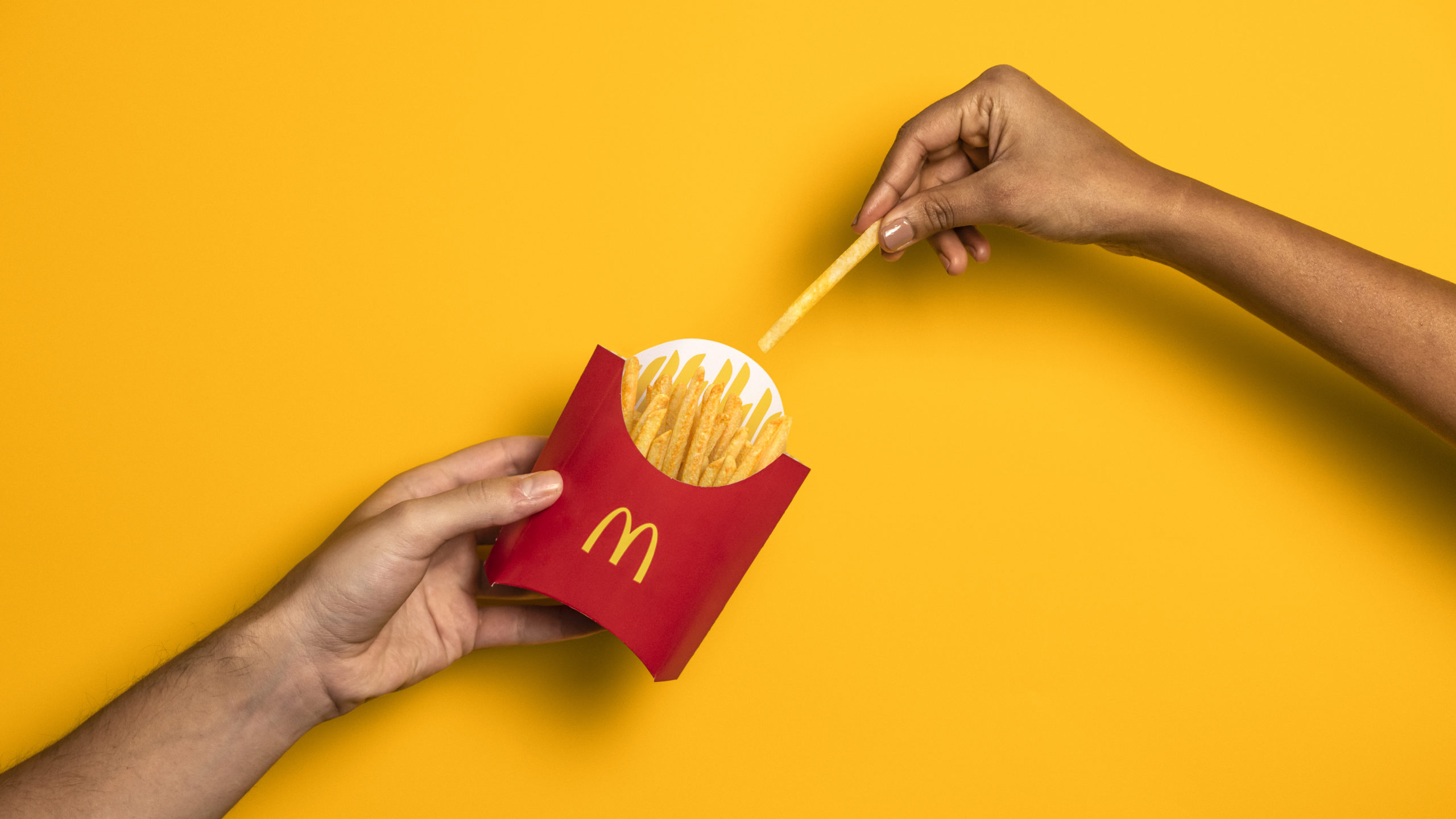
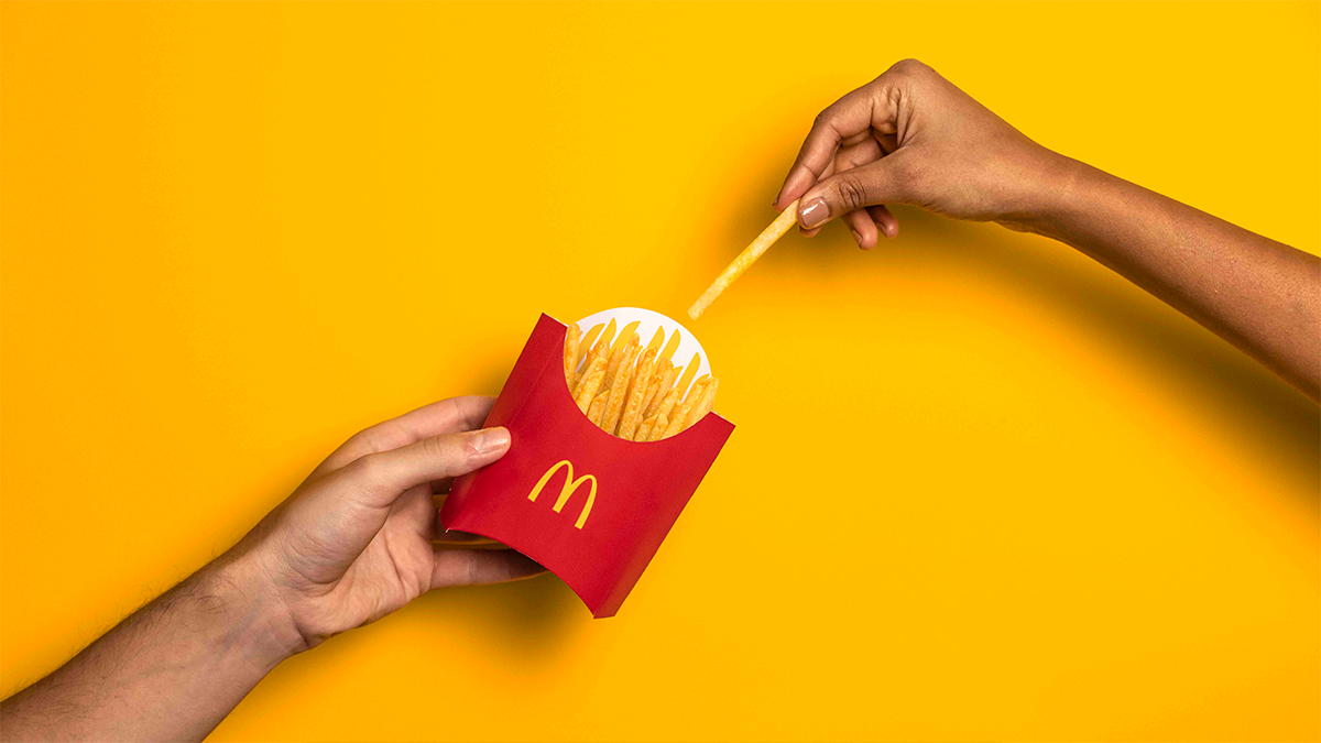
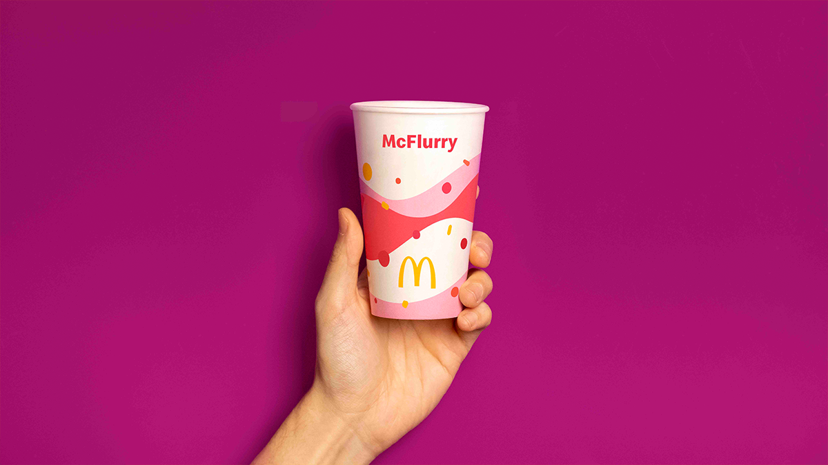
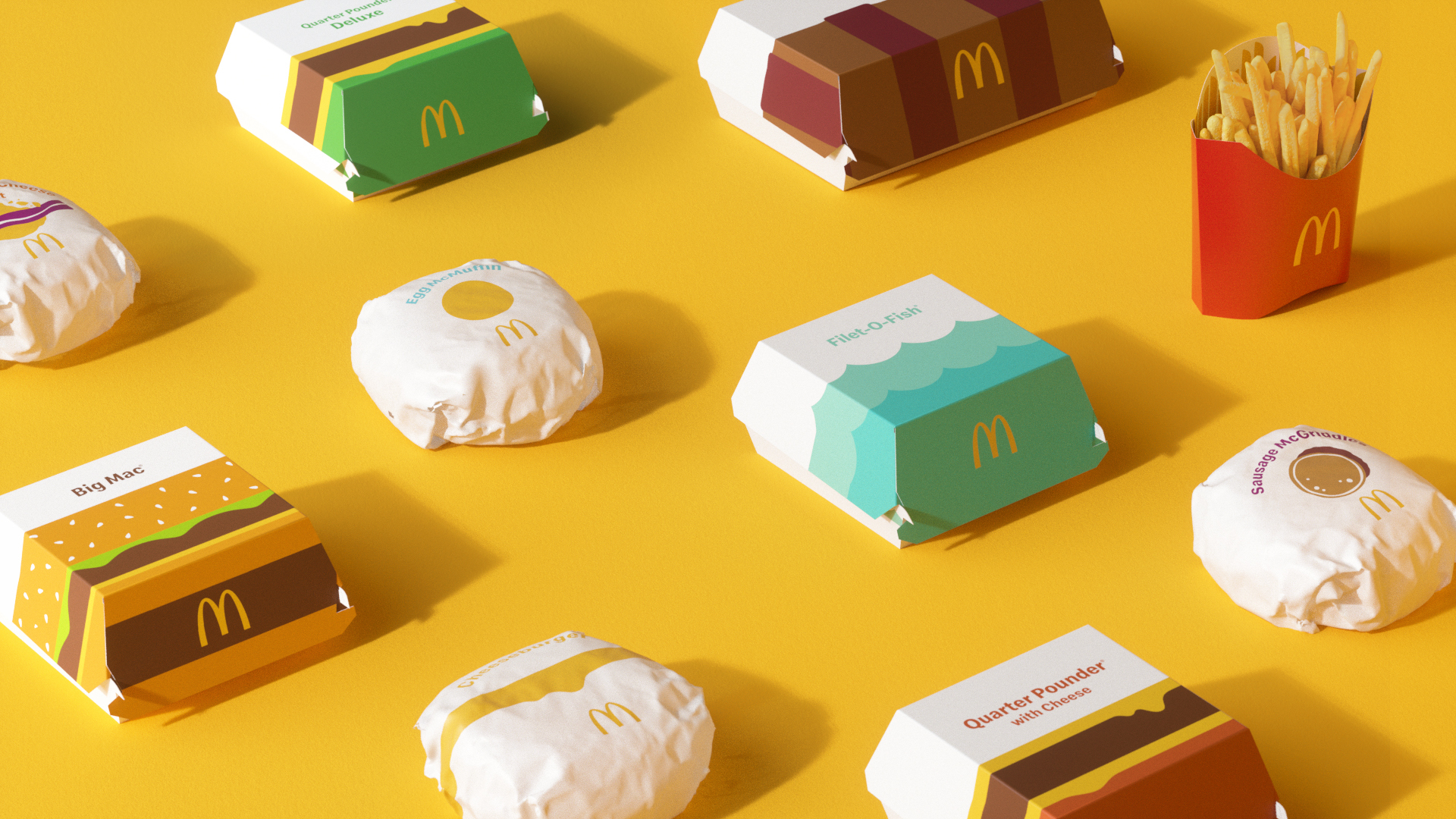
The renewed packaging design brings a sense of joy and ease to the brand through bold graphics. Transitioning from a design system with prominent on-pack messaging, the graphic representations of menu items help make each of the structures more connected and evocative of McDonald’s’ playful point-of-view. No matter the combination of each unique order, from the cool, blue waves on the Filet-O-Fish® clamshell or the golden, melting cheese on the Quarter Pounder® with Cheese clamshell, the packaging makes for an expressive, visual system.
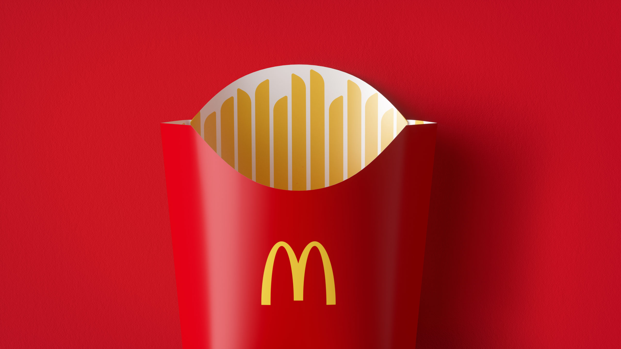
“Our task was finding out what was really special about each menu item to design a system that would make it easy for others to do the same,” said Matt Sia, Creative Director at Pearlfisher. “There’s beauty in the simplicity of McDonald’s’ iconic menu items. We aimed to find the most special, recognizable and iconic expression of each – celebrating them in a way that makes people smile. Bringing personality to life through simple illustration allows for the packaging to be functionally unique, easy to identify, aesthetically minimal and, most importantly, emotionally joyful. Everything in this system has a purpose and helps activate McDonald’s’ brand positioning to make delicious, feel-good moments easy for everyone.”

The redesigned packaging ensures that operations remain efficient for McDonald’s’ crew members making each meal. Each wrapper, clamshell and pack is designed to be identifiable where order assembly occurs. The easy-to-understand graphics drive recognition regardless of where in the world orders are being assembled, shared and enjoyed.
The McDonald’s menu includes great tasting, famous favorites. Pearlfisher took this opportunity to update and simplify the global system for a more confident experience.
“We’re proud to debut this redesigned system,” said Barbara Yehling, Senior Director of Global Menu Strategy at McDonald’s Corporation. “Pearlfisher helped to ensure that this redesign modernizes our brand, highlights the specialness of our menu, and delivers on our commitment to quality.”
Discover the new packaging at McDonald’s restaurants or by visiting McDonalds.com.
Credits:
Hamish Campbell, VP Executive
Creative Director Matt Sia,
Creative Director
Tiffany Bacani, Design Director
Alex Wagner, Senior Designer
Shruti Shyam, Designer
Brandi Parker, Head of Realization Justine Allan, Head of Client Management Courtney Tight, Client Director
Teri Neis, Client Manager
Stephen Kwartler, Senior Digital Artworker
Partner Agencies:
HAVI
Boxer Brand Design
McDonald’s Local Agencies
Turner Duckworth
Source: Pearlfisher & FAB News
Pearlfisher redesigns McDonald’s’ global packaging system added by newsroom on
View all posts by newsroom →
You must be logged in to post a comment Login