One&All will be rolled out by Sodexo to college canteens across the US
How can you stand out and be all things to all people?
Challenged by Sodexo to unite the evolving tastes and values of thousands of students across the US with the needs of every college administration, strategic branding agency, Without, found commonality in diversity. Repositioning the canteen as an exemplar of what a college does best — celebrating difference — Without created One&All, a new brand built on a rallying cry: one dining hall, something for all.
From cultural values to religious beliefs, and sporting teams in between, every college student is as different as what they eat. For university administrators — each operating as independent units — the dining hall needs to feed over one million people every day. Already serving 350 colleges across the US, Sodexo needed a unified brand to bring multiple stakeholders together and scale a growing, billion-dollar food business.
Without developed a strategy based on the seemingly impossible: finding consensus in diversity by making difference the commonality. One campus, thousands of students. One dining hall, something for everyone. One company, a team of many. One purpose, for the good of all.
The result was One&All, a brand built on fix and flex. From global dishes with full dietary transparency and customization options, to places for every vibe and student-driven initiatives, One&All creates spaces where you don’t just dine, but belong.
Diego Raso, Vice President, Marketing & Brand Management at Sodexo, said: “Our work on One&All has become a blueprint for how we build brands at Sodexo. It is now a benchmark against which all new projects are compared. With One&All, Without embraced difference and turned diversity into the very thing that brings us together.”
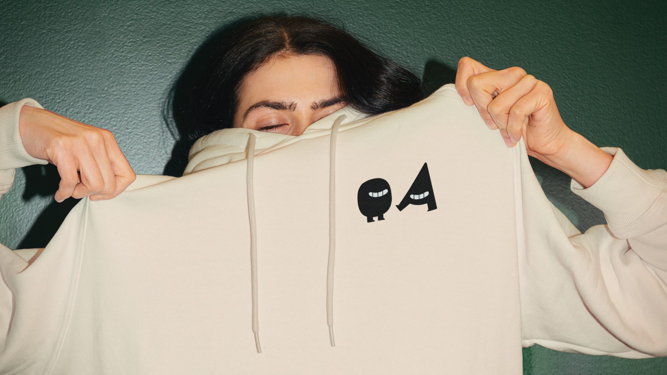
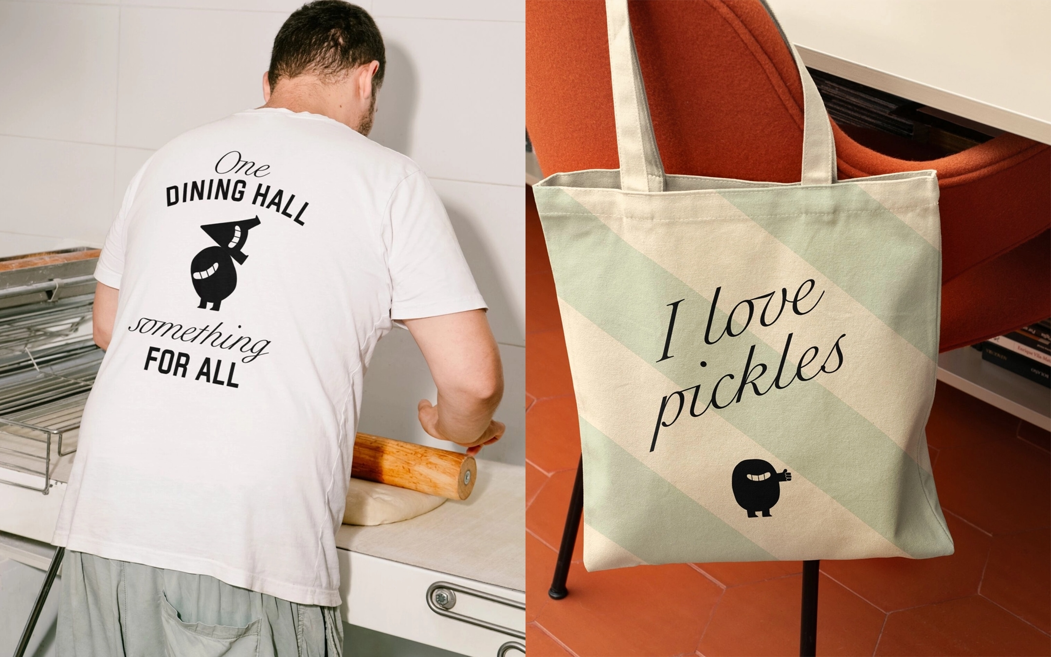
A collegiate visual identity was built from a modern take on varsity-style design cues. Without took the concept of a college mascot to create two dining hall hosts: the illustrated characters of “One” and “All”, shaped by the letters O and A. One’s a vegan, All is into carnivore ‘teins. One needs caffeine, All’s in training. With their very different personalities, the pair were perfect for fronting ideas for merch, including T-shirts, hoodies, caps, tote bags and mugs.
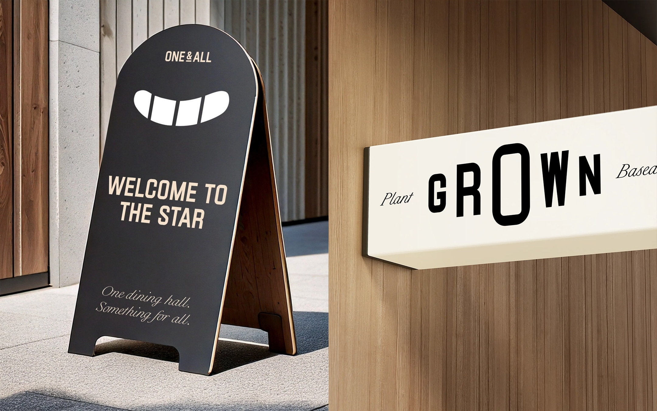
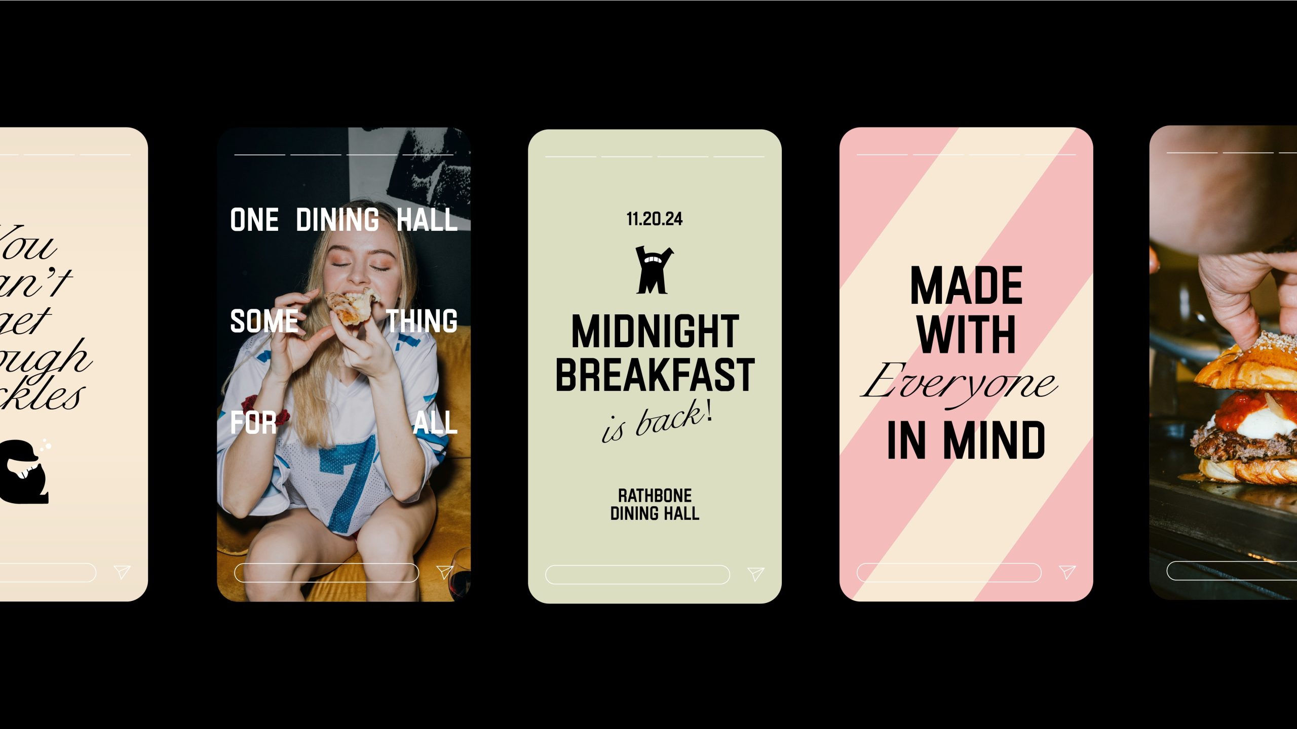
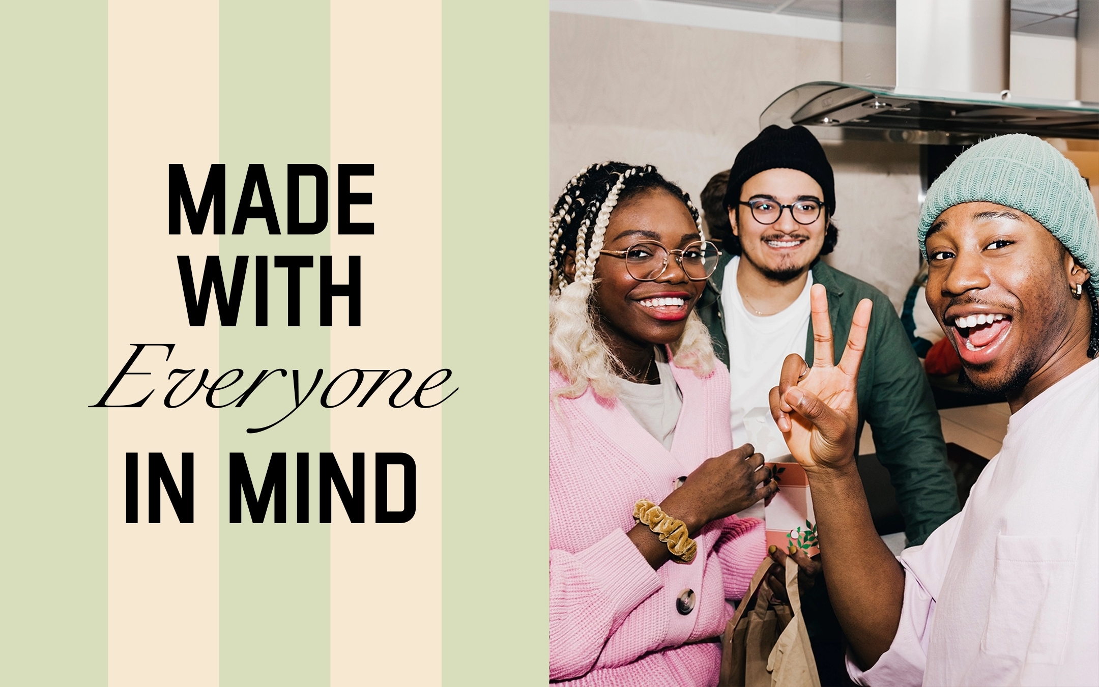
Without created an ownable colour palette of rhubarb pink that cuts through the breadth of the colleges (no college has pink as its core colour), with a supporting cast of secondary shades to flex the identity for different universities and give a timeless, nostalgic feel. A striped background combines the visual language of teams on campus with deli/food spaces.
Varsity-style typography blends the big and bold with a script-style typeface for character and diversity and a modern-retro vibe, while a positive slogan-style tone of voice fosters a team ethos and collective mindset.
Without developed a comprehensive identity system and brand guidelines that can be fixed and flexed to work for an operational chain of command that stretches from global headquarters, to diverse university campuses, to individual site managers and teams, each operating as independent units with a common goal.
Philip Koh, Strategy Director, Without, said: “We realized the strongest way to appeal to Gen Z and satisfy the needs of every stakeholder was to find commonality in diversity – and that’s the spirit of US colleges. This has been one of our most comprehensive and systemic projects, working alongside brilliant internal teams and external suppliers to deliver one market proposition with universal appeal.”
Source: Without
Without rebrands billion-dollar, multi-stakeholder brand feeding Gen Z added by newsroom on
View all posts by newsroom →
You must be logged in to post a comment Login