 Beer has long been associated with an unhealthy lifestyle, not helped by the overused term ‘beer belly’. Emerging drinking trends show that consumers are gravitating towards healthier alternatives and are placing quality over quantity.
In line with this new wave of thinking, FMCG trade title The Grocer challenged brand and packaging design agency PB Creative to develop a beer brand that dispels negative connotations and improves public awareness of the health benefits.

Heart-Felt Concept
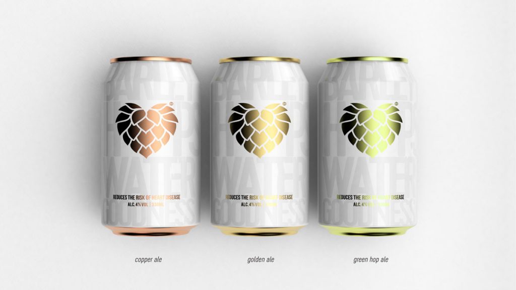
 PB Creative responded with Hop Heart, a craft-beer brand inspired by the high levels of vitamin B6 found in beer, which are known to reduce the risk of heart disease. Recognised for creating designs with beauty and clarity, PB Creative’s concept centres around a brand icon: a heart-shaped hop.
Placed at the heart of the packaging, this icon clearly communicates the brand story – that the beer is made from the finest ingredients and is also good for you and your heart. It also drives home the message that hops are a key component, imparting flavour and character as well as health benefits.
 The colour of the hop changes for each taste variant – golden ale, green hop and copper ale – while the fresh colour palette is subtly suggestive of the natural ingredients used to make the beer.
A Passionate Campaign
The team developed a campaign that playfully draws on the iconic ‘I heart NY’ strapline, using the can’s central icon to spell out ‘I heart beer’ and ‘beer hearts u’. As well as emphasising PB Creative’s passion towards communicating that it is a high-quality beer, the brand icon and packaging design also reinforce the health-giving benefits.

Co-director Ben Lamberts says: “There is definitely a gap in the market for a beer that promotes its health benefits while retaining authenticity. We challenged ourselves to create a brand that is simple in its execution and delivery of communication, and which would appeal to a modern-day consumer.”

Source: PB Creative

You must be logged in to post a comment Login