Creating a compelling narrative, visual identity and brand world, BrandOpus have partnered with Punch, who manage a portfolio of 1300+ pubs in the UK.
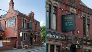
To coincide with an ambitious strategic vision whilst maintaining a link to its roots in the traditional world of pubs, Punch briefed us to reframe and reposition the brand and create a new visual identity, that both focuses on the company’s move to become a more modern pub co, and appeal to a younger, increasingly entrepreneurial, demographic of publican.
Immersing themselves in the Punch business, BrandOpus wanted to celebrate their role as patrons of the Great British local and capitalise on pubs’ inherent feeling of warmth and emotional connection; they are the ultimate social leveler and a place where everyone is welcome. As such the agency created a narrative that, at its heart, captures the essence of hospitality that runs through the Punch business; from head office, to publicans to the guests themselves.
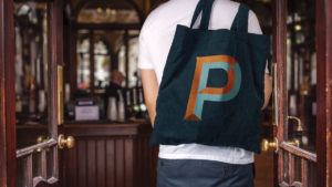
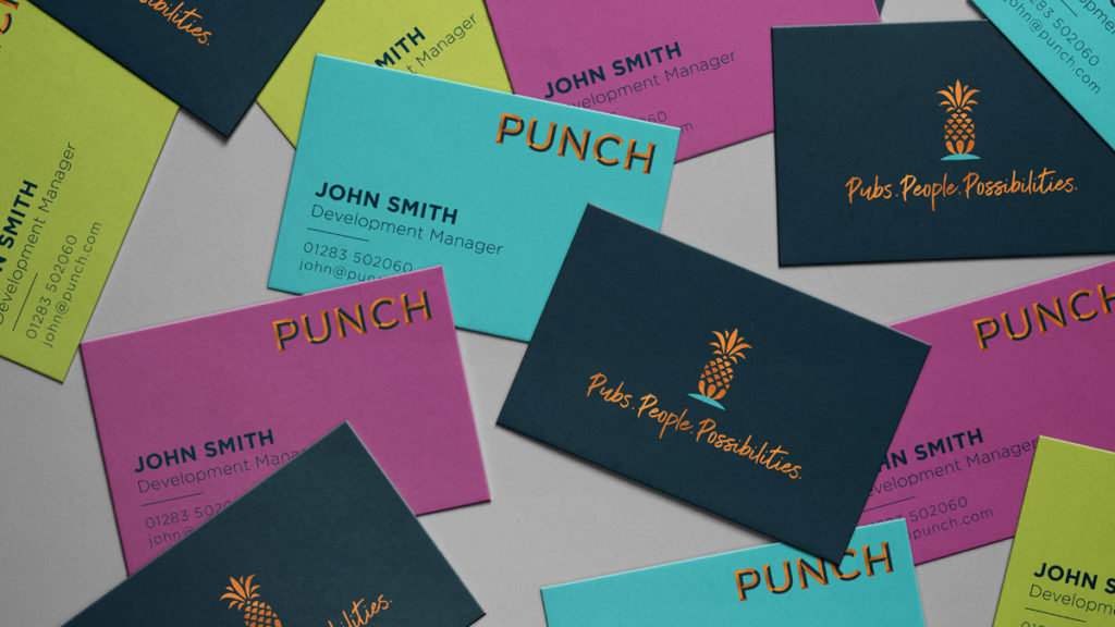
Encapsulating this narrative visually, BrandOpus introduced the symbol of the pineapple, which has throughout history, existed as an icon of welcoming hospitality. Whilst the wordmark itself evokes traditional pub signage and, therefore creates a sense of familiarity, they have adopted contemporary, more unexpected colourways, opening up a new audience for the brand.
John Ramskill, Executive Creative Director, BrandOpus says “Having delved into its historical associations with hospitality, we were struck by the prevalence of pineapples hiding in plain sight all around us. Architectural manifestations above doorways, adorning gateposts, and doorknockers fashioned from brass to name a few. This tradition of conveying a warm welcome, makes it the perfect symbol for Punch’s ambition to put outstanding hospitality at the heart of their business.”
Source: BrandOpus
BrandOpus Provide an Inviting Welcome for UK Pub Owners, Punch added by newsroom on
View all posts by newsroom →
You must be logged in to post a comment Login