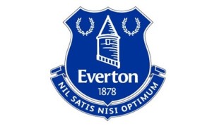
 Premier League football team Everton FC has completed its rebrand U-turn with the unveiling of a new crest chosen by fans.
The club launched its 2013/14 crest, which was designed by its in-house graphics team, earlier this year.
However, following online protests from fans, the club almost immediately announced that it would drop the mark for the 2014/15 season and work with supporters to develop a replacement logo.
Liverpool-based consultancy Kenyon Fraser was engaged to work with Everton fans to develop a replacement logo. The club says around 20 000 fans were involved in the consultation.
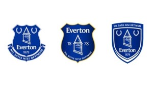 Three options were presented last month, and supporters voted to choose their favourite. The winning design received almost 78 per cent of the vote.
Everton says the new crest design, which will be used from the 2014/15 season onwards, ‘strongly reflects the club’s heritage and status as an authentic, respected football club’.
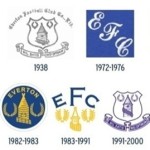
The design features the club’s ‘Nil Satis Nisi Optimum’ motto, which had been dropped for the previous identity, as well as a redrawn Prince Rupert Tower, which is similar to that on the club’s 2000-2013 crest.
The new design also sees two laurel wreaths, and the club’s 1878 founding date, return to the crest.
An Everton FC statement says, ‘The design is modern and clean but with a strong element of tradition, reflecting the most-preferred previous club crests, while being easier to use across the range of modern media.’

You must be logged in to post a comment Login