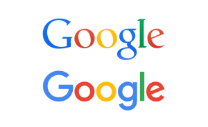
 Google has unveiled its biggest update in 16 years with the introduction of a new dynamic, animated logo which will react to users written and verbal search requests.
The new look ditches the old serif typeface which Google has used since 1999 in favour of its own sans-serif creation. The changes will see the letters of “Google” transform into a series of four coloured dots that morph life depending on the kind of search that is being made.
When a search is initiated, the Google typeface will give way to the four coloured dots which will undulate like water. The increasing popularity of voice searches has been accounted for as well; now when an audible search is being made the four dots will change into an equalizer which reacts to the tone and pitch of vocals.
While the search is being processed, the four dots re-emerge and spin until they transform into the Google lettering again when the search results appear.
The overhaul is a significant change for Google which has only previously made small tweaks to letter spacing and removed the drop shadow but other than that it has remained the same since its incarnation.

You must be logged in to post a comment Login