Gigi, an innovative plant-based Italian-style gelato, launches with brand and packaging design by London agency Straight Forward Design.
Interest in plant-based eating is soaring, and Gigi spotted a gap in the market for a gelato that’s jam-packed with vitality-boosting nutrients, as well as being rewarding and delicious. The gelato is made with cold-pressed fruit and veg to lock in all the goodness, and cutting-edge production processes to give it a rich, ‘creamy’ and satisfying taste appeal.
The Straight Forward Design team recognised that Gigi is a category-changing product, and the brand and packaging identity needed to reflect that. The result shows how ‘health’ and ‘indulgence’ design cues can be combined effectively, getting across to consumers this product is both nutrient-rich and delicious.
Zeno Tosoni, CEO and Co-founder, Gigi, says: “Gigi is all about showing that healthy can be rewarding. We needed a brand and packaging design strategy to convey that message to shoppers, who are faced with an increasingly crowded ice-cream category. Straight Forward Design has created a solution that combines immediate taste and health cues with a strong brand presence.”
Typically, design language in the ice-cream sector goes heavy on indulgence, while health foods get wrapped up in conspicuous virtue-signalling.
Mike Foster, Creative Director, Straight Forward Design, says: “We sought to find a sweet spot between the two and developed a new visual language to support that. A lot of non-dairy ices are full of unhealthy ingredients, so it was important to set Gigi apart and create a strong foundation for future growth.”

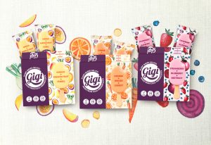
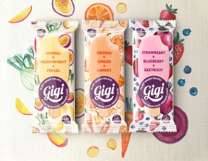
Taking inspiration from heritage Italian design cues, hand-painted watercolour illustrations confidently celebrate the natural, plant-based ingredients upfront, and make a virtue of the interesting and surprising flavour combinations.
Steering away from some of the more elaborate naming strategies to be found in the sector, Gigi product names have been delivered in an open, friendly font to communicate brand authenticity. Soft colour-ways support the illustrations and make each variant stand apart, while offering cohesion across the whole range.
And an image of the product on pack shows clearly that this has an authentic ice cream-like texture. Finally, the combination of confident brand identity and strong product story using illustrations creates brand-blocking opportunities and sets Gigi up to flex and grow.

Ralph Barkmeijer, COO and Co-founder, Gigi, says: “Gigi is carving a new niche for itself in this cluttered arena, and Straight Forward Design has developed a look and feel that helps it stand apart while celebrating the fact that this it’s healthy, vegan and delicious. Straight Forward Design’s global brand and marketing expertise has been invaluable in helping us negotiate a big, complicated sector. We’re a start-up with a vision, and the agency’s insights have been priceless.”
Source: Straight Forward Design
Plant-based gelato Gigi launches with category-changing branding by Straight Forward Design added by newsroom on
View all posts by newsroom →
You must be logged in to post a comment Login