Chase Distillery launches its cocktail competition, Chase Cup, in line with 2019’s Rock the Farm music festival, with a new brand identity by London design agency ShopTalk.
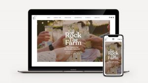
The website has just gone live, and mixologists from all over the world are being invited to submit cocktail creations that celebrate Chase Distillery’s single-estate potato vodkas and botanical-rich gins. The final showdown will take place during the festival, which is being held at Chase Distillery’s family-run potato farm in Herefordshire on 3rd and 4th June.
Chase brand guardian ShopTalk was asked to develop an identity that would celebrate the family, the farm and the spirits – and give bartenders and drinks industry professionals an opportunity to get to know, love and appreciate the brand ‘from the ground up’.
The Chase family has farmed potatoes in Herefordshire for generations. Father and son, William and James Chase, wanted the festival and its new branding to bring to life Chase’s earthy field-to-bottle production values and artisanal spirit.
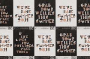
The ShopTalk team responded to the challenge with a craft-inspired identity that places the potato at the very heart of the brand. Alongside the identity, ShopTalk created a bespoke typeface, Spud Sans, which celebrates the potato and is completely ownable by Chase.
The new font was developed using old-fashioned potato-printing techniques, before being refined digitally. The resulting alphabet has a truly homespun feel but is clean and clear-cut, so it can be used effectively across event and directional signage.
James Wood, ShopTalk’s Co-founder and Creative Director, says: “At Chase Distillery, everything starts with the humble spud, so we felt it was important that the new brand and identity did too. We took inspiration from the stencilled potato crates, jute sacks and enamelled signs that can be found all over Chase Farm, and devised a unique typeface using potato carving.”
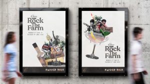
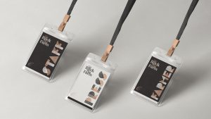
The main logos for Rock the Farm and Chase Cup are in a serif font to achieve stand-out, but have been given the potato-print texture to maintain brand cohesion, and Spud Sans appears on posters, lanyards, digital platforms, promotional material and wayfaring signage.
Collages on promotional posters introduce British iconography, including the Union Flag, as well as images of musicians, mixologists and potato plants, bringing together all of the festival’s essential ingredients.
James adds: “Having previously created the brand and packaging for Chase Potato Vodka, we had already established that Chase is nostalgic and proudly British, with a strong sense of integrity, so it was important that the additional collateral communicated all that to Rock the Farm festival visitors, too.”
James Chase, the distillery’s Head Ambassador, says: “The new identity really gets across that Chase is a from-scratch, home-grown operation. It conveys so much complex messaging but in a simple, unadulterated fashion. We’re confident that ShopTalk’s work will communicate very effectively who we are as a business to all the festival-goers.”
Source: ShopTalk
ShopTalk shakes things up for Chase’s cocktail contest and festival added by newsroom on
View all posts by newsroom →
You must be logged in to post a comment Login